Create Custom Form Components
Target audience: Developers
Since Flowable 3.17 there is a new way to create custom components which is simpler and provides a live preview. Please check-out the related documentation.
The approach on this page is still supported and can also be migrated to the new approach.
Introduction
Flowable provides a wide variety of out-of-the-box components which you can use to model your processes, cases, forms, etc. But sometimes there are some custom elements which are specific to your domain. Since these components are not provided to you by Flowable, you can extend the set of out-of-the-box components with your own components.
This how-to describes how you can create your own form components and integrate them in Flowable Design and Flowable Work/Engage.
The code for this how to can be found at GitHub.
Creating a Palette
The first step to your custom form component is to create a palette file.
The palette file can be either for the form or for the page palette.
Those two model types have different palettes, however most form components are usable for both.
Depending on which model you would like to use, you can either patch the palette flowable-form-palette, the flowable-page-palette or both of them.
In the following we will just use the form palette, but it will work for the pages in exact the same way.
In our Flowable Design project Flowable is looking on the classpath location com/flowable/config/custom/palette for custom palettes.
We need to create a .palette file in this directory to make our own element available.
To have suggestions and validation by your IDE, and suggestions we recommend using the JSON Schema.
In this example we are just calling the file chart.form.palette:
{
  "$schema": "https://developer-docs.flowable.com/schemas/palette.json",
  "Palette-Id": "chart-form-palette",
  "title": "Chart Palette Extension",
  "patchPalettes": ["flowable-work-form-palette"],
  "resourceBundles": ["com/flowable/config/custom/palette/translation"],
  "groups": {
    "chart": {
      "index": 10
    }
  },
  "presentations": [
    {
      "id": "pie-chart.presentation",
      "icon": "component-presentations/palette-icons/chart.svg",
      "bigIcon": "component-presentations/palette-icons/chart.svg"
    }
  ],
  "stencils": [
    {
      "id": "pie-chart",
      "xmlTag": "chartPie",
      "type": "node",
      "superId": "Component",
      "propertyPackages": [
        "labelWithoutDefaultValueAttributes",
        "commonAttributes",
        "borderColor"
      ],
      "roles": [
        "core_form_controls",
        "controls_morph"
      ],
      "groups": ["chart"],
      "presentationId": "pie-chart.presentation",
      "properties": [
        {
          "id": "chart-items",
          "type": "SimpleTextExpression",
          "path": "extraSettings.items",
          "category": "commonDetails",
          "optional": false,
          "index": 0
        },
        {
          "id": "value",
          "visible": false
        }
      ],
      "layout": [
        {
          "type": "layout.form.controls",
          "minWidth": 100,
          "minHeight": 100,
          "minControlWidth": 150,
          "minControlHeight": 150,
          "offsetX": 10,
          "offsetY": 0
        }
      ]
    }
  ]
}
The xmlTag is the actual tag which will be used to render the component.
When we choose the xmlTag it's important that we prefix it with a unique suite name.
The suite name will then be used to lookup the form components in Flowable Design.
Based on our XML tag chartPie the suite name is chart, followed by the component name with the first uppercase letter Pie.
The icons and view path we are using is already on our classpath, since they are part of the Flowable Work integrated charts.
To pass in the actual value of our items to display we specify a property of the type SimpleTextExpression to allow the user to specify the input of our component.
By convention, we are going to assume that this is a list of objects with the keys label and value inside.
To enhance this component, you could also make this dynamic attributes to pass in through the palette file.
This is skipped in this how-to to keep it simpler, but the way would be actually really similar to how we pass through our actual items.
There is a default property value which is mandatory on our palette.
Since our component doesn't have any outputs, this field can be hidden.
To achieve this, we need a property with the same id and an additional flag to set the visible value to false.
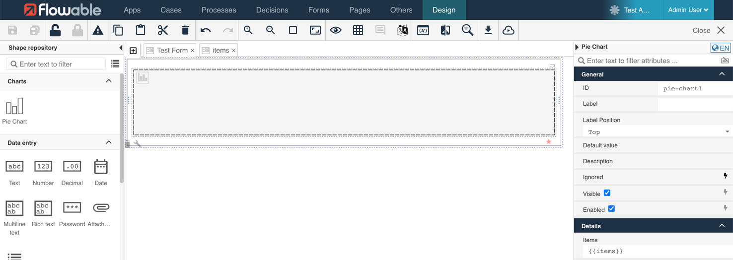
Once we start Flowable Design, we will see our component there.
There are no translations yet, this is why we will see the translation tags which we need to provide.
Therefore, we can create a file com/flowable/config/custom/palette/translation.properties - exactly the name we have specified as resourceBundles, only with .properties at the end.
In this file we can provide now our translations:
group.chart.title=Charts
pie-chart.title=Pie Chart
pie-chart.description=Displays a Pie Chart
property.chart-items.title=Items
property.chart-items.description=Items which should be displayed in your chart
Our palette file is now complete. The component is visible in Flowable Design:
However, going to the preview we will see an error message:
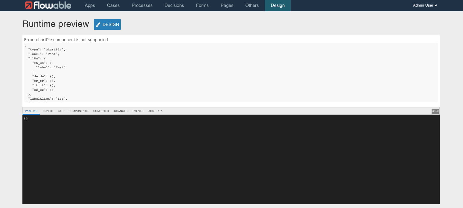
The reason therefore is simple, we haven't implemented our component yet. In the next chapter we are going to implement the component, before we then go ahead and integrate our implementation in Flowable Design as well as Flowable Work and Engage.
Writing a Basic React Component
As a first step on the way to the new component, a frontend development environment is needed. A storybook is a great fit, since it provides a fast feedback cycle and allows us customization without integrating it every time. Once the setup is done, the component can be written and manual tested in our storybook. You might want to add additional unit tests, however this is out of scope for this How-To.
Setting up a Storybook
We can start in a new empty directory, which will include our frontend customization. Later on, this directory can be included in our build process to automatically build the component once needed.
This tutorial assumes that you are already authenticated against the Artifactory.
In our new directory, let's call it frontend-customization, we can first install some packages:
yarn add react react-dom @flowable/forms
yarn add --dev typescript \
                @storybook/react \
                @storybook/addon-storysource \
                @storybook/addon-links \
                @storybook/addon-essentials \
                @storybook/addon-cssresources
It is always recommended, to use the latest version with all new features and security patches. During writing the tutorial those version have been React 17.0.2, Flowable Forms 3.9.0, TypeScript 4.2.4 and Storybook 6.2.9.
Storybook runs with almost no configuration.
However, it requires us to create a basic main.js file which tells us where to find our storybooks.
Let's use the following file and save it into .storybook/main.js:
module.exports = {
    stories: ['../src/**/*.stories.@(js|md|tsx)'],
    addons: ['@storybook/addon-essentials', "@storybook/addon-links", "@storybook/addon-storysource", "@storybook/addon-cssresources"]
}
As a next step we need to ensure that there is at least one story.
The story files are simple and just need to export all our stories as a constant, while providing some meta data as default export.
The following story is showing us a Flowable Form with a text field in our Pie Chart story src/charts/pie.stories.tsx:
import {Form, _} from "@flowable/forms";
import "@flowable/forms/flwforms.min.css";
import React from "react";

export const TestStory = () =>
    <Form
        debug={true}
        payload={{}}
        config={_.sfs.parse("text: value={{testField}} size=12 label=Test Field col=0 ")}
    />

export default {
    title: 'PieChart'
}
As a last step, we need to add the storybook script to our package.json.
This can be done with the following section:
{
  "scripts": {
    "storybook": "start-storybook -p 6006",
    "build-storybook": "build-storybook"
  },
  "dependencies": {
    ...
  },
  "devDependencies": {
    ...
  }
}
Now we can run the story by simply using yarn run storybook.
The storybook now starts and opens on http://localhost:6006/.
In case you see there a Cannot GET / as the first message without any content, try to remove the node_modules folder and execute yarn again.
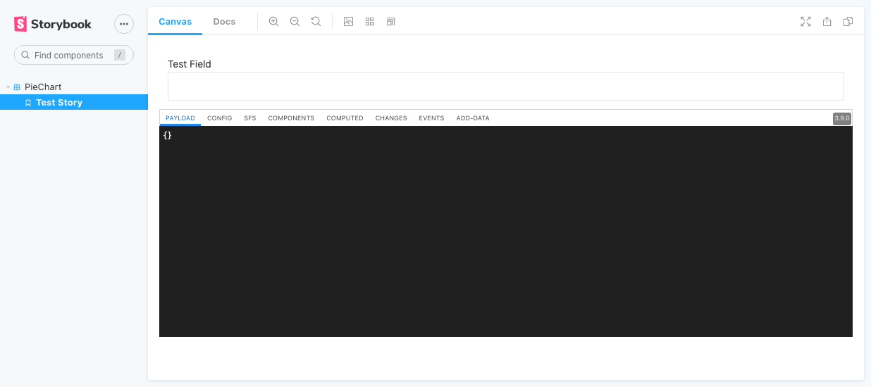
Once the storybook finally is started there is one component with one story:
Implementing the Component
Now there is the base to create an own form component.
To keep our component simple we will use an out-of-the-box pie chart component from recharts:
yarn add recharts
See recharts.org or more details.
The component installed, we only need to hook-up a new Form component with our inputs based on the palette file with the recharts component.
Therefore, let's create a new PieChartComponent which can do this.
A first and simple version of the charts/pie.component.tsx might look like this:
import {Cell, Pie, PieChart} from "recharts";
import React from "react";

export function PieChartComponent(props) {
    const Label = props.Components.label;
    const items = props.config.extraSettings.items;

    return <div>
        <Label {...props} />
        <PieChart width={400} height={300}>
            <Pie
                data={items}
                cx="50%"
                cy="50%"
                labelLine={true}
                outerRadius={100}
                dataKey={"value"}
                label={(entry) => entry["label"]}
            >
                <Cell fill="#3e5c41" />
                <Cell fill="#7d3333" />
            </Pie>
        </PieChart>
    </div>;
}
Since React supports class and function components we have the choice.
For this simple example a function component is used.
In the first two lines of the function properties are extracted.
There are several properties available by default, a full list can be found here.
This sample uses Components which gives you access to all other components by the key they have.
Using the existing label component becomes handy to not redo certain already existing components.
Passing through all properties will propagate the label attribute configured in the palette and it will render it accordingly.
Our second parameter is coming from the config.
The config itself is automatically propagated from the palette file and placeholders are looked up.
This means that an expression is automatically changed to the actual content, without the need to do any lookups.
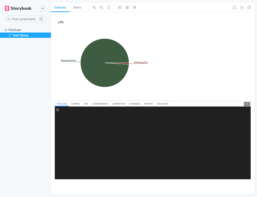
To use the component, our story book can now be adapted.
The sfs syntax allows us to directly specify the items embedded as part of the chartPie component we would like to have:
import {Form, _} from "@flowable/forms";
import "@flowable/forms/flwforms.min.css";
import React from "react";
import {PieChartComponent} from "./pie.component";

export const TestStory = () =>
    <Form
        debug={true}
        payload={{}}
        Components={{
            chartPie: PieChartComponent
        }}
        config={_.sfs.parse("chartPie: label=Life size=12 col=0 [[items= || label:Awesome,value:99 || label:Stressful,value:1]]")}
    />

export default {
    title: 'PieChart'
}
This file can be called pie.stories.tsx.
To enable JSX and specify compiler options a tsconfig.json file is required.
This content can be used to get started:
{
  "compilerOptions": {
    "jsx": "react",
    "module": "esNext",
    "moduleResolution": "node",
    "preserveConstEnums": true,
    "strict": false,
    "strictFunctionTypes": false,
    "target": "es5",
    "sourceMap": true,
    "inlineSources": true,
    "importHelpers": true,
    "resolveJsonModule": true,
    "esModuleInterop": true,
    "downlevelIteration": true,
    "typeRoots": ["./node_modules/@types", "./types"]
  }
}
For later development when you specify all typings the mode strict is recommended.
In this How-To some typings are skipped to shorten the tutorial, this is why strict is set to false.
The result of the story book is going to look like this:
Since the component is now done, it's time to create a build and integrate our custom component into the Flowable Design application.
Integrating Component in Flowable Design
To integrate the component in Flowable apps we first need to compile the component.
While we are doing the compilation, we don't need to package react and @flowable/forms, since those components are already available in Flowable.
The compilation can be done with the rollup tool, which allows us to specify the exclusion of those components and how the result should be exposed.
To ensure that Flowable is able to find the component, we first need to create an input file for rollup.
Since this first file is specific to our suite, let's call this file suite.tsx.
It simply contains a default export with the list of our components:
import {PieChartComponent} from "./charts/pie.component";

export default {
    chartPie: PieChartComponent
};
To install rollup, including some plugins, we can execute the following yarn add command:
yarn add --dev rollup \
            rollup-plugin-sourcemaps \
            rollup-plugin-uglify \
            @rollup/plugin-node-resolve \
            @rollup/plugin-typescript \
            @rollup/plugin-commonjs \
            @rollup/plugin-replace
It is always good to use the most recent version which include bug and security fixes. For reference, during the creation of the tutorial, the following versions have been recent and used to write this tutorial:
| Package | Version |
|---|---|
| rollup | 2.48.0 |
| rollup-plugin-sourcemaps | 0.6.3 |
| rollup-plugin-uglify | 6.0.4 |
| @rollup/plugin-node-resolve | 13.0.0 |
| @rollup/plugin-typescript | 8.2.1 |
| @rollup/plugin-commonjs | 19.0.0 |
| @rollup/plugin-replace | 2.4.2 |
With those plugins it's now possible to create a rollup configuration file rollup.config.js:
import commonjs from "@rollup/plugin-commonjs";
import typescript from "@rollup/plugin-typescript";
import {uglify} from "rollup-plugin-uglify";
import sourceMaps from "rollup-plugin-sourcemaps";
import resolve from "@rollup/plugin-node-resolve";
import replace from "@rollup/plugin-replace";

const input = "src/suite.tsx";
const outputJs = "./dist-suite/index.js";

export default {
    input: input,
    output: {
        name: "flowable.externals",
        file: outputJs,
        format: "umd",
        sourcemap: true,
        globals: {
            react: "flowable.React",
            "react-dom": "flowable.ReactDOM",
            "react-router": "flowable.ReactRouter",
            "@flowable/forms": "flowable.Forms",
            "@flowable/forms-work": "flowable.FormsWork",
            "@flowable/work": "flowable.Components",
        },
    },
    plugins: [
        replace({
            'process.env.NODE_ENV': JSON.stringify('production'),
        }),
        resolve(),
        commonjs(),
        typescript(),
        uglify(),
        sourceMaps()
    ],
    external: [
        "react",
        "react-dom",
        "react-router",
        "@flowable/forms",
        "@flowable/work",
        "@flowable/work-scripts",
        "@flowable/forms-work"
    ],
};
The output section specifies to expose the elements as flowable.externals, which is the default Flowable expects.
Please refer for more details to the chapter about Customize User Interface and Flow-Apps of the documentation.
Globals specifies the lookup for existing modules which are not included in the bundle (see also external).
This script only has a limited set of plugins which can be extended with more, for example in case CSS customization is needed.
Next, the build can be added to the package.json:
{
  "scripts": {
    ...,
    "build-suite": "rollup -c --environment BUILD:production --environment BUILDTYPE:suite"
  }
  ...
}
Now the script can be executed and it should generate a dist-suite/index.js file:
yarn build-suite
This file need to be copied to the classpath of our Flowable Design installation as part of the public/js folder:
cp dist-suite/index.js /path-to-flowable-design-classpath/public/js/flowable-forms-chart/
The folder name flowable-forms-chart consists out of two parts.
The first part flowable-forms- is static.
The second part chart is based on the suite name of our form component.
Since our form component is named chartPie, it's extracting everything up to the first uppercase letter of our xmlTag of the palette definition file.
This part of the form component is considered our suite name and appended as second part.
In case we have a Spring Boot starter based setup, the structure could look like this:
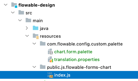
In this screenshot there are dots for the visualization of package separation. When you create the folder please ensure that each of the elements are separate sub-directories.
With this change we should now be able to see our component. However, depending on our form configuration itself, the content of the diagram might be empty.
This could be solved by not using UMD builds, and using ESM or CJS instead, that can be tree-shaken correctly, but that’s out of scope for this How-To.
Changing the Form Model to Allow Data Input
To be able to add some content to the diagram it's required to create a variable with a list of objects.
This can be easily modeled as a sub-form with the option Multiple elements checked.
The sub-form then needs to contain the required fields label and value:
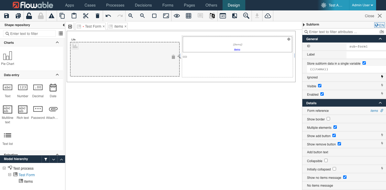
The pie chart component expects an integer type input for the "value" parameter. Therefore you have to use the "Number" component of Flowable Design instead
of a "Text" component to model value field of the sub-form.
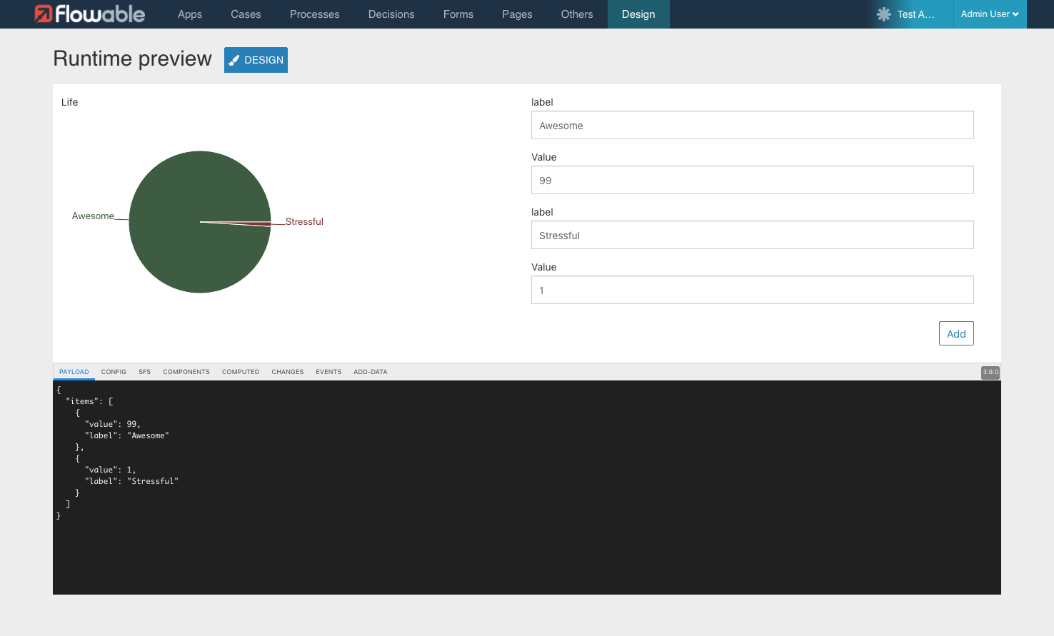
Once the preview button is pressed, we can now insert some data and see in the form that the data is propagated to the payload in the black debugging window below the form. In addition, the chart is also automatically updating with the values from the form:
Integrating Component in Flowable Work/Engage
The last piece to the puzzle is to integrate the component into Flowable Work or Flowable Engage (in the following just Work).
The integration is similar to the Flowable Design integration.
However, Work requires the output format in a slightly different way.
Therefore, the input and outputJs variable in the rollup configuration can be changed so that we have two separate builds.
The configuration at the beginning could look like this:
const suiteActive = process.env.BUILDTYPE === "suite";

const input = !suiteActive ? "src/index.tsx" : "src/suite.tsx";
const outputJs = !suiteActive ? "./dist/custom.js" : "./dist-suite/index.js";
The field src/index.tsx still needs to be created.
Components in Flowable Work are a list of lists instead of an object.
This is the reason why the suite.tsx can't be reused.
A simple example how this file could look like:
import {PieChartComponent} from "./charts/pie.component";

const formComponents = [
    ['chartPie', PieChartComponent]
];

export default {formComponents};
Of course, this file or the suite.tsx could iterate over the other file and automatically convert the format.
To keep this tutorial simple, the component is just specified twice.
As a next step, the second build need to be added to the package.json:
{
  "scripts": {
    "storybook": "start-storybook -p 6006",
    "build-storybook": "build-storybook",
    "build-suite": "rollup -c  --environment BUILD:production --environment BUILDTYPE:suite",
    "build-work": "rollup -c  --environment BUILD:production --environment BUILDTYPE:work"
  },
  ...
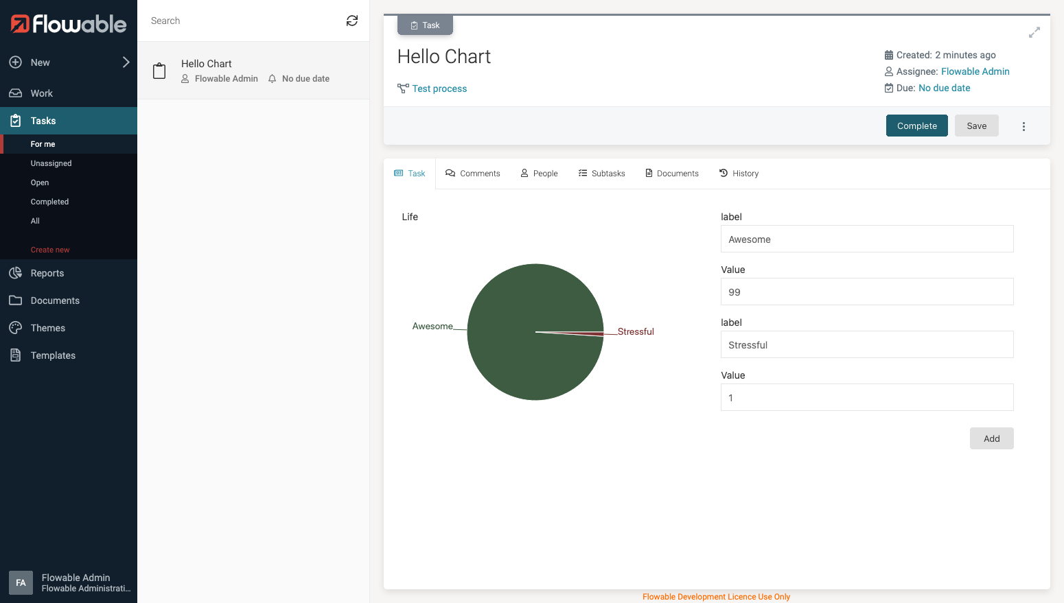
After running the build with yarn build-work the output file can be copied to the static/ext directory of our Work classpath.
cp dist/custom.js /path-to-flowable-work-classpath/static/ext/
Now you are ready to use the component. Simply create a process or case and include in on of your forms the component. The result could look like this:
Conclusion
Flowable Design and Work, in addition to being a low-code platform, also allows adding custom components using standard frontend techniques. This is a powerful way to enrich the capability of your modelling people with technical solutions specific to your business.
The purpose of this How-To was to show how the development setup can be done, and a simple component can be integrated inside Flowable Design and Work. To create more powerful components it's worth it to read the documentation about Custom Datatable and Custom Composition. Furthermore, there is also a follow-up How-To about the Custom Composition Components.
The frontend customization part of the documentation explains the details of how Flowable Work can be even more customized and enhanced with your frontend code.