Create Composite Form Component
Target audience: Developers
Introduction
Flowable provides a wide variety of out-of-the-box components which you can use to model your processes, cases, forms, etc. But sometimes there are some custom elements which are specific to your domain. Since these components are not provided to you by Flowable, you can extend the set of out-of-the-box components with your own components.
To create those custom form components, you can create them based on out-of-the-box Flowable Forms components. This gives you a powerful way to define new components based on the already existing elements.
This How-To assumes that you worked through the How-To: Create Custom Form Component to setup your environment. In case you haven't checked it out, it's recommended to walk through it first.
Base Component Class
The goal of this How-To is to create a component which has an optional text field based on a checkbox. However, as soon as the checkbox is checked, the text field is mandatory and need to be filled out.
As a base component either a functional or a class component can be used. However, when using composite components the class component is an advantage since it
does require static methods defined on the component. The basic component looks like this, and extends the Model.FormComponent from @flowable/forms:
import {Model} from "@flowable/forms";
import React from "react";

export class TextWithCheckboxComponent extends Model.FormComponent {

    public render() {
        return <div>test</div>;
    }

}
The render() method returns the content of what is supposed to be rendered. To test the component, a storybook allows you to try the rendering with Flowable
Forms. Details about the storybook, and the setup is part of the How-To Create Custom Form Component.
Creating a Component with a Label
Once the component shell is ready, the component can be filled with content. Therefore, either other React or Javascript components can be used. Alternatively,
Flowable Forms component can be rendered as part of the component itself. Components can be accessed through the props attribute Components. This attribute
gives a component store with all the available Flowable Forms components. As an example, the label
component can be used to render a label. Simply use the label component and pass on all props, since those contain information about the own component.
import {_, Model} from "@flowable/forms";
import React from "react";

export class TextWithCheckboxComponent extends Model.FormComponent {

    constructor(public props: Model.Props) {
        super(props);
    }

    public render() {
        const {Components} = this.props;

        const Label = Components.label;

        const bem = _.bem("text-with-checkbox");

        return <div className={bem()}>
            <Label {...this.props} />
        </div>;
    }

}
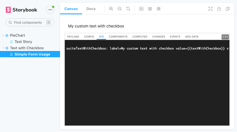
To test the component the following SFS could be used (assuming you named the component suiteTextWithCheckbox):
suiteTextWithCheckbox: label=My custom text with checkbox value={{textWithCheckbox}} size=12 col=0
The component will look like this:
Adding a Child Component
The label component in the previous section is to render just the label. It does not require any additional information for the component itself, though there is no custom configuration needed.
Additional attributes can be resolved during the $resolve lifecycle of a component. Inside the $resolve phase it's possible to also resolve custom form
definitions which are not part of the layout. A simple checkbox form would be for example:
{
  "type": "boolean",
  "value": "{{checked}}"
}
Let's assume this is stored in a variable checkboxDefinition.
During runtime, Flowable is converting those to so called "resolved" components.
The difference is that the "resolved" component is using the current context.
Instead of having the value as "{{checked}}" it's looking up the current context inside the current scope.
This means, that it would be true, false, or undefined depending on the scope.
The original definition is also available as $original attribute and there are additional attributes like $path available.
An example of the resolved definition above would be:
{
  "$additionalData": {/* additional data provided to the form */},
  "$computedPath": ".extraSettings.layoutDefinition.rows.0.cols.0.resolvedCheckbox"
  "$original": {
    "type": "boolean",
    "value": "{{checked}}"
  },
  "$path": "checked",
  "$scope": {
    "checked": true
  },
  "extraSettings": {
    "layoutDefinition": null
  },
  "type": "boolean",
  "value": true
}
With this, the $resolve method provides a powerful way to convert the official definition content to an internal structure used to render the form.
Also, access to certain other fields are there to do then as part of the component lookups based on expressions.
The resolved method for our use-case with just an additional checkbox can look like this:
    static $resolve(
        unresolved: Model.Column,
        scope: Model.Payload,
        addData: Model.Payload,
        Components: Model.ComponentStore,
        formCache: FormCache,
        currentPath: string
    ) {
        const resolve = Components.panel.$resolve; // 1
        const resolved = resolve(unresolved, scope, addData, Components, formCache, currentPath); // 2
        const resolvedCheckbox = resolve(
            checkboxDefinition,
            resolved.value,
            addData,
            Components,
            formCache,
            currentPath
        ); // 3

        return {...resolved, resolvedCheckbox}; // 4
    }
Those are the steps done inside the $resolve method:
- Take the
$resolvemethod from the panel component. This method can be used to resolve other components, since thepanelis an aggregation component. - The
$resolvemethod from the panel can be used to convert theunresolveddefinition provided as a parameter and resolve it with the currentscopeandaddDataprovided. This will do the normal$resolvewhich would also happen, in case there is no$resolvemethod. - Execute the
resolvemethod on our custom form definition. This takes the definition as an input and creates the resolved JSON as explained above. - Return the entire config which will be available to the
render()method asconfig.
The custom attribute resolvedCheckbox is available as part of the config in the render() method.
To have typings, the config can be simply casted to a model with the custom attribute:
const definition = config as Model.ResolvedColumn & {
   resolvedCheckbox: Model.ResolvedColumn;
};
Once this is done, the component can be taken from the components store and used:
const Boolean = Components.boolean;

// ...

return <div className={bem()}>
   <Label {...this.props} />
   <div className={bem("content")}>
      <Boolean
              {...this.props}
              config={definition.resolvedCheckbox}
              onChange={val => onChange({$path: definition.resolvedCheckbox.$path, $value: val})}
      />
   </div>
</div>
The onChange method can use the onChange method from props.
However, just calling onChange will set the entire payload of the current component.
To restrict the onChange to a certain path, an object with $path and $value can be provided.
Everything combined results in the following component:
import {_, Model} from "@flowable/forms";
import {FormCache} from "@flowable/forms/packages/flowable-forms/src/flw/FormCache";
import React from "react";

const checkboxDefinition = {
    type: "boolean",
    value: "{{checked}}"
};

export class TextWithCheckboxComponent extends Model.FormComponent {

    constructor(public props: Model.Props) {
        super(props);
    }

    public render() {
        const {Components, config, onChange} = this.props;

        const definition = config as Model.ResolvedColumn & {
            resolvedCheckbox: Model.ResolvedColumn;
        };
        const Label = Components.label;
        const Boolean = Components.boolean;
        if (!definition.resolvedCheckbox) {
            return null;
        }

        const bem = _.bem("text-with-checkbox");

        return <div className={bem()}>
            <Label {...this.props} />
            <div className={bem("content")}>
                <Boolean
                    {...this.props}
                    config={definition.resolvedCheckbox}
                    onChange={val => onChange({$path: definition.resolvedCheckbox.$path, $value: val})}
                />
            </div>
        </div>;
    }

    static $resolve(
        unresolved: Model.Column,
        scope: Model.Payload,
        addData: Model.Payload,
        Components: Model.ComponentStore,
        formCache: FormCache,
        currentPath: string
    ) {
        const resolve = Components.panel.$resolve;
        const resolved = resolve(unresolved, scope, addData, Components, formCache, currentPath);
        const resolvedCheckbox = resolve(checkboxDefinition, resolved.value, addData, Components, formCache, currentPath);

        return {...resolved, resolvedCheckbox};
    }

}
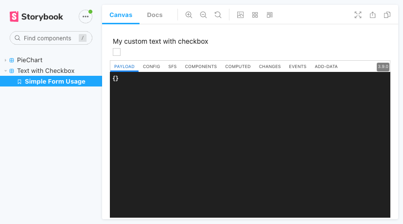
And the rendered version in the storybook looks like this:
Bind Values Between Child Components
The checkbox component uses a static definition which is provided by a JSON object.
This is not necessarily required, since the current context is available as part of the $resolve method.
In the resolved variable the entire value is available.
Also, already resolved components can be treated as normal config objects and the value can be retrieved.
For example:
const textDefinition = {
   type: "text",
   value: "{{content}}",
   isRequired: true,
   enabled: false
};

// ...

const usedTextDefinition = {...textDefinition};
// set the enabled flag
usedTextDefinition.enabled = !!resolvedCheckbox.value;
// resolve the dynamic component
const resolvedText = resolve(usedTextDefinition, resolved.value, addData, disabled);
Before the resolve(...) call the text definition enabled is set based on the current value of the checkbox.
This is also possible with all other available attributes on the definition of the (sub-)component.
Rendering works in the same way as before, just simply add the component from the components store with the definition created by the resolve method:
 <Text
     {...this.props}
     config={definition.resolvedText}
     onChange={val => onChange({$path: definition.resolvedText.$path, $value: val})}
 />
Doing this change adds an additional text field next to the component. With a few lines of CSS it can also be displayed next to each other:
.flw__text-with-checkbox__content {
  display: flex;
}

.flw__text-with-checkbox__content .flw__boolean__checkbox {
  margin: 0;
}
Now, to also adapt the checkbox to reset the text field once it is unchecked, it's possible to write a custom onChange method using the original one:
const onChangeCheckbox = (val) => {
   const value = {};
   value[definition.resolvedCheckbox.$path] = val;
   return onChange(value);
}
This resets the entire content of the component and just save the checkbox, rather than adapting the single value.
Combining everything will result in something like the following component:
import {_, Model} from "@flowable/forms";
import React from "react";
import "./text-with-checkbox.component.css"

const checkboxDefinition = {
   type: "boolean",
   value: "{{checked}}"
};
const textDefinition = {
   type: "text",
   value: "{{content}}",
   isRequired: true,
   enabled: false
};

export class TextWithCheckboxComponent extends Model.FormComponent {

   constructor(public props: Model.Props) {
      super(props);
   }

   public render() {
      const {Components, config, onChange} = this.props;

      const definition = config as Model.ResolvedColumn & {
         resolvedText: Model.ResolvedColumn;
         resolvedCheckbox: Model.ResolvedColumn;
      };
      const Label = Components.label;
      const Text = Components.text;
      const Boolean = Components.boolean;
      if (!definition.resolvedCheckbox) {
         return null;
      }

      const bem = _.bem("text-with-checkbox");

      const onChangeCheckbox = (val) => {
         const value = {};
         value[definition.resolvedCheckbox.$path] = val;
         return onChange(value);
      }

      return <div className={bem()}>
         <Label {...this.props} />
         <div className={bem("content")}>
            <Boolean
                    {...this.props}
                    config={definition.resolvedCheckbox}
                    onChange={onChangeCheckbox}
            />
            <Text
                    {...this.props}
                    config={definition.resolvedText}
                    onChange={val => onChange({$path: definition.resolvedText.$path, $value: val})}
            />
         </div>

      </div>;
   }

   static $resolve(
       unresolved: Model.Column,
       scope: Model.Payload,
       addData: Model.Payload,
       Components: Model.ComponentStore,
       formCache: FormCache,
       currentPath: string
   ) {
      const resolve = Components.panel.$resolve;
      const resolved = resolve(unresolved, scope, addData, Components, formCache, currentPath);
      const resolvedCheckbox = resolve(checkboxDefinition, resolved.value, addData, Components, formCache, currentPath);

      const usedTextDefinition = {...textDefinition};
      usedTextDefinition.enabled = !!resolvedCheckbox.value;
      const resolvedText = resolve(usedTextDefinition, resolved.value, addData, Components, formCache, currentPath);

      return {...resolved, resolvedCheckbox, resolvedText};
   }

}
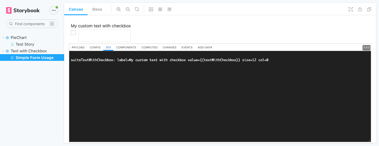
And the rendered version would be simply a text box combined with a checkbox:
Adding Validations
The validation of the component is missing so far.
To add validation we can define an $addValidations(column: Model.ResolvedColumn, Components: Model.ComponentStore) method.
Since the parameter provides the already resolved component, we have access to everything created in the $resolve method.
The column.$errors can be initialized as new list and filled with a list of errors.
Also, it's possible to validate child components.
In this example we can validate the text field as mandatory as soon as the checkbox is checked:
    static $addValidations(column: Model.ResolvedColumn, Components: Model.ComponentStore) {
        column.$errors = [];
        if (column.resolvedCheckbox?.value) {
            (Components.panel as Model.ContainerComponentClass)
                    .$addValidations(column.resolvedText, Components);
            Array.prototype.push.apply(column.$errors, column.resolvedText.$errors);
        }
    }
The $errors from the child component we need to propagate to the composite component to ensure that the form is invalid.
Conclusion
Combining multiple Flowable components provides a powerful way to create new custom components. The component can then be build and made available for Flowable Design, Flowable Work, and Flowable Engage. This sample has just two fields which are combined together. However, it's also possible to create multi-dimensional components which are then rendered to the user in different ways. This creates a powerful way to create own custom components which easily fit in the look and feel of the application.