Attachment
The Attachment component allows any type of documents (for example, images, PDF files, Microsoft Word files, etc.) to be uploaded. As the attachment is bound to a variable like every other component, the attached documents can be referenced through that variable anywhere later in the process, case or any other form.
Example
Properties
General
| Attribute | Type | Description | Category |
|---|---|---|---|
| Model Id | String | This is a unique id for the component. | Every field on a form model needs a unique ID, which is automatically generated but can be changed if needed (e.g. to reference in expressions or for debugging purposes). If the field type supports rendering a label, and most types do, it can be configured here. This label is a displayed on the form to the end user and typically indicates what value is expected in the field. The documentation property holds free-form text that can be used to give more details about this attachment field, like its purpose, usage in other models, etc. |
| Label | Text | The label attribute adds a label to the component. | |
| Label position | Selection:
| The position of the label, you can choose between left or top. | |
| Label tooltip | Text | When it is defined, a question mark icon will appear in the component label. When the user hovers over it it will show this text in a tooltip. | |
| Documentation | Multiline Text | A free-form text to explain the use cases for this form field. | |
| Value | Text | The binding for the form field. Use an appropriate expression to bind the component to its value and specify where the value is written/read. For example, use '{{myVariableName}}' to store the value of the field in a variable named 'myVariableName'. Use prefixes to define the scope of the value, for example, 'root.' for referencing the root case/process to store the value in. Please refer to the section 'Frontend expressions' in the Flowable guide for more information. | The purpose of a form is to either display some value or to have users provide values for the various fields of a form. In both situations, this value needs to be bound to an identifier using the {{myValue}} notation, and the value provided by the user will be stored in a variable with that identifier. If there already was a value bound to the identifier before, for example because another form had a field bound to the same identifier, it will be displayed. |
| Tab Index | Integer | Determine their relative ordering for sequential focus navigation. Tab index will be ignored if the component is inside a subform. | |
| Has content model | Boolean | When true the user will be able to select a content type for the uploaded files and to fill in additional metadata defined by the content model for the file. | |
| Allowed content models | ContentModels | A list of IDs of content models from which the user can choose as the content type. If empty, all available content models are allowed. | |
| Require content model | Boolean | When true, the user will be forced to select one of the content types. |
Attachment
| Attribute | Type | Description | Category |
|---|---|---|---|
| Upload URL | Text | Specifies the URL used to upload new attachment content. | When uploading an attachment, the files need to be sent to a server-side URL to be stored. The Upload URL is meant to configure this. Similarly, if an attachment needs to be deleted, this must be passed to the server-side too. For this purpose, the Delete URL is used. |
| Update file URL | Text | URL to upload a file when the user chooses to upload a new version of an existing file. Leave blank to disable this feature. | |
| Delete URL | Text | When Delete URL is provided and the user removes a file, a DELETE request will be fired to that URL. The information in the file can be used if the Delete URL contains expressions with {{$item}}. | |
| Allow file deletions | Selection:
| Uploaded files can be removed when Allow file deletion is true or when the file has just been uploaded and Allow file deletion is newOnly. | Detailed configuration options for the attach field. |
| Preview type | Selection:
| The type of the preview within the attachment component, use 'None' if no preview rendering should be done, 'Icon' if the icon of the attachment type should be rendered or 'Thumbnail' if the content of the attachment (for example, image) should be rendered as a thumbnail. | |
| Thumbnail maximum height | Integer | Specifies the maximum height for the thumbnail in pixels (e.g., 150). | |
| Select files text | Text | Specifies the message to be shown in the attachment component to tell the user to select files. | Customize the various texts that are displayed to the user when working with the attachment field. |
| Drop files text | Text | Custom text when dragging and dropping files. | |
| Allowed files text | Text | Custom text for allowed files when dragging and dropping files. | |
| Max. files reached text | Text | Custom text when the maximum number of files is reached. | |
| File source | Selection:
| Choose the source (either local or from an external platform) for the files. Multiple sources can be selected as well. | Select the source of your file selection. It can be from the local file storage or different external file provider like Sharepoint. |
| Store copies of Sharepoint files | Boolean | Select to create copies of Sharepoint items. Otherwise, flowable will create a link for the selected Sharepoint file. |
Validation
validation
| Attribute | Type | Description | Category |
|---|---|---|---|
| Required | Boolean | The required flag specifies if entering a value for the component is mandatory. | Providing proper data in form fields is important, especially when in process, case, decision or any other models the values provided in the form fields are used in subsequent steps. To make sure that the data is correct, validation is crucial. For this reason, a form can only be submitted when all fields are valid and thus all validation properties configured on the left apply. Check the tooltips on the properties for more information. |
| Minimum attachments | Integer | The minimum number of attachments needed to be uploaded for this component. | |
| Maximum attachments | Integer | The maximum number of attachments allowed to be uploaded, leave it blank for no limit. | |
| Valid file extensions | Text | Specify the valid file extensions separating them by comma (for example .doc, .pdf, .png). | |
| Validation Panel Display | Selection:
| Display at validation panel and validation tooltip. | |
| Custom validations | List | List of additional validations to apply. | The attachment field can have custom validation rules beyond the standard set of validations. Such a rule is written as a frontend expression in the form of {{myExpression}}. If this expression evaluates to false, the submission of the form won't be possible. |
errorMessages
| Attribute | Type | Description | Category |
|---|---|---|---|
| Minimum attachments | Text | Specifies the error message shown if the minimum number of needed attachments is not yet reached. | If there any validation rules configured for this attachment field, an error message will be displayed to the user when the field is deemed invalid. This error message can be customized. Make sure to choose the matching error message property for the particular validation rule property you want to customize the message for. |
| Maximum attachments | Text | Specifies the error message shown if the maximum number of allowed attachments is reached. |
Rendering
| Attribute | Type | Description | Category |
|---|---|---|---|
| Description | Text | The description attribute adds a description to the component. | Some field types have an extra line of text displayed to give the user more details about the field. |
| Ignored | Boolean | If true the component will be hidden and the value will not be part of any payload. | Fields can also be shown or hidden based on the visible condition. This can be a frontend expression in the form of {{myExpression}} which can reference other form field values by their IDs. Fields can also be enabled or disabled, and similarly this can be made dynamic based on a frontend expression. Some field types can be ignored (the property is shown here if that's the case), which means that its value won't be taken into account. |
| Visible | Boolean | Boolean value or expression specifies whether the component is visible or hidden. This expression might include another value in the same form, for instance use a checkbox bound to {{showAdditionalFields}} and use the very same expression as the visible attribute to show or hide the component according the checked state of the checkbox. If you want to only show the component, if the form is not used as the init-form, you can use the expression '{{root.id}}' which evaluates to true only, if there is a current case id which is not the case in an initialization form. | |
| Enabled | Boolean | Boolean value or expression specifies whether component is enabled or disabled. | |
| Style class | Text | Stylesheet class name. Add any style classes to be applied to the component for the desired styling and rendering. | The attachment field can get customized CSS classes to customize the default styling. Note that the CSS files needed for the customizations must be available on the runtime system. |
Advanced
| Attribute | Type | Description | Category |
|---|---|---|---|
| Events | List | The attachment field emits low-level events on which can be reacted with a frontend expression to implement various use cases that are not possible with regular modeling. If the expression produces a value, it can be stored in a new variable using the Result variable property. |
List Attribute Details
Custom validations
| Attribute | Type | Description |
|---|---|---|
| Expression | Text | Validation passes when this expression is true. |
| Error message | Text | Message to display when the validation fails. |
Events
| Attribute | Type | Description |
|---|---|---|
| Event label | Text | This is a unique id for the component. |
| Event type | Selection:
| The type of event emitted by the form field. |
| Expression | Text | Validation passes when this expression is true. |
| Result variable | Text | Capture the result of the expression in a result variable. |
Custom texts
selectFilesText
Additional variables can be used: multiple
e.g. Click here tu upload files
e.g. Drag&drop new file{{multiple}} (new file / new files)
dropFilesText
Additional variables can be used: multiple, draggedfiles
e.g. Release to drop files
e.g. Dropping {{draggedFiles}} file{{multiple}}
allowedFilesText
Additional variables can be used: maxfiles
e.g. Too much files to drop
e.g. Allowed files is {{maxfiles}}
maxFilesText
Additional variables can be used: maxfiles
e.g. No more files allowed
e.g. Max files reached. Max is {{maxfiles}}
How this component works with the payload
Given an upload component with value {{my_upload}} the payload will be an array of file info.
{
  my_upload: [
    {file_1_info},
    {file_2_info},
    ...
  ]
}
Let's see each file info object how it should look like in the payload:
Once a file has been added
{
  my_upload: [
    {
      name: "file-1.zip",
      size: "123456789",
      fileData: {},
      previewUrl: "blob:https://url.com/1234-5678-abcd",
      autoupload: false,
      uploadUrl: "https://url.com/upload",
      progress: 0
    }
  ]
}
nameis the original file namesizeis the file size in bytesfileDatais the HTML5 API full file data structurepreviewUrlis a URL accessing a preview image of the file.
It's first generated in local as a blob resource and can be overwritten by server.
It will be shown ifpreview: "thumbnail"was set in the definition.autouploadis the autoupload setting from the definitionuploadUrlis the uploadUrl setting from the definitionprogressis the progress of the file in percent.
It mustn't be changed.
It will be increased automatically while uploading.
Once a file has been uploaded
{
  my_upload: [
    {
      name: "file-1.zip",
      size: "123456789",
      previewUrl: "blob:https://url.com/1234-5678-abcd",
      autoupload: false,
      uploadUrl: "https://url.com/upload",
      progress: 0,
      ...
      <JSON server data>
      downloadUrl: "https://url.com/download/file-1.zip",
      status: 3
    }
  ]
}
- Same data as when file was added will be there but the unnecessary
fileData <JSON server data>is the server response that will be added even overwritting existing datadownloadUrlis the url where to access the uploaded file.
If it applies it should come in<JSON server data>.
It will be used to mark attached/uploaded file with a link as downloadable.statusis the upload result.
It mustn't be changed.
Possible status codes are:
| Status | Code name | Description |
|---|---|---|
| 0 | old | Previously uploaded file |
| 1 | deleted | Attached (uploaded) file marked as deleted |
| 2 | uploading | File is being posted |
| 3 | success | Upload finished and successful |
| 4 | error | Upload finished with errors |
| 5 | invalid | Not a valid resource or file type |
| 6 | new | Just selected file, not yet uploaded |
File Metadata
Additional data can be added to files through file types when hasFileType is true for this component. It requires the Form getFileTypes and getFormDefinition props to be defined.
After adding a file the user will see a "content type" dropdown with all the available file types. When one of them is selected the associated form will be displayed and the user will be able to add the required metadata.
That metadata will be stored inside the metadataProperties inside the file data. In case of doubt please add any metadata to one file and see the effect in the paylad in the developer tools
SharePoint Integration
v3.15.0+The SharePoint integration is a connector that is not enabled in Flowable Work by default and requires an additional license.
Set-up
Make sure you properly configured the SharePoint integration. Check out this Page for detailed instructions.
Modelling
You can apply the SharePoint integration into existing or new attachment fields.
Select the Attachment property and click on the File source option.
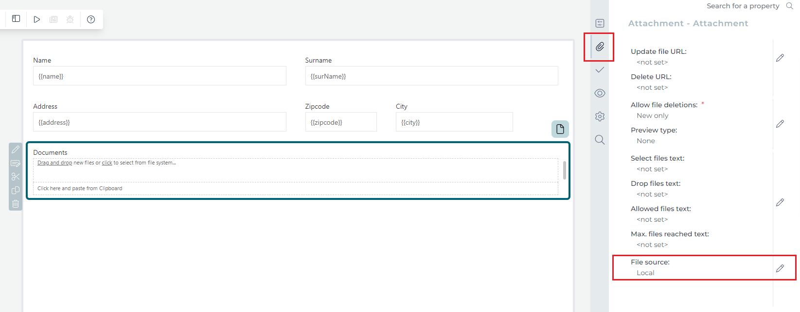
Open the dialog and select SharePoint in addition to local. You can also decide if you want to store copies of SharePoint files or the references.

Reference SharePoint files
The default configuration will always reference SharePoint files. That means the actual data is always stored in SharePoint and no physical copy is created. Read more about the handling of permissions.
Store copies of SharePoint files
Reasons for storing physical copies can be:
- Performance
- especially if with excessive read operations during your automation.
- Compliance and Auditing
- certain regulations might require physical copies of data for auditing and compliance purposes.
Usage in Flowable Work
In this example, we use the created form as the start form and work form of our case. The first thing you see is the small SharePoint button in the bottom left corner of the attachment field.
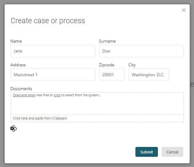
Click on it and will open the SharePoint dialog
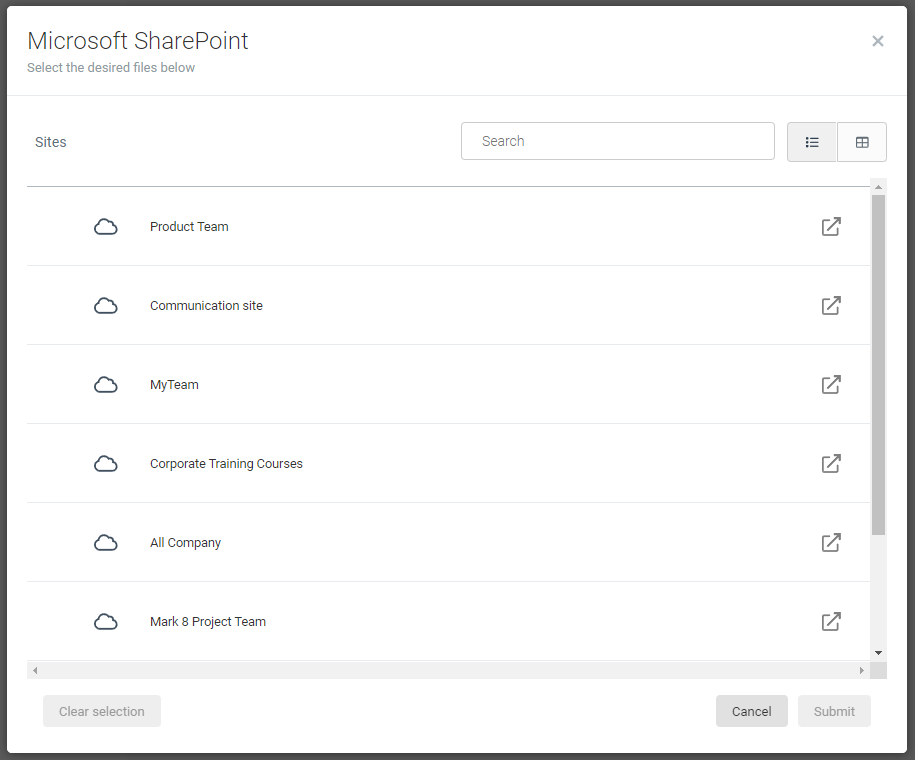
You will see a list of all the available Sites. Click the button on the right side to navigate directly to SharePoint.
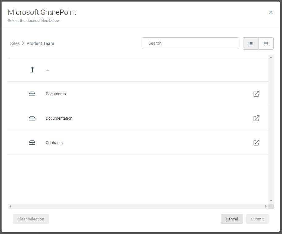
Click on the site to view all folders and documents.
Folders
Files
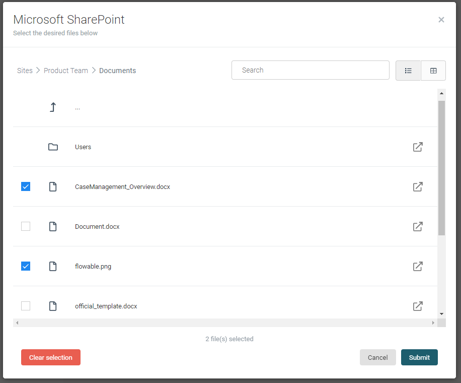
Select all the files you want and click on submit.
After creating the case, we can take a look at the content items within the work form
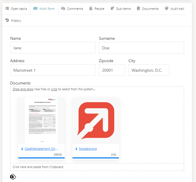
Similar to content items that were created from local files, the icon and thumbnail are not created for provisional items.
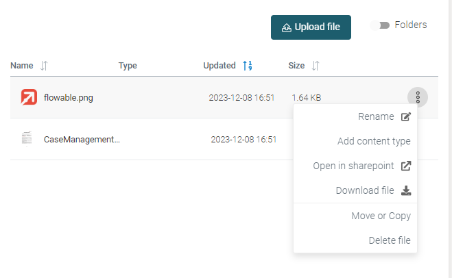
Let's have a look at content items from the Documents tab perspective. As you can see, the menu for each SharePoint content item changed.
Renamewill only rename the content-item within Flowable Work, but not the actual file in SharePoint.- You can
Open in SharePoint. A new window will open and the SharePoint item is displayed. Download filewill download the current file from SharePoint.Move or copywill only move the content-item within Flowable Work, but not the actual file in SharePoint.Delete filewill only delete the content-item in Flowable Work, but not the actual file in SharePoint.- You are no longer capable of creating a new version. That is 100% in SharePoint business.
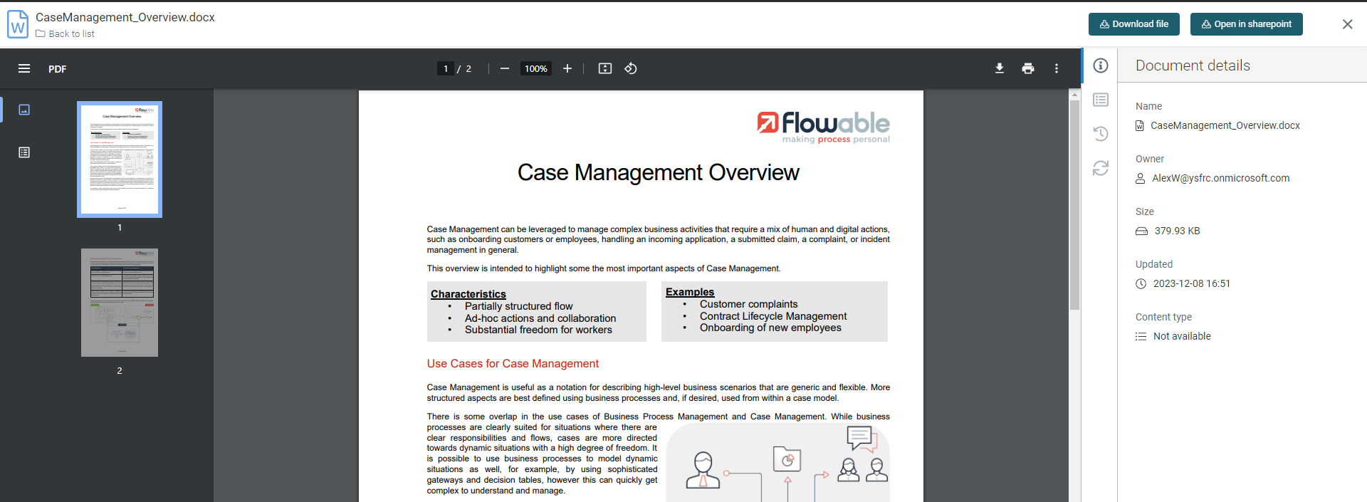
File opened in SharePoint
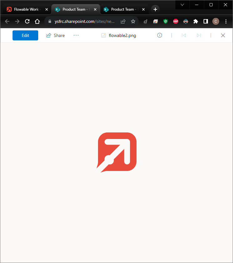
opening office files will open them in the corresponding Office 365 suite.
Permissions
If you decide to store SharePoint files as references, the permissions within Flowable Work only apply to the content-item. The actual file data permissions are managed by SharePoint.
That can create a scenario, where a user is granted read access to the content item in Flowable, but has access to the file in SharePoint.
Downloading the file will result in an error with status code 404. However, using the Open in SharePoint will open a new tab with the SharePoint website to request access.
