Dashboards
In the Dashboards sections, various dashboards are displayed that give insight into the system resource usage of each member of the current cluster, throughput metrics and instance overview data.
If the Dashboards section isn't available or no data is displayed in the charts, it could be that
the system hasn't been set up properly. See the Administrator Guide for more details.
Dashboard Header
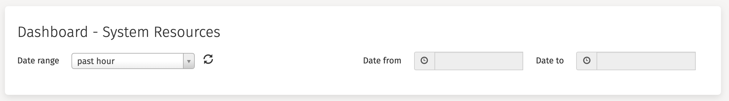
Every dashboard has a header at the top of the screen that looks as follows:
- The
Date rangedropdown allows the display the data for time period: pasthour|day|week|month|yearorcustom. - Next to the
Date rangedropdown is a refresh button. This will refresh all data currently displayed on the screen with the latest values. - The
Date fromandDate tofields become active when selectingcustomin theData rangedropdown and can be used to visualize a custom date range.
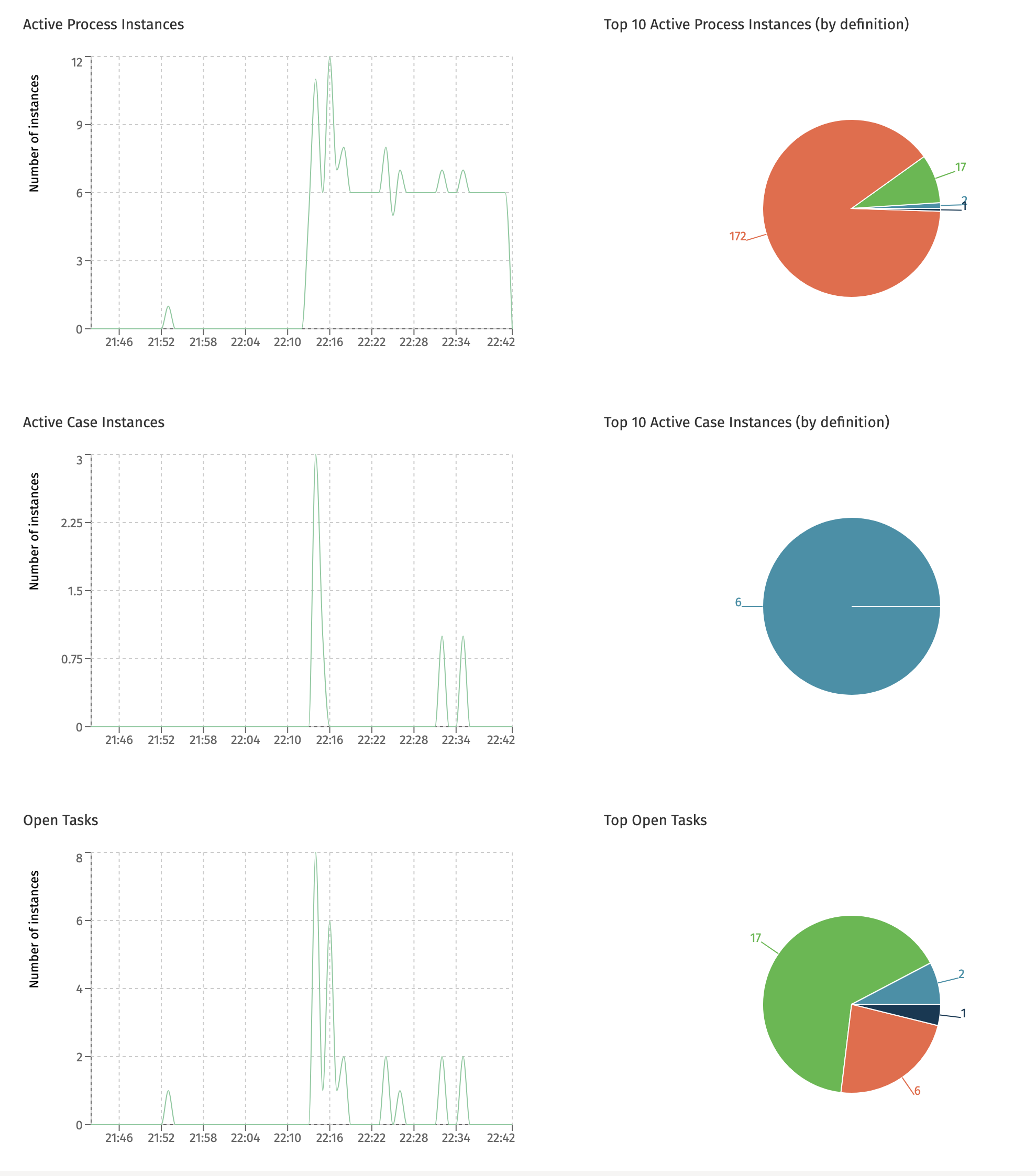
Running Instances
This dashboard is only available when the currently selected cluster configuration points to a Flowable Work or Engage cluster.
The Running Instances dashboard shows the number of started process instances, case instances and tasks created in the selected time period. The pie charts on the right-hand side show the top ten of most started definitions in that same period.
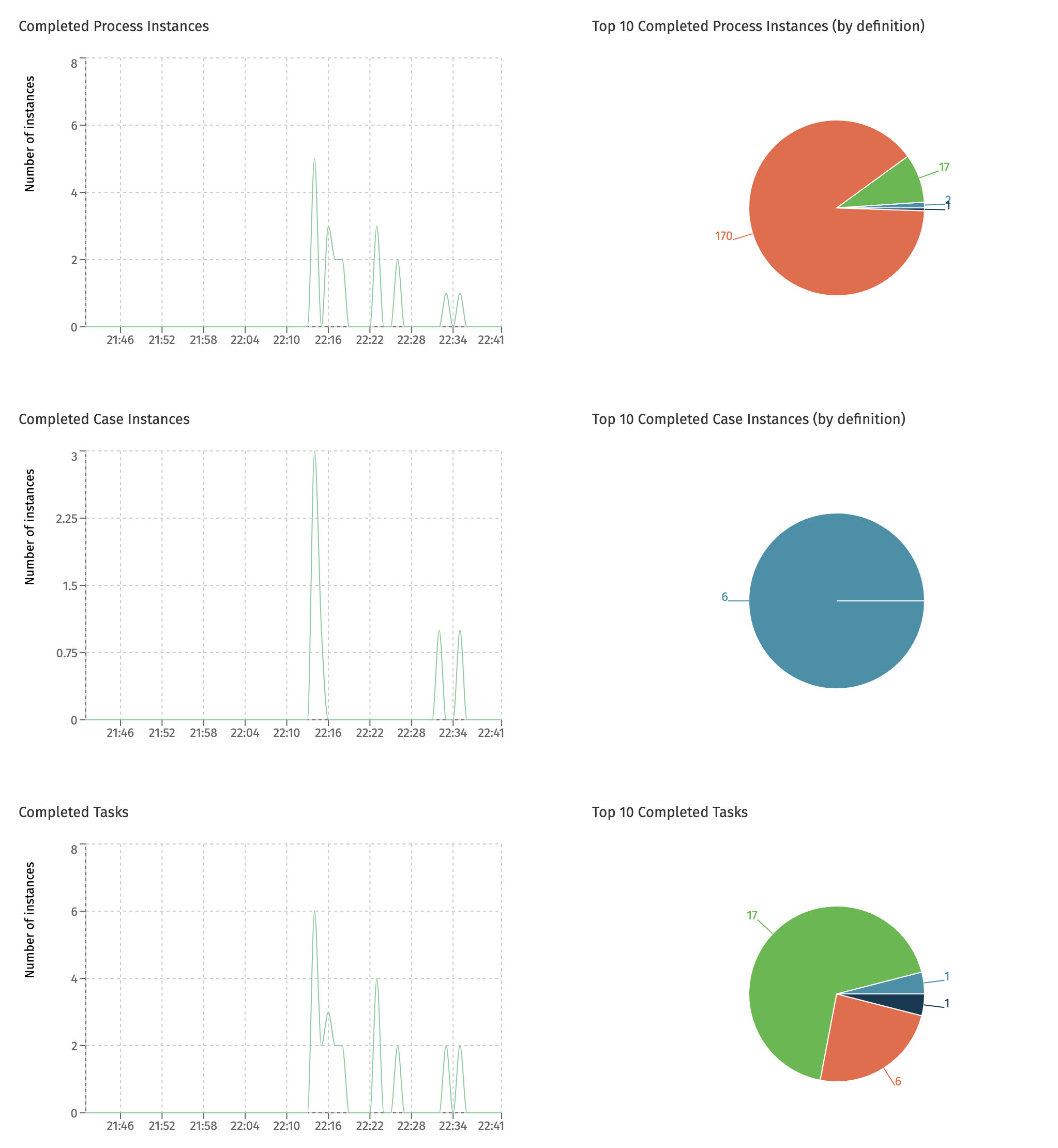
Completed Instances
This dashboard is only available when the currently selected cluster configuration points to a Flowable Work or Engage cluster.
The Completed Instances dashboard shows the number of process instances, case instances and tasks that were completed in the given time period. The pie charts on the right-hand side show the top ten of most completed definitions in that same period.
Multi-Node Charts
A Flowable cluster setup typically consists of multiple instances or nodes. The dashboards that benefit from getting insight into how the different nodes compare to each other include this information: when hovering a datapoint in the chart, the node name is displayed.
All charts in the next sections are multi-node charts.
System Resources
This dashboard displays system resource usage for each node of the currently selected cluster.
The Average CPU Usage chart displays what percentage of the CPU was used by each Flowable instance:
The Average Memory Usage chart shows the memory (in megabytes) used by each Flowable instance:
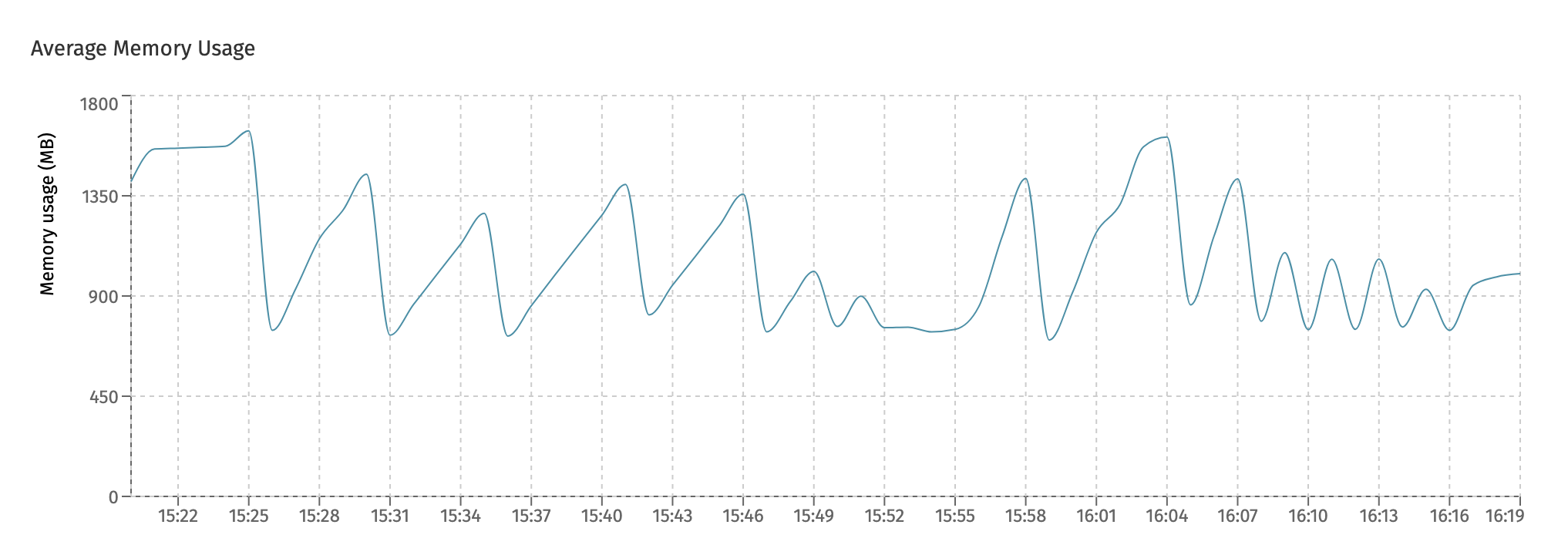
The number shown on this chart is the JDK heap and non-heap memory combined.
The Max Active Database Connections chart shows how many database connections were active in the given time frame.
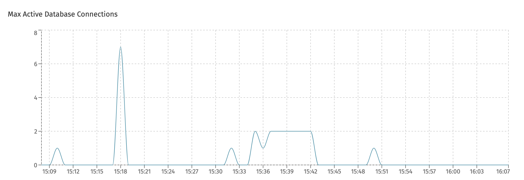
Note that an 'active' connection is one that was actively used for the time period, not how many connections are pooled by the internal connection pools. As such, a system doing nothing will show zero 'max active connections', even when connections are pooled by the connection pool. This number thus can differ from what can be seen on the database monitoring side.
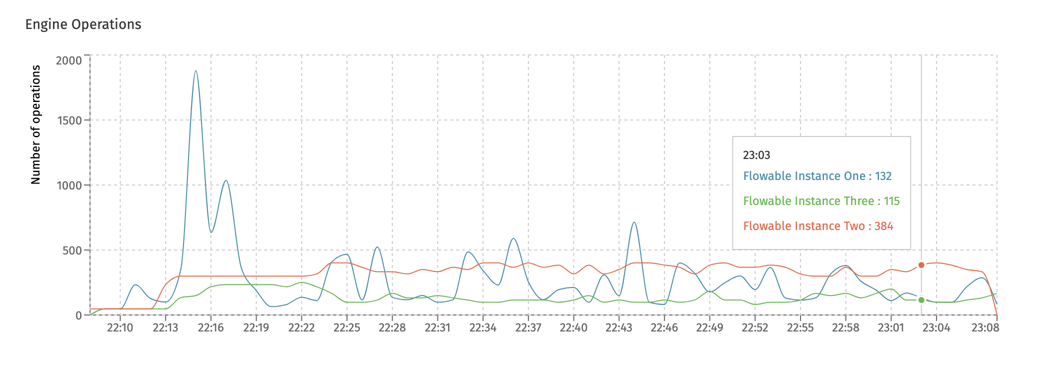
Engine Operations
This dashboard displays high-level throughput numbers for each Flowable instance in the cluster.
The Engine Operations chart give an insight at how many low-level engine operations were executed:
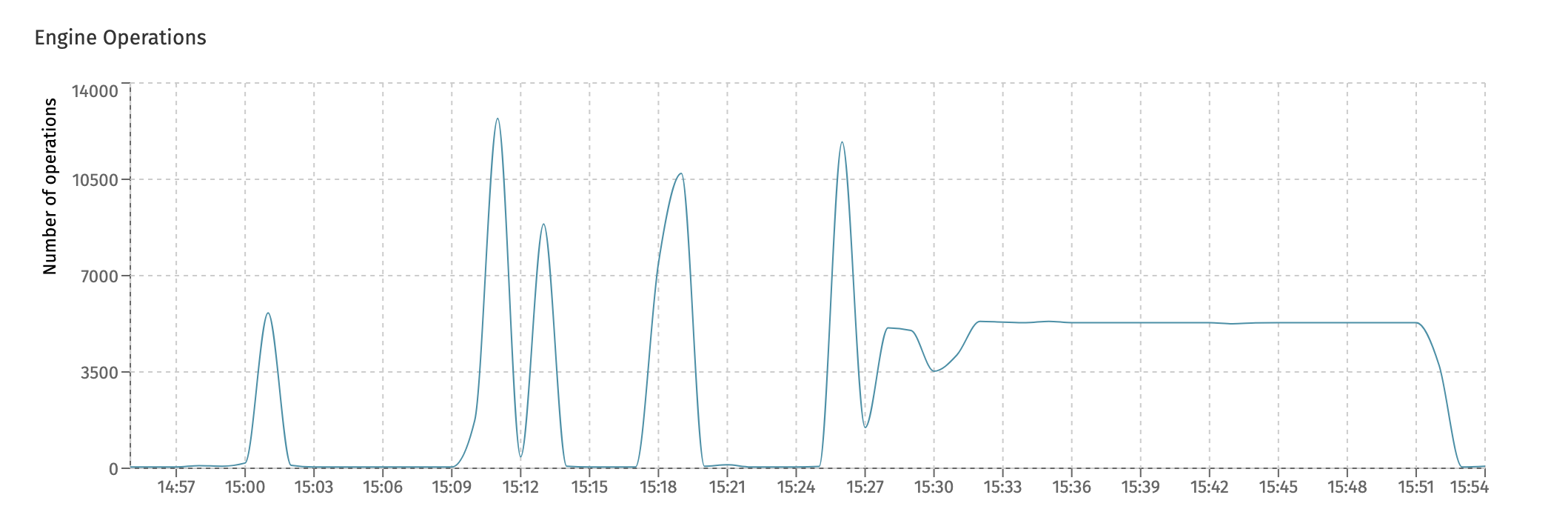
Technically, the 'operation' measured here is the amount of Flowable commands being executed. Each Flowable API usage corresponds with a number of low-level commands that are the building blocks of every Flowable engine.
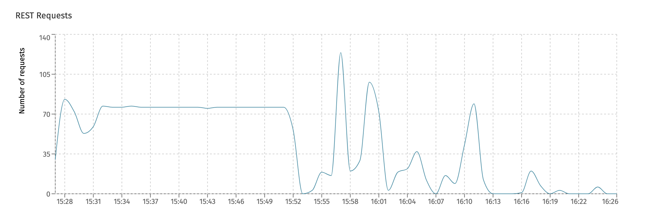
The REST Requests chart displays the overall count of REST calls executed against each individual instance:
Async Executors
This dashboard gives insight into the internal working of the Flowable async executor. This component is responsible for executing asynchronous task (e.g. service tasks, scripts, etc.), timers and history jobs (jobs that are used to process historical data and/or to publish the data to Elasticsearch).
This is an important dashboard to keep an eye on if you're using lots of asynchronous steps in processes and/or cases.
The first chart, Async Executor Threadpool shows the internal threadpool size. The async executor uses various threadpools to execute the asynchronous work. Each node has various threadpools. In the following screenshot, the three different colored lines indicate the fluctuating size of three different threadpools. Hovering the datapoints will show the actual threadpool.
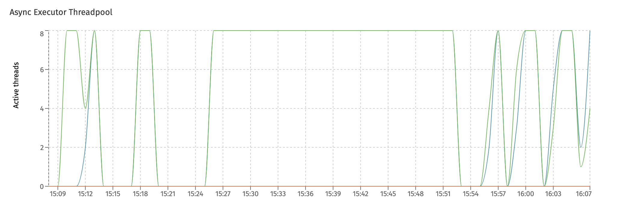
In this particular screenshot, two threadpools are maxed out to 8 for multiple minutes after each other. This typically indicates that the system is under load and the threadpool configuration could be tweaked to be larger in size (also potentially making the connection pool max size higher) to cope with the higher load.
The Jobs executed by Async Executors shows the overall number of jobs executed in the system, regardless of the type of job (async, timer, history, etc.):
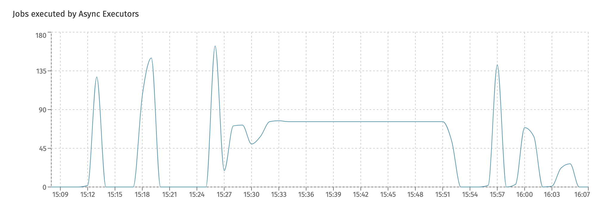
Charts for each individual type of job can be found in the
Job Executiondashboard.
The Async Executor Average Execution Time displays the average execution time for jobs:
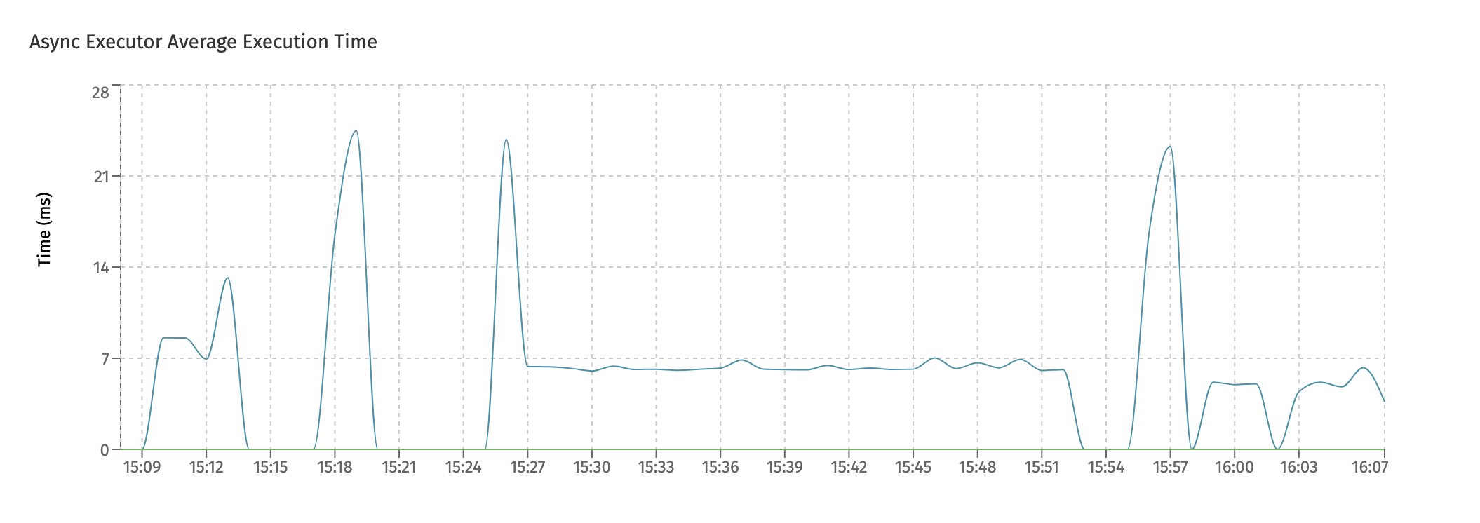
Long running jobs will keep a threadpool blocked while executing. If this chart shows high average times and the amount of threads in the threadpool is small (monitored by the first chart), this could lead to bad performing systems.
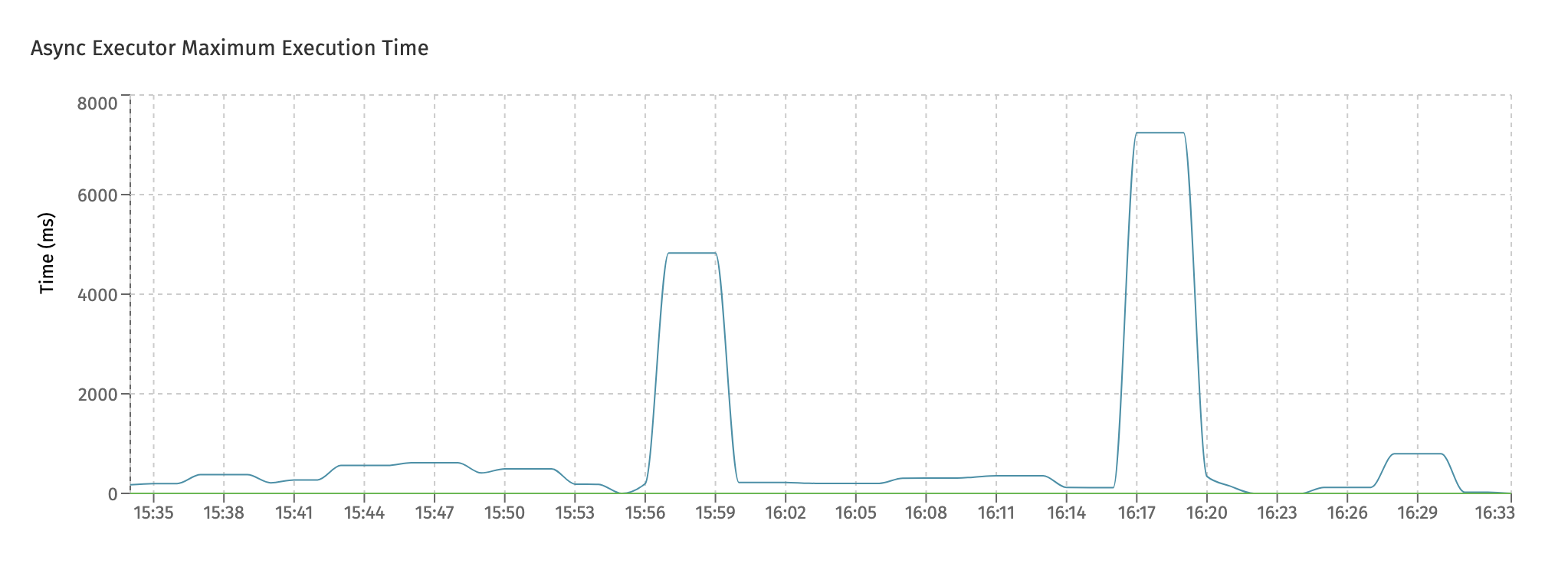
The Async Executor Maximum Execution Time similarly displays the maximum job execution time for the given time period shown:
The Async Executor Queued Number of Jobs chart shows the jobs that are being queued internally. The async executor uses an internal queue to store jobs temporarily when threads are busy.
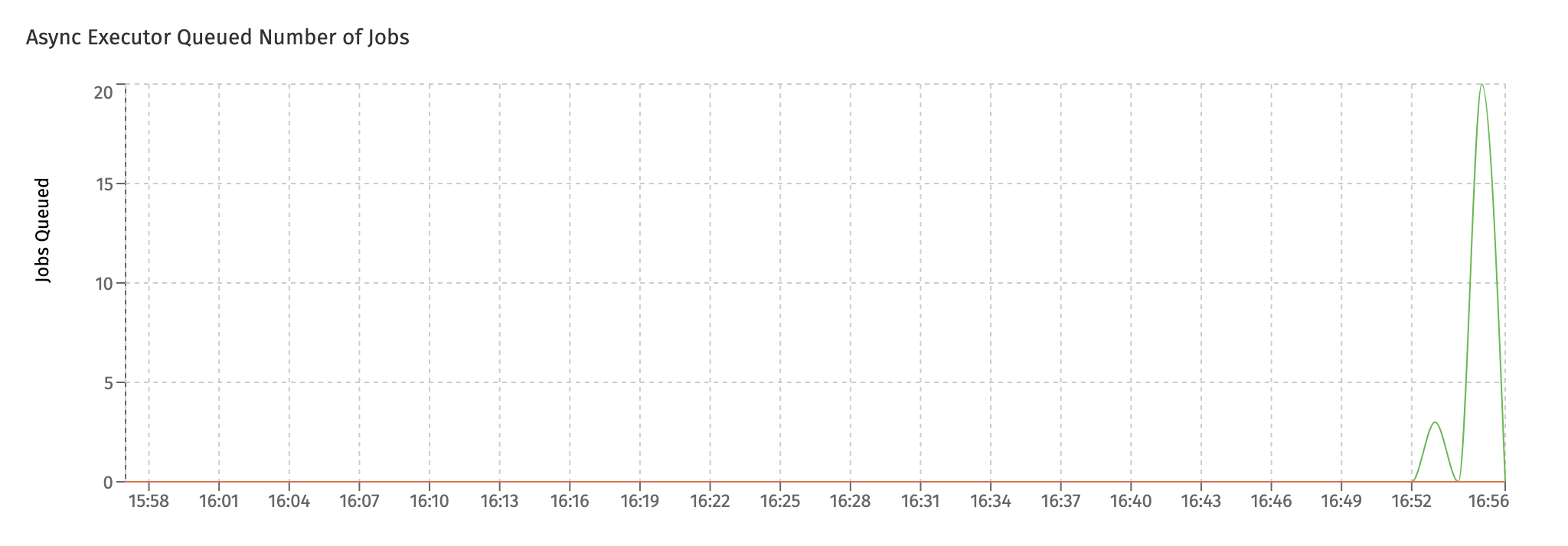
In an ideal setup, the queued number should be zero or close to zero. As shown in the screenshot, when suddenly load increases on a system there can be a sudden spike on queued jobs. That's okay, if it's a spike that goes away over time. However, if this persists, it typically indicates that not enough threads are available for handling the load.
Job Execution
In this dashboard, the focus is on the successful execution of the different job types.
Together with the Async Executors dashboard, it gives a good insight in how the async executor component is handling all jobs in the system.
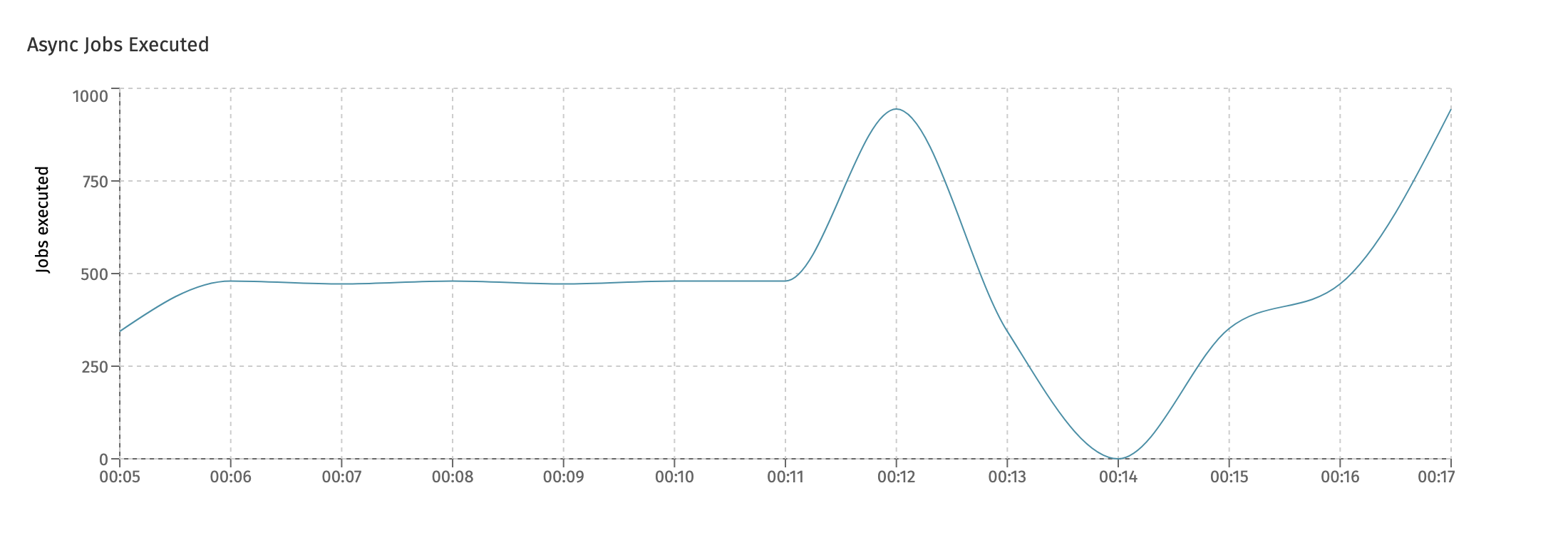
There is a chart for each main type of job. The first one is the Async Jobs Executed chart, which shows how many asynchronous jobs (like asynchronous service tasks or other task types) have been successfully executed:
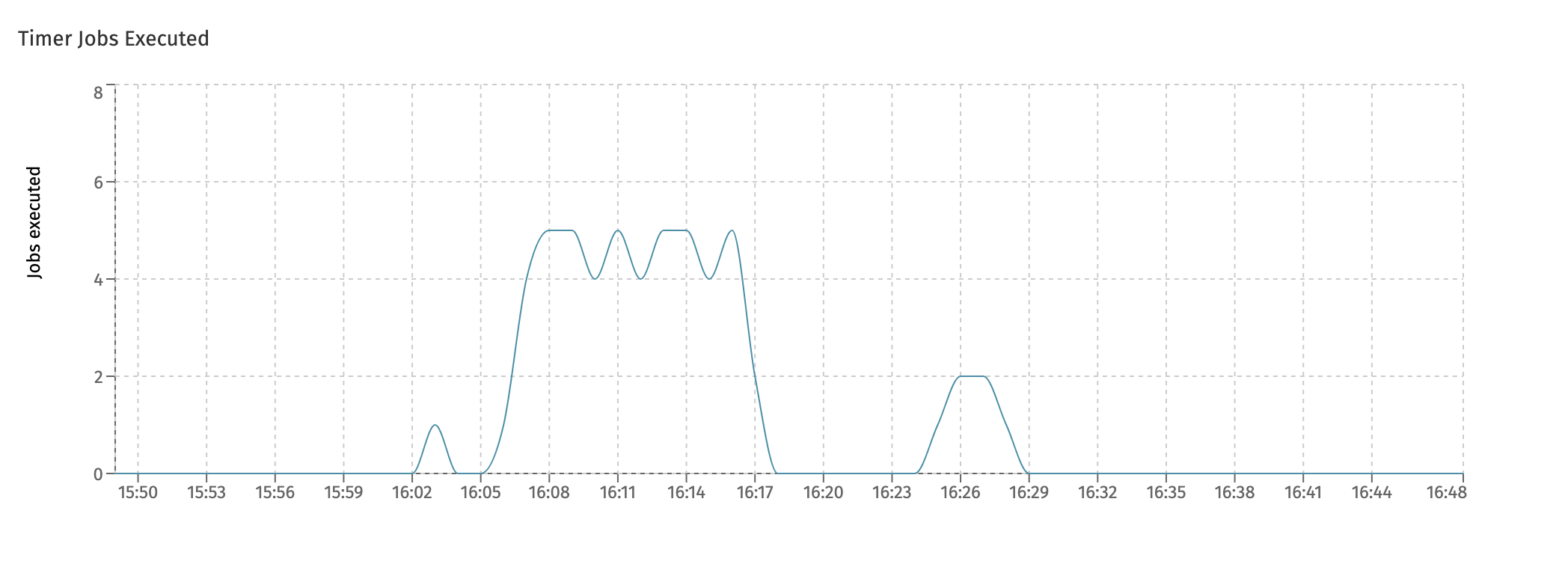
The next chart is the Timer Jobs Executed and similarly shows the timer jobs which were executed:
This is related to - but not the same - as the following chart, which is the Timer Jobs Scheduled chart:
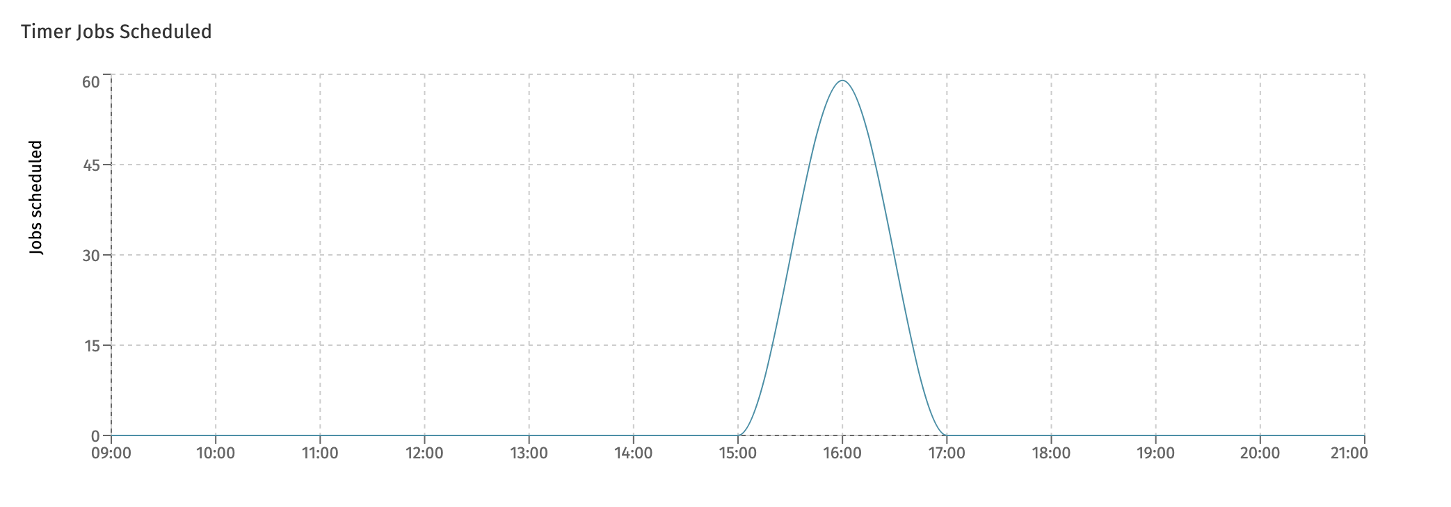
The difference between the two charts is that timers can be scheduled a long time before they are actually executed.
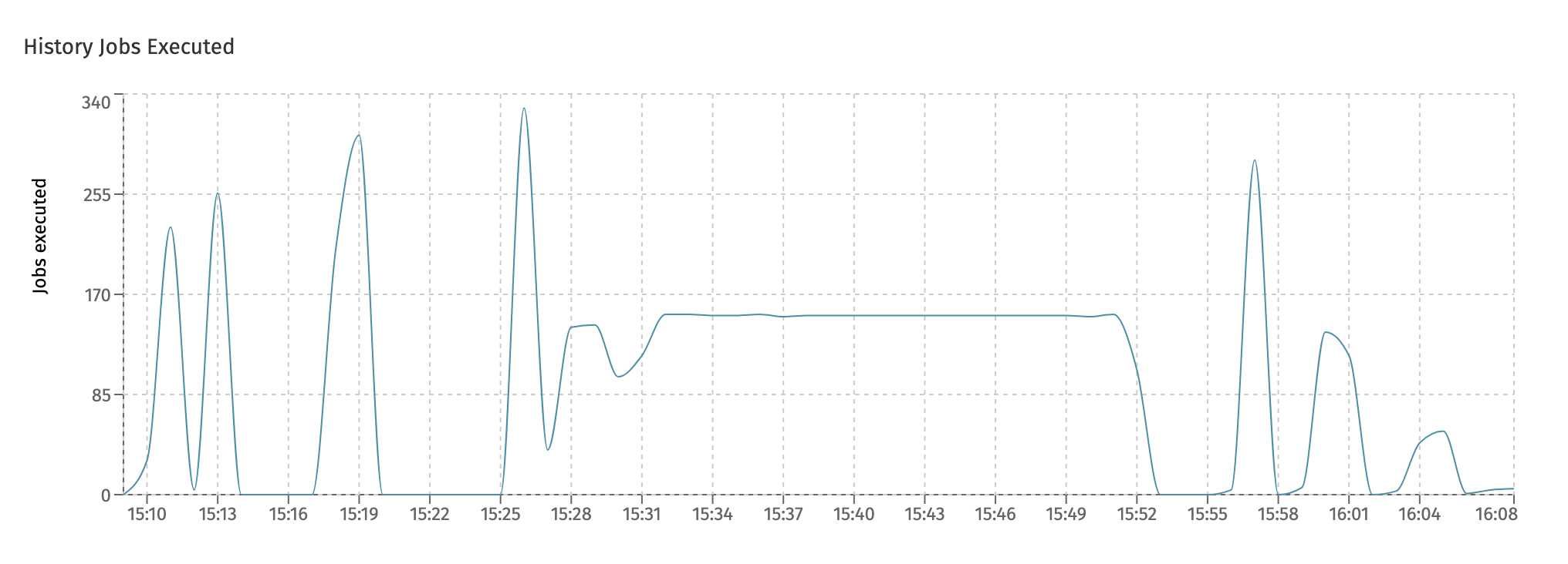
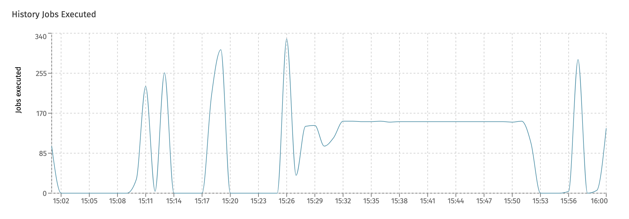
In the last chart, History Jobs Executed, the amount of history jobs are displayed. These kinds of job are used a lot in Flowable Work, for example for asynchronous history and to send indexed data in bulk to Elasticsearch for querying and user dashboards.
Job Failure
While the Job Execution dashboard tells us everything about the throughput of job executions in the system that were successful, this dashboard zooms in on failing jobs.
The charts shown here are similar to the ones in the Job Execution dashboard: one for each type (async, timer and history) and two new charts:
- The Rejected Jobs chart shows the amount of jobs that were rejected. This is not the same as a job that for example failed due to an exception that happened.
Job rejection happens when the job queue (which is monitored in the
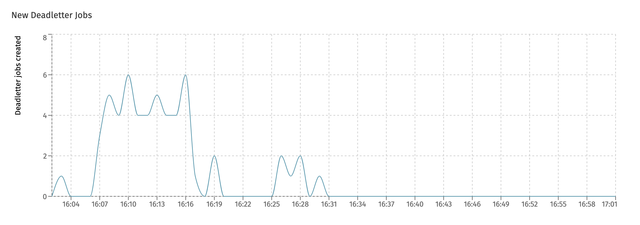
Async Executorsdashboard) is full. At that point, all threads of the async executor threadpool are busy and the queue for temporary holding the jobs before execution is also full. To avoid overloading the instance, new jobs are rejected such that other instances can attempt to pick them up and execute them. - When a job fails (due to an exception), the job is retried three times with a wait period in between retries. Both the number of retries and the wait time is configurable. The New Deadletter Jobs chart shows the jobs that kept failing and have become a 'deadletter job'. An administrator can manually move the job back to become executable (e.g. because a 3rd-party system that was down before, and led to job failure, is now up and running again).
Keeping an eye on the
Rejected Jobschart is a good idea. It's not a good sign when jobs are rejected and definitely not if repeated patterns of rejection start to show.
Eventregistry
This dashboard shows metrics around the Flowable event registry. Currently, it displays the events received in the system:
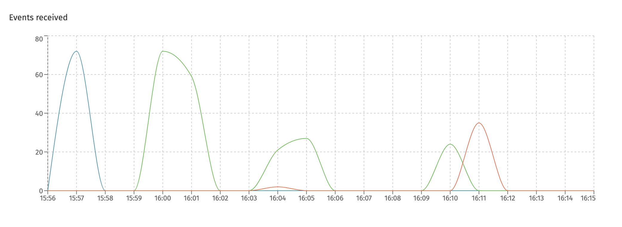
Each differently colored line here represents a different type of event that is handled. The event type is shown when hovering over a datapoint.
Active Users
This dashboard is only available when the currently selected cluster configuration points to a Flowable Work or Flowable Engage cluster.
This dashboard displays the unique users using the system. It shows the overall number of users across all instances or per instance.
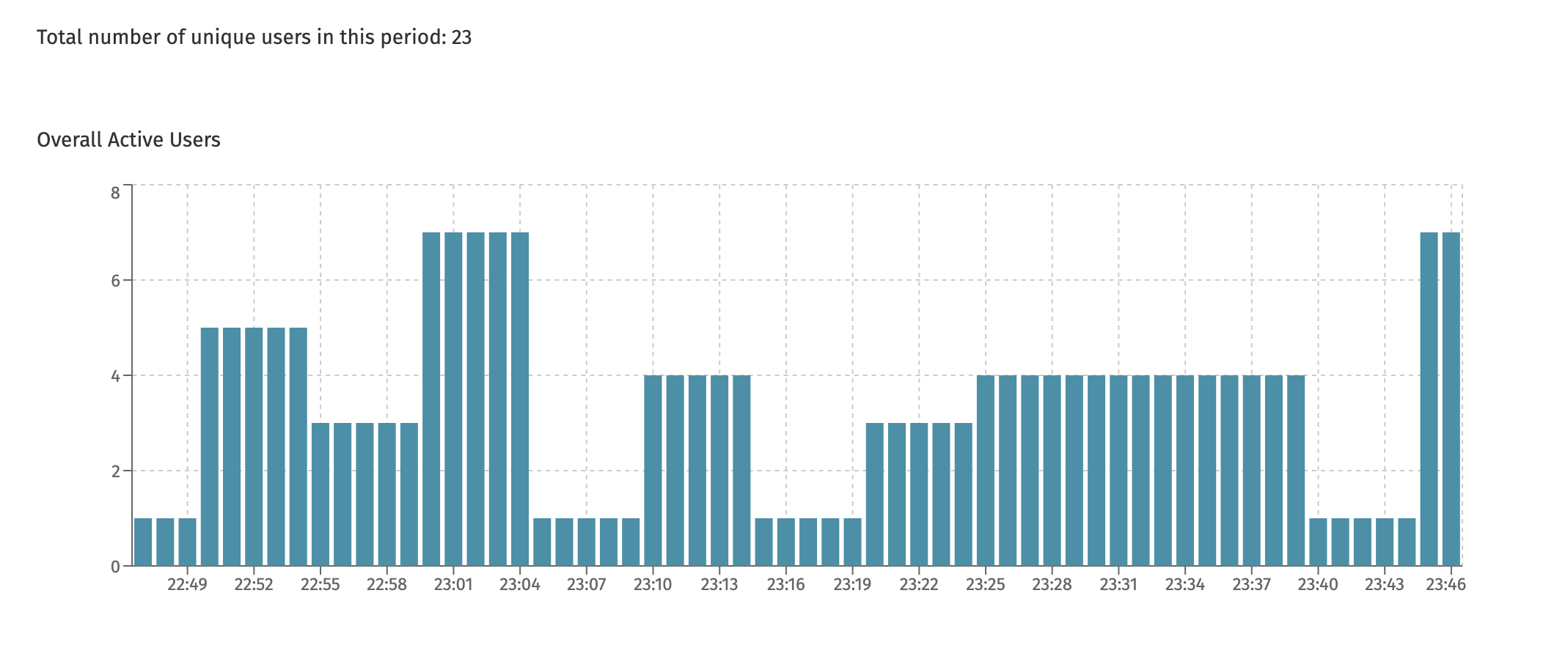
At the top of the page, the total number is shown. This is useful, as in the screenshot example above, the chart never shows more than 8 unique users at any point in time. However, seen over the time period, 23 different unique users have used the system (but never more than 8 different users at the same time).