Customizing the user interface
Custom case views and custom React components
There are many ways in which Flowable can be customized. In this tutorial, we're going to look at a couple of ways the user interface can be extended. One requires no programming at all, just using models defined in Flowable Design. The other shows how a custom Javascript component can be used to configure deeper changes in the Flowable UI. The scenario we're looking at is where we'd like to have a specific case-focused view rather than the default Flowable Work case view, and also that we can show video content from a task form.
Import the custom task UI app
In Flowable Design, import the custom UI demo app, CustomUIApp.zip, which can be downloaded from here.
Once imported, you'll see a number of different models. There's a case model, a process model and some forms.
Case Views
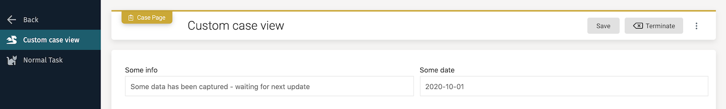
Open the case model Custom UI case and you'll see a trivial case with only 2 elements: a process that runs immediately and a Case page.
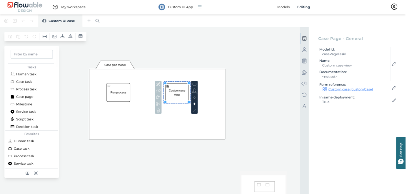
A Case page can behave like other CMMN elements, so you can have full control over when is it available or not by using entry sentries. There can be as many Case pages as you want, but also a Case page can contain multiple views. With this example, if you look at its attributes, you can see some of the options for what may be configured. First, a view created using a form. In this one, we have the custom view link to the same form as the start form, Custom case, but more usually you would define a much more specific and sophisticated form, like an overall case dashboard. You can also define an icon and display order for the Case page - set the Icon to what you like and the Index to 1.
There are also attributes that define what to do as the case changes state, so the case view could be editable while the case is active, but hidden when it becomes complete.
To define some additional elements to the custom view, click on the Case page's Page elements attribute, which pops up a dialog that allows additional elements to be included in the case page.
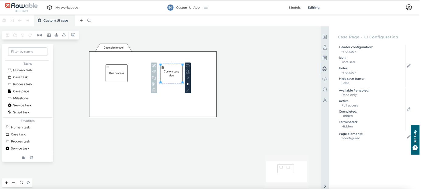
We have only defined one extra element, which is a custom link that allows us to define where to jump to if the user wants to navigate out of the case. There's a set of predefined types of element. We've selected an Internal link element and defined the navigation to go to /tasks/mine. The index defines the element's display order. We've set this to 0, which means it'll be at the top (the same approach as the index used in FlowApp dashboard pages).
The next thing we need to look at is in the process model. Click on the Process Task (Run process) and open the Simple process that contains two-steps. Then click on the first task to see its attributes.
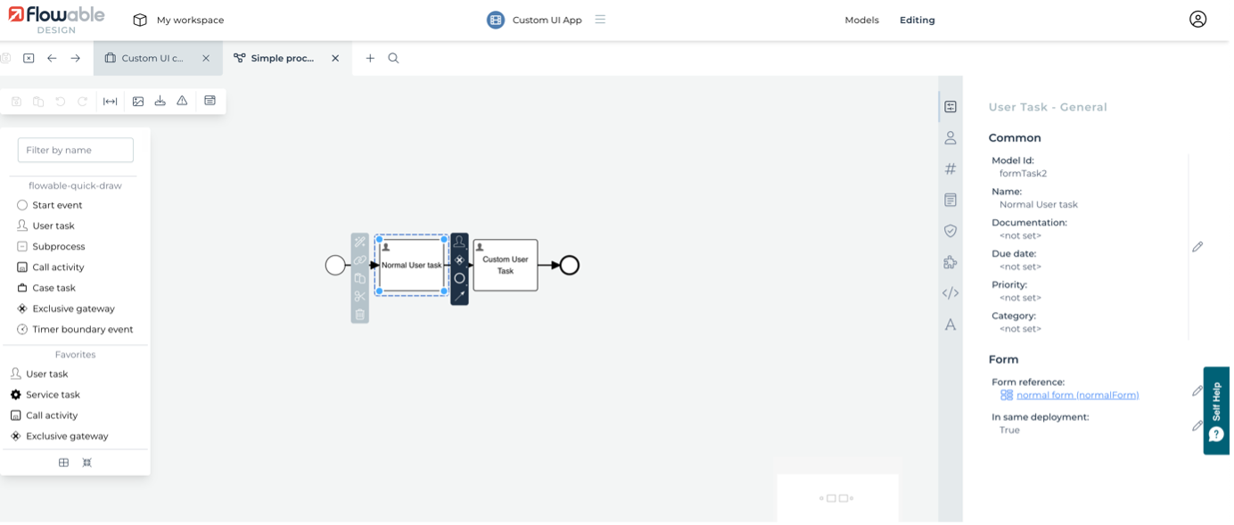
For this task to show in the case view, the Expose to custom case view attribute has been enabled and so exposes some more attributes. Choose a label and icon, then set the index (all elements in the case menu will be ordered by their index value).
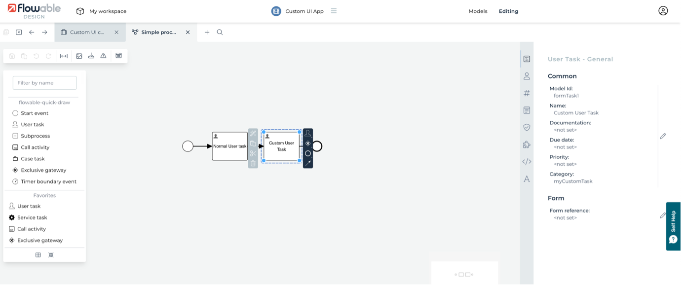
While we're here, click on the second task, Custom User Task, and notice that it's been given a category value of myCustomTask - we'll come back to that later on.
Publish and deploy the app, then switch to the Flowable Work application to see it in action. Create a new instance of the Custom UI case, giving any details requested in the start form. A new case will be displayed, but you should now see a new link in the case's header area: Navigate to case view.
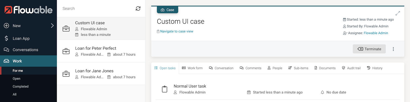
Click on this link and you will navigate to the case page we defined. You can navigate directly to a case view using the URL pattern #/case-view/case/{{caseID}}, for example from a datatable list of cases in a dashboard. You should now see the case view with the menu labels and icons we defined.
Because we marked the first task in the process to show in the case view, and a process instance was automatically started as part of this case instance, the task is there in the navigation menu. Click on it to show the task details, including the form with the dynamic display of a script button.
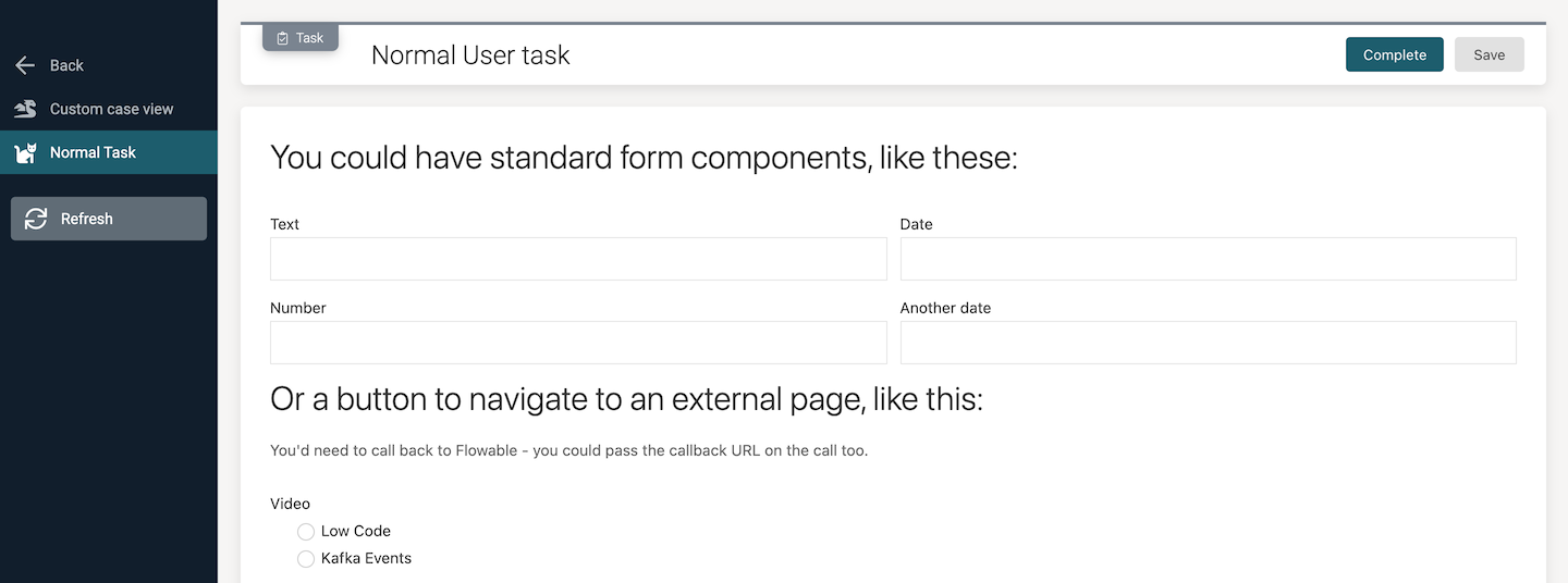
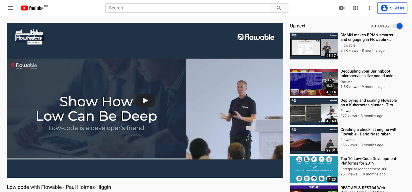
Select one of the video radio buttons and a new button becomes visible. This shows how you can launch an external application or web component in a separate browser tab or window based on data collected.
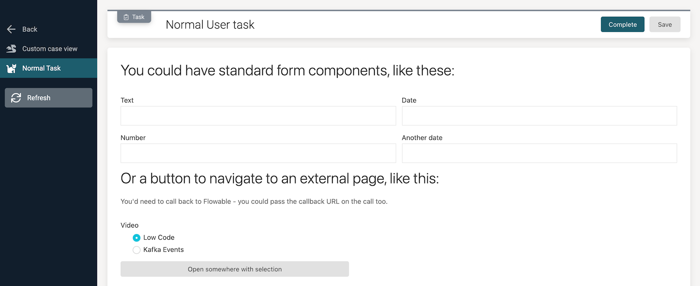
Click the button and the selected Youtube video is launched.
Custom React components
Sometimes, it's not that you want to change the whole Flowable Work experience with case views, but tweak or extend the existing UI. This might be by removing some of the tabs in certain situations, or adding new custom tabs. In the example below, we're going to remove some tabs and add another that has the Youtube video embedded inside it.
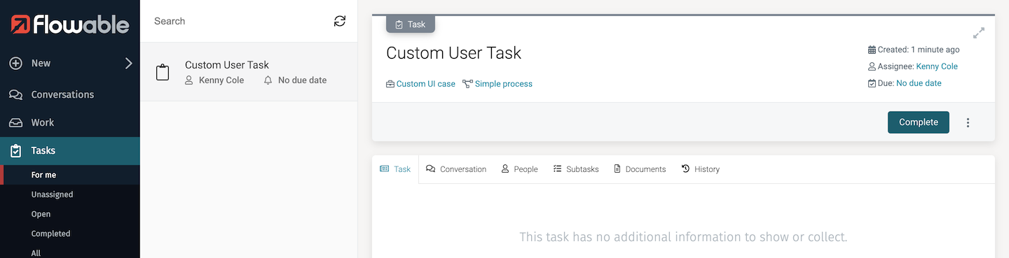
With the case instance you started above, complete the first task and it will then create an instance of the second task. Go to the Flowable Work view for Tasks, find and select the task. You'll see the standard set of tabs and no form content (well, we didn't define a form for it, so no surprise).
Copy the custom React code into place
You wouldn't do things this way in production, but for this tutorial it's a quick and easy way to experiment with things. The configuration of Tomcat in the Trial download has been set to look in the custom folder in the Flowable installation for any custom Javascript extensions. A folder containing an example component, CustomTaskBuilt can be downloaded from here. Copy the two files in the unzipped CustomTaskBuilt folder into the custom folder in the Flowable installation.
Now go back to the task you just looked at above and refresh the browser page. This time it should look a bit different!
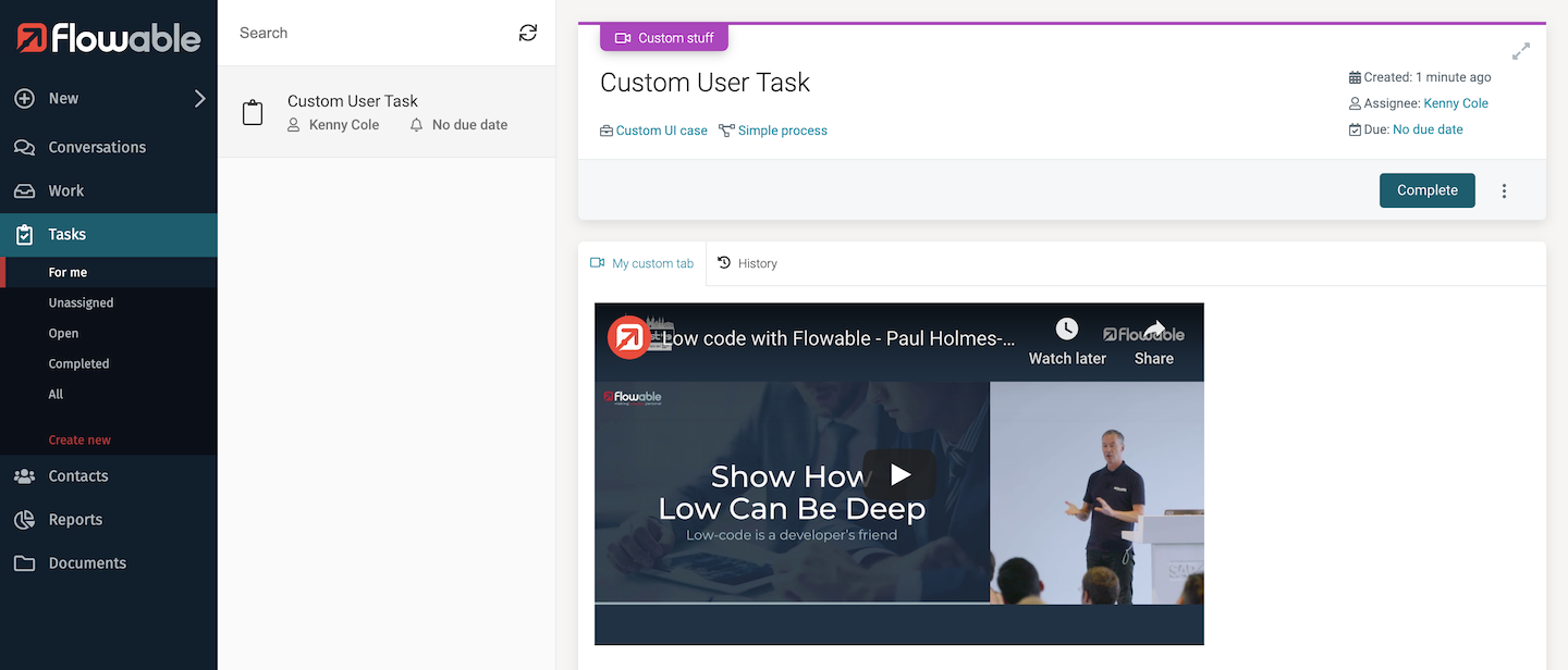
However, if you go and look at any other task, there's no video or tab changes. This is because the customization we added was triggered by the task category. The React component is only activated when the task category is set to myCustomTask. Any task created with this category will have this customization applied. Of course, there's plenty of other options you could use to determine when a customization should apply.
The source for the React component can be downloaded from here. This needs to be built before any changes can be deployed. There's a whole section in the Developer documentation on how to do this and many other customizations
Summary
We have seen how easy it is to create custom views without writing a line of code, and these capabilities will only increase with each release of Flowable. We've also seen a hint of how completely custom UI components written in React can be plugged into the existing Flowable user interface. There's many places where that kind of extensibility is possible.