Form Editor
The Form Editor is the primary means to construct a form using simple drag-and-drop commands. The form is used by other elements such as cases and tasks to interact with the user.
User Interface
The Form Editor interface is roughly divided into four areas:
-
The menu bar on top, just below the navigation bar
-
The palette on the left side
-
The canvas in the middle
-
The attribute bar on the right side
The following sections describe each area in detail.
Menu Bar
The menu bar offers a number of actions, some of them only affecting the currently opened model while others have a more global impact.

| Group | Icon | Description |
|---|---|---|
| Save | Saves the currently opened model. | |
| Saves all opened models. | ||
| Validate | Validates the currently opened model. | |
| Protocol | Undoes the previous action. | |
| Redoes the most current action. | ||
| Export | Exports the currently opened model, only possible if the model was saved. | |
| View | View runtime preview. | |
| Back to edit mode (in runtime preview) | ||
| Enable debug console (see dev tools). | ||
| Enable form component development. | ||
| Show or hide gridlines. | ||
| Locking | Locks the current model, see model locking | |
| Unlocks the current model to allow all user to get the lock. | ||
| Model | Opens the Data Model Viewer. | |
| Opens the variable view showing the parent and root variables available to the model. | ||
| Opens the Revision Editor, see model versioning. | ||
| Publish | Publish an app, see publishing apps. |
Drawing Area
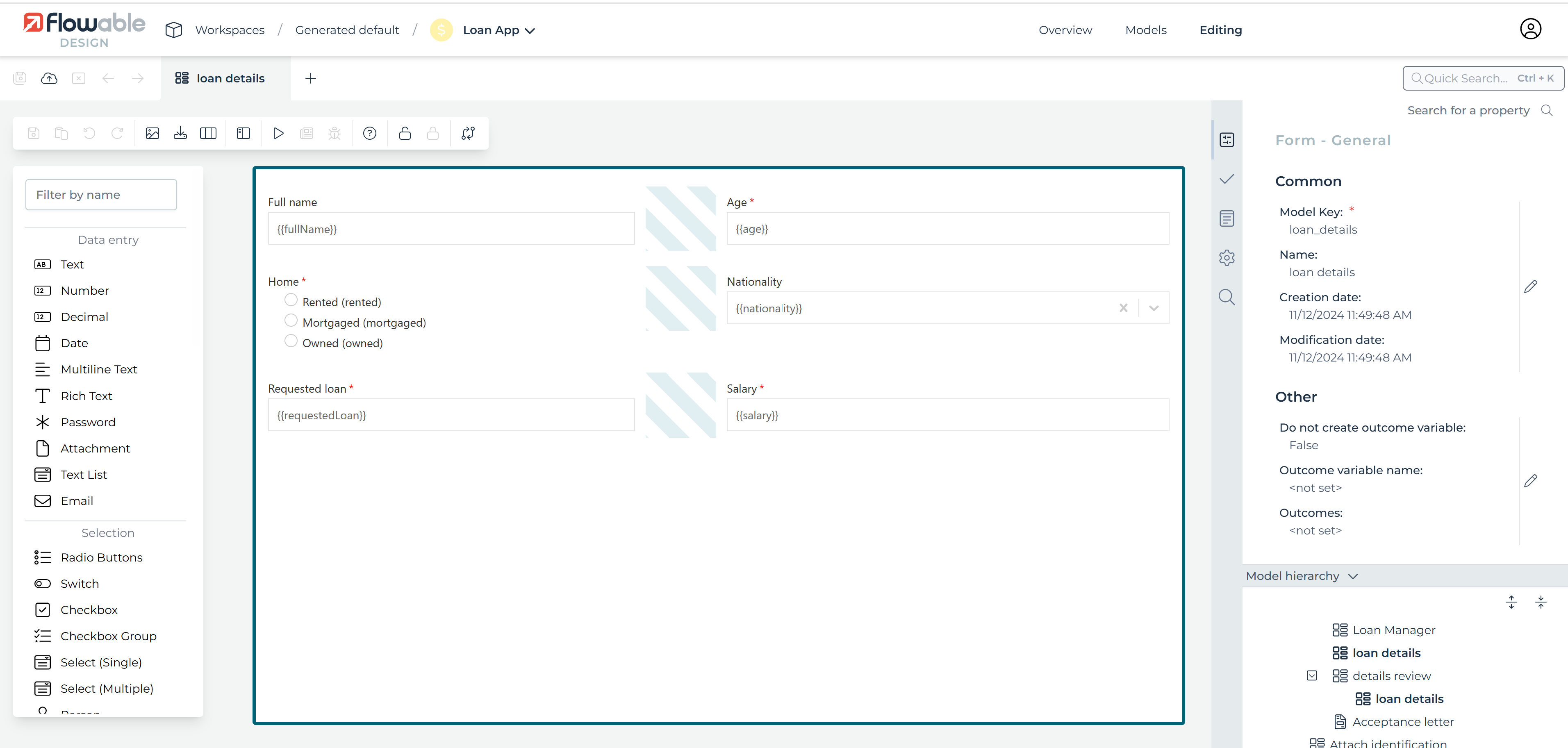
A form is a graphical layout of fields that are bound to a data model to allow the data model to be displayed to the user. The fields are arranged in rows on the canvas.
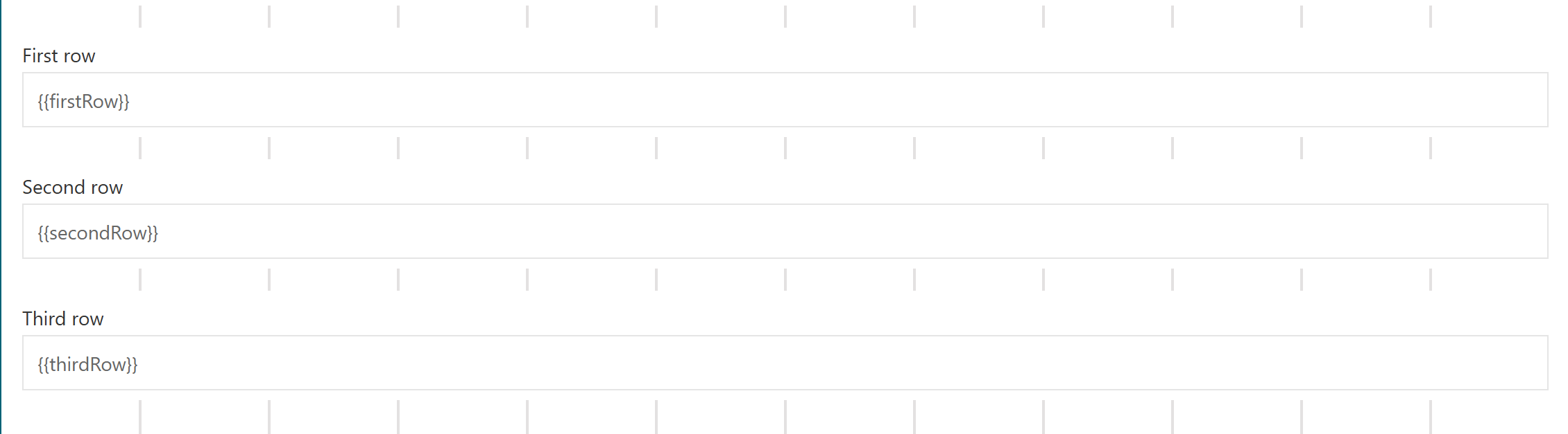
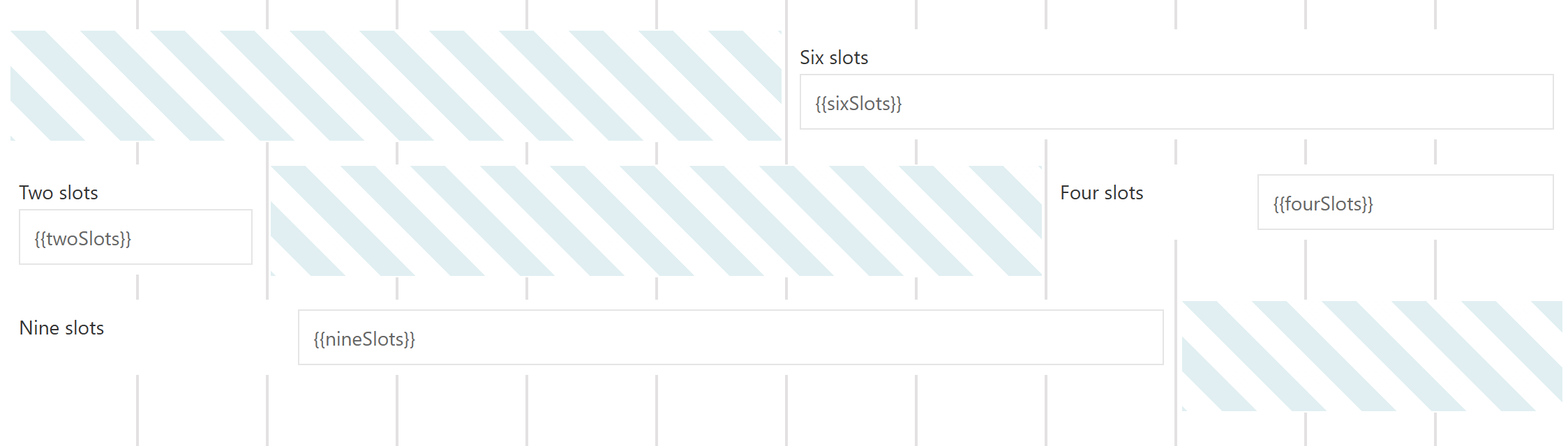
Each row is made up of exactly twelve slots. All slots are equal in size, so the width of a slot is one-twelfth the width of the whole form. A field can occupy exactly all slots, or it can occupy only a part of the slots. It is possible to place more than one field in a row.
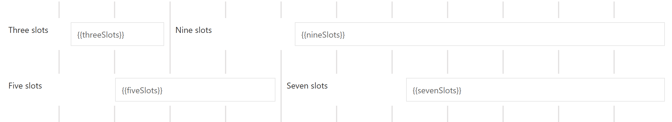
Not every slot needs to be occupied by a field. It is allowed that single slots of a row are empty. These empty slots can be at the beginning, in the middle, or at the end of a row.
To create your forms, you can use simple drag-and-drop commands. To do so, select an element in the palette on the left side and drag it to the drawing area. The element is then part of the form.
If you click anywhere in the canvas, you can change specific attributes in the attribute panel on the right side. If you click on an element, you can change its attributes. If you click outside of an element (in the "space between"), you can change the attributes of the form itself, for instance, the outcomes.
Key Concepts
Form Definition
For the BPMN engine, we adhere to the BPMN specification and for the DMN engine, we use the DMN specification. For start and task forms no Oasis specification exists. Therefore, we have defined a JSON-based form definition structure that we use as an output format for the Flowable Form Editor and is used to render start and task forms in the Flowable Task application.
Fields
Field Layout
A field is made up of several parts (all but the widget part are optional):
| Name | Description |
|---|---|
| Widget | The widget visualizes the data model. Most widgets are interactive and let the user change the data model; however some widgets are read-only. There are widgets to manipulate strings, numbers, dates, rich text, selections, and many others. The widget is located in the center of the field; all other parts are arranged around the widget. The field configuration defines the precise positioning of the field parts. |
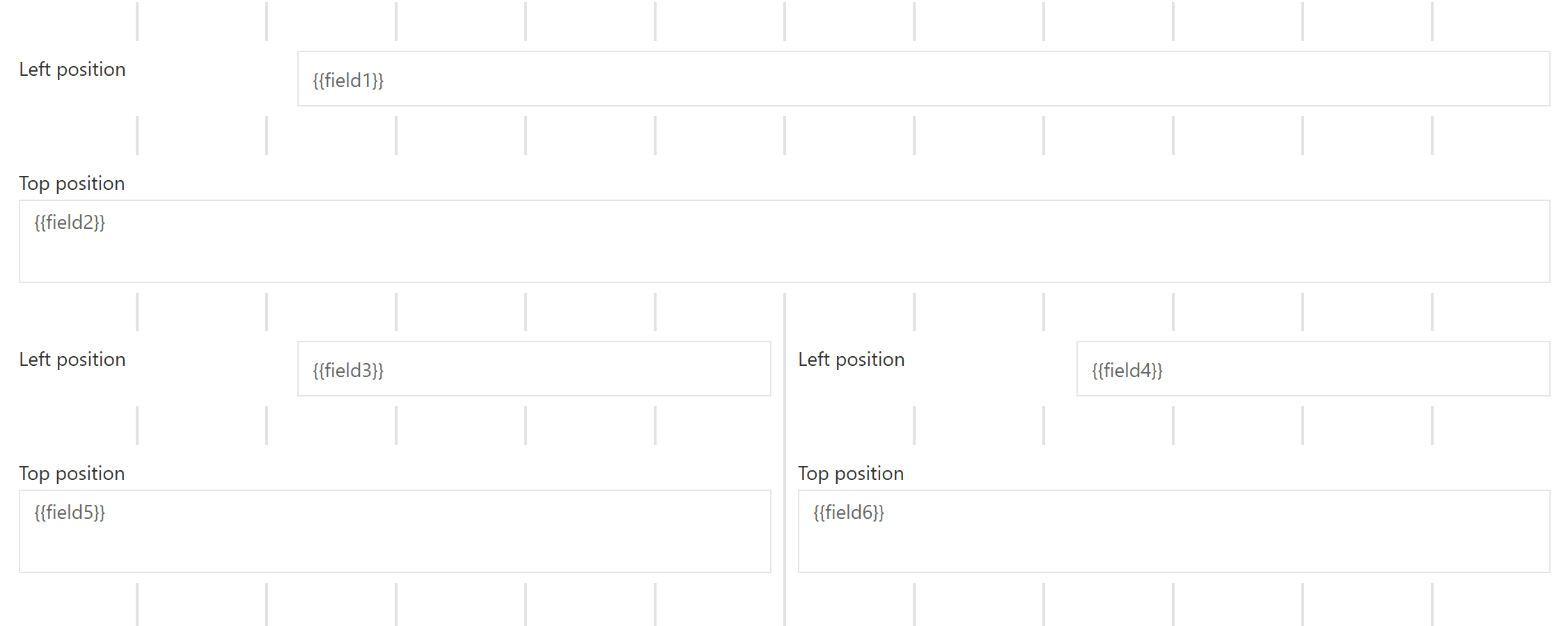
| Label | The label tells the user to which part of the data model the widget is bound. The label is located on the left side or top of the widget (depends on the field configuration). |
| Required indicator | The required indicator is displayed for required fields. Required means that the widget cannot be empty. The required indicator is located on the right side of the widget. |
| Description | The description gives additional information to the user. This can be formatting instructions or further description about of the App uses the entered value. The description is located on the bottom of the widget. |

Field Alignment
To enhance the readability of a form, the field parts of all fields are aligned among themselves: the labels are aligned, the widgets and descriptions are aligned, the required indicators are aligned.
The alignment is performed per slot. All fields that start in the same slot build a field group. Inside such a field group Flowable looks for the widest label which becomes the dominating label for that slot. All labels in the field group are then enlarged to the same width of the dominating label. This is done by adding space between the label and the widget. This ensures that all widgets and descriptions of a field group start in one line and all.
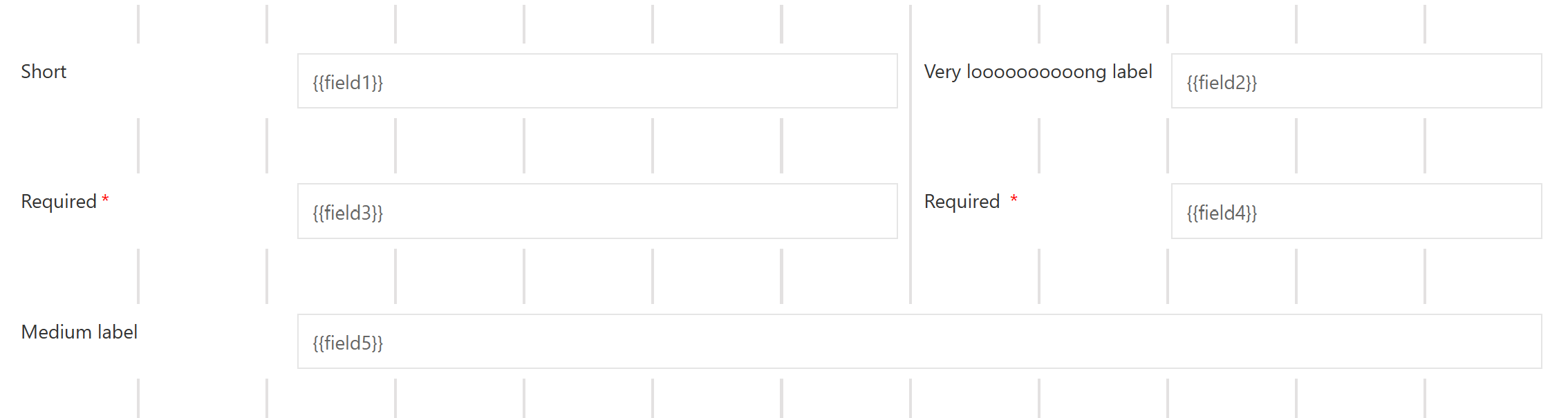
The only exception is with fields that have top label positions. For these fields, the label, the widget and the description all start at the beginning of the slot.
Binding
Binding is the process to connect the form fields to the data model. The binding in Flowable is always bi-directional. When the user changes the form fields, then those changes are immediately propagated to the data model. On the other side changes in the data model are immediately propagated back to the form fields.
A binding expression defines to which part of the data model the form field is
connected. The binding expression has to be a writable front end expression, e.g.,
{{foo}}, {{case.bar}}.
There are some reserved expressions that cannot be used as they are used internally to save some work item information. The reserved front end expressions are:
-
id
-
definitionId
-
definition
-
type
-
state
-
creationTime
-
updateTime
-
currentUser
Common Component Attributes
There are different available components in the Form Editor. The following attributes are attributes which are shared among all the components.
| Group | Name | Description |
|---|---|---|
| General | ID | This is a unique id for the component. |
| Label | The label attribute adds a label to the component, if not empty. | |
| Label position | The position of the label, you can choose between Left or Top. | |
| Label tooltip | When it is defined, a question mark icon appears in the component label. When the user hovers over it, it shows this text in a tooltip. | |
| Value | The binding for the component (if the component is a value component). Use an appropriate expression to bind the component to its value and thus specify where the value is saved read. For example, use {{myVariableName}} to store the value of the component in a variable named myVariableName. Use prefixes to define the scope of the value, e.g., root. for referencing the root case to store the value in or parent. to store the value in the parent work item of the current one. For instance {{root.foo}} stores the value in the root case using a variable named foo. For more information please refer to the Flowable Forms section. | |
| Default value | If a value is not set, the default value is used (only if the component is a value component). Use an appropriate value; e.g., a text, a number, an id or a comma-separated list. | |
| Description | The description attribute additionally adds a description to the component. | |
| Visible | Boolean value or expression specifies whether the component is visible or hidden. This expression might include another value in the same form, for instance, use a checkbox bound to {{showAdditionalFields}} and use the very same expression as the visible attribute to show or hide the component according to the checked state of the checkbox. If you want only to show the component, if the form is not used as the init-form, you can use the expression {{root.id}} which evaluates to true only, if there is a current id which is not the id in a start form. | |
| Ignored | If true the component is hidden and the value is not part of the payload. | |
| Enabled | A Boolean value or expression specifies whether component is enabled or disabled. | |
| Placeholder | The text that appears in the component when there is no value. (only if the component is a value component) | |
| Validation | Custom validations | List of additional validations to apply. |
| Documentation | Documentation | Documentation intended to explain concepts of its use for future reference. |
| Customization | Style class | Stylesheet class name. Add any style classes to be applied to the component for the desired styling and rendering. |
DataSource Component Attributes
There are different available components in the Form Editor. The following attributes are attributes which are shared among all the components that have a DataSource.
| Group | Name | Description |
|---|---|---|
| Data source | Data source | Specify the data source type: Static (for fixed predefined options or a variable binding), REST (for data coming from any REST endpoint), or Master (for Master Data instances coming from the MasterData REST endpoint of Flowable Work). |
| Items | If the data source type is Static then specify a set of predefined options or a variable binding for the selection list. The name is used as the label in the selection list, and the value is used to store the selected element. | |
| Query URL | If the data source type is REST then specify the REST endpoint URL used to query for the full list of items. | |
| Lookup URL | If the data source type is REST then specify the REST endpoint URL used to retrieve the item by id. | |
| Path | Where to find the array of items in the REST response, e.g., 'data.users'. | |
| Master data key | If the data source type is Master then specify the key representing the master data to load, e.g. md-country | |
| Format | This is an expression used to generate the label for each item. For example, Mr. {{$item.name}} {{$item.surname}}. The expression is evaluated against the current work object. The selected item is available as $item. | |
| Storage | Specifies how the data provided by the Data Source is stored in the variable. Choose 'ID' if only the uniquely identifying field (see attribute map to) of the selected entry should be saved in the variable, choose 'Full value' if the whole object should be saved and thus making it possible to display other values of the selected element within the form as well. Pay attention as storing the full value could lead to bloating the variables with unnecessary information depending on the amount of data retrieved by the REST endpoint. | |
| Map to | The attribute of an item into which the value is mapped, which uniquely identifies each item within the set of options. For a Static data source value is commonly used as the map to attribute and for a REST data source id is commonly used as the map to attribute. | |
| Client side filter | Specifies whether the result filtering needs to be done in the frontend rather than in (or in addition to) the backend. | |
| Navigation URL | The URL to navigate to for the selected item. The URL might contain expressions, most likely at least {{$item.id}} to include the id of the selected element in the navigation URL. | |
| Target | Specifies the target for the navigation URL, use '_blank' to open the selected item in a new window or '_self' to use the same window for navigation. |
Common Button Attributes
There are different available components in the Form Editor. The following attributes are attributes which are shared among all the components.
| Group | Name | Description |
|---|---|---|
| Common button | Button alignment | The alignment of the button, either 'Left' or 'Right'. |
| Icon URL | The URL of the icon to show. | |
| Icon alignment | The alignment of the icon, either 'Left' or 'Right'. | |
| Primary | Mark the button as primary. This has an impact on the button styling. | |
| Tooltip | When the user hovers the button it will show this text in a tooltip. |
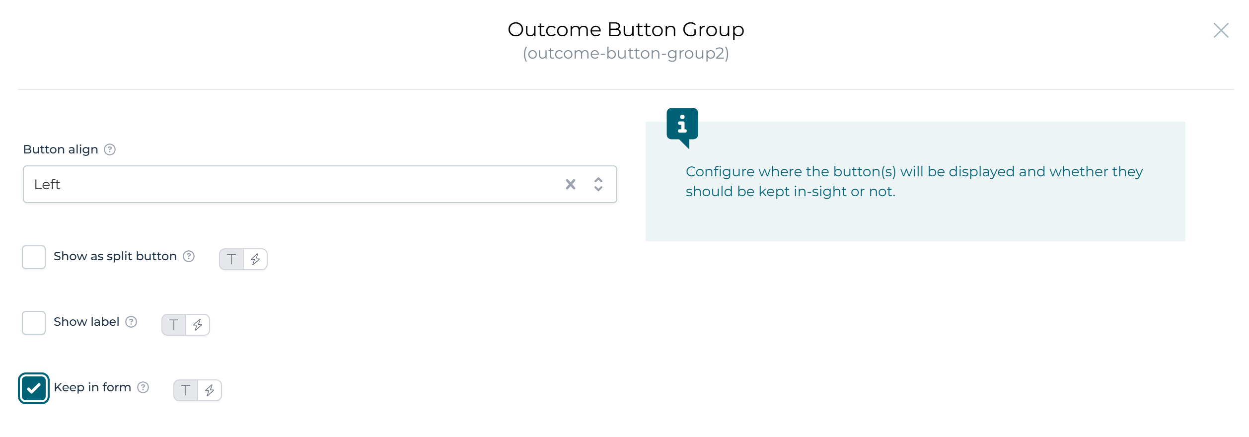
Form Outcomes
Form outcomes are used to complete a user task and allow the user to indicate how the completion should be considered, for example, if a task is approved or rejected. Outcomes are typically displayed to the user to select as part of the task or form. These outcomes can be defined in the form details outcomes property or inside the form using an Outcome button group.
By default, if you do not set any outcome, the default Complete outcome is used. There are two additional task actions that are usually displayed with outcomes, Save and Claim. These actions can be configured explicitly to change the default behavior.
To achieve this, set one of the following values as the outcome value:
-
__CLAIM: Use this value to configure a claim action in a form. This action will be visible when a task has no assignment. This allows users to claim a task and assign it to themselves. -
__SAVE: Use this value to configure a save action in a form. This action will be visible only if the task is assigned to a user. It saves the form contents without completing the task, to allow work on it later. -
__CANCEL: Use this value to configure a cancel action in a form. It cancels the form contents. This is only applicable to modal forms such as start forms. -
COMPLETE: Use this value to configure a complete action in a form. This action will be visible only if the task is assigned to a user. It completes the task.
Defined at Form Level
In the detail section of the form it is possible to set a list of outcomes that will always be rendered in the task header.
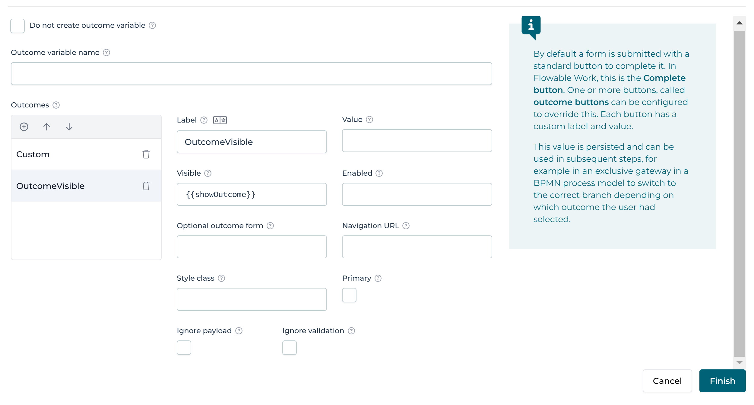
Defined inside the Form
It is also possible to configure outcomes inside a form using two form components, they are the Outcomes Button group and Outcome button.
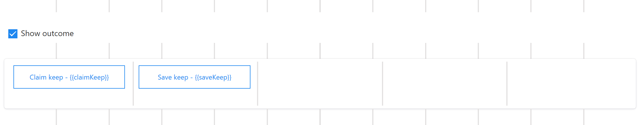
The Outcomes Button group has a specific Keep in form property to display these custom outcomes in the task header, like outcomes defined at the form level, as above.
Form Components Overview
Flowable Forms provides numerous pre-defined components which enables you to build rich, beautiful forms. There are four categories of components:
-
Data Entry: These components allow users to enter data directly. A typical example is a text field or a date picker.
-
Selection: Selection components offer a number of pre-defined options to choose from. Checkboxes, buttons and radio buttons are commonly used components in this category.
-
Display: These components display content. Images and data tables belong in this group.
-
Container: Container components allow you to better structure your form. Tabs, Wizards and Subforms belong in this group.
Data Entry Components
The following Data entry components are available:
Data Selection Components
Currently, the following Selection components are available:
- Radio Buttons
- Checkbox
- Checkbox Group
- Select (Single)
- Select (Multi)
- Person
- Group of People
- Button
- REST Button
- Expression Button
- Action Button (Flowable Work)
- Service Button (Flowable Work)
- Outcome Button
Display Components
Currently, the following Display components are available:
- Text Display
- HTML Display
- List
- Image
- Link
- PDF Document
- Document Gallery
- Data Table
- Horizontal Line
- Alert
- Chart (Flowable Work)
Container Components
Currently, the following Container Components are available:
Translating the Form
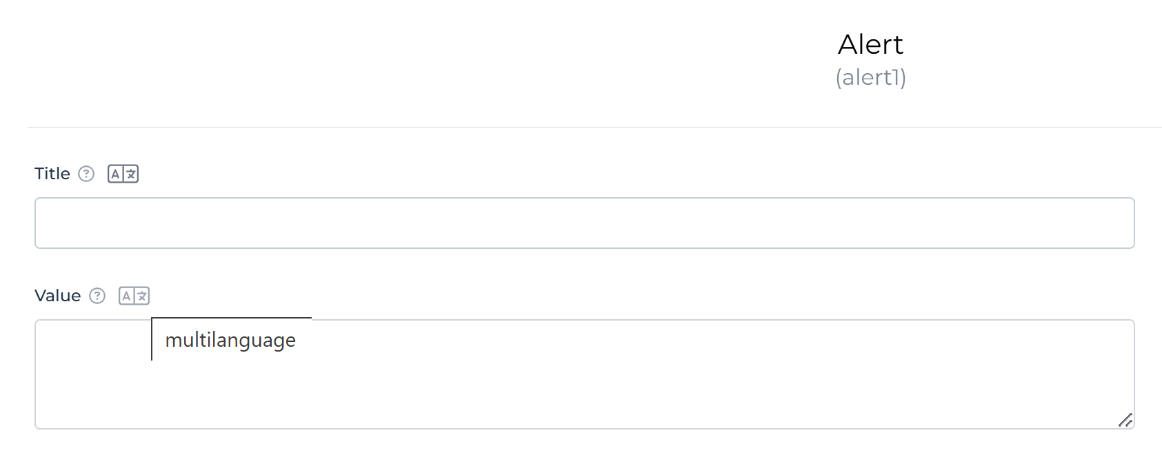
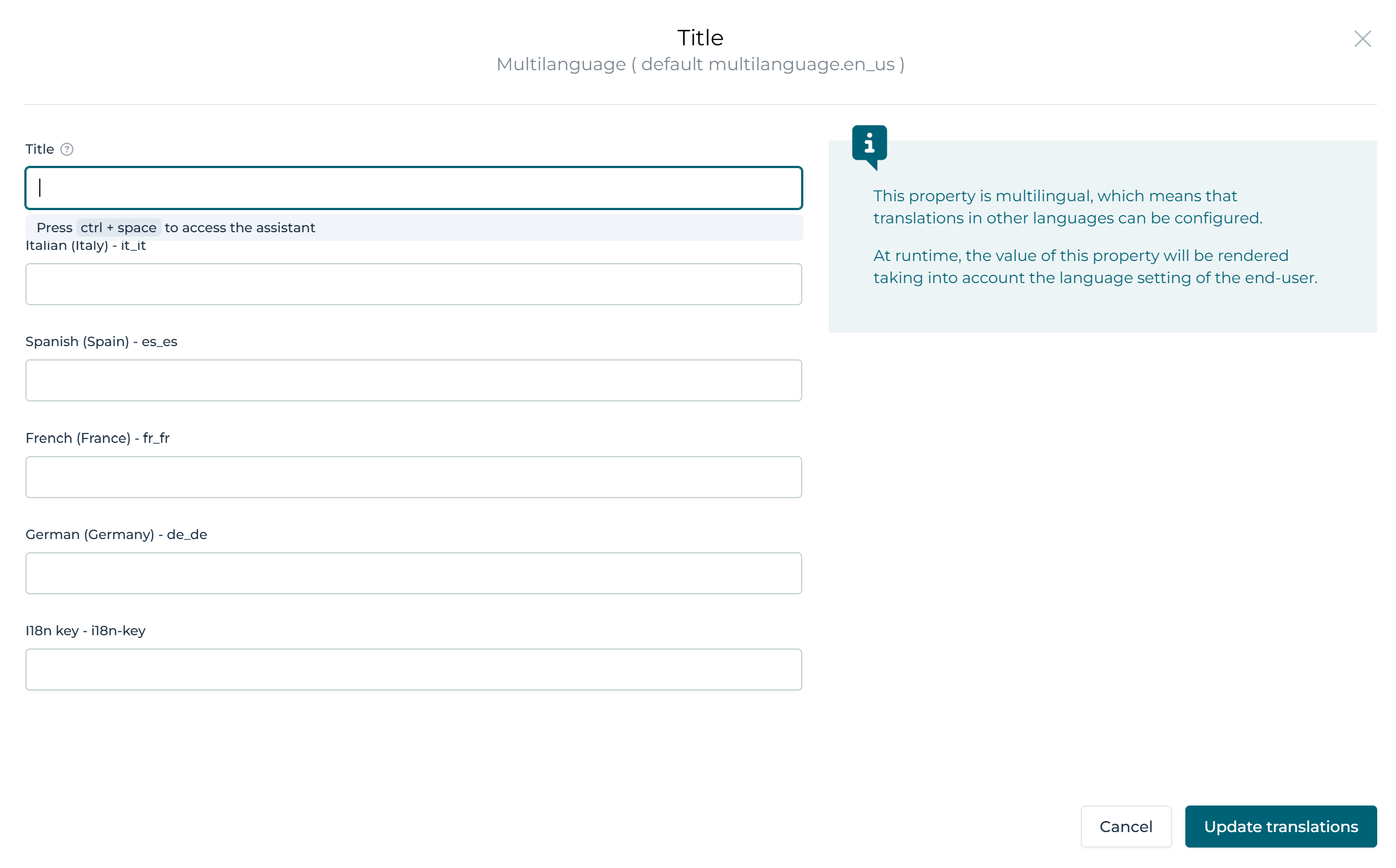
Next to the label you see the language symbol , when clicking on that the translations can be changed:
With this selected you can now see options in each element to fill in the French information:
Flowable Forms Cheatsheet
This document aims to provide users of Flowable Forms with a brief introduction to the most essential concepts surrounding the use of Form Expressions. For a more complete discussion see Form Expressions in the Flowable Developer Guide.
About Form Expressions
Flowable Forms is built on the React technology. As such, there are many dynamic elements. To facilitate working with Flowable Forms, so-called Form Expressions were introduced to perform important tasks with a simple yet powerful expression language. A simple Form Expression consists of two curly braces and an enclosed variable, e.g., {{your_expressions}}. However, it is also possible to construct more complex Form Expressions for specific use cases. That way, modelers can concentrate on modeling instead of coding.
While there are many places where Form Expressions are used, easily the most important one is for binding variables. Many form components require you to set a value, often referred to as binding. Using a Form Expression, it is possible to define what value a form component displays and where it saves its value. For instance, a text field which saves its value to the variable firstName would look like this: {{firstName}}. If that same variable were used in another form, where firstName was already set, it would display the value.
Another common use case for Form Expressions is in so-called Runtime Conditions.
These conditions allow you to change certain aspects of a component dynamically. For instance, it is possible to make a text field required if the variable age is greater than 18 with the following expression: {{age > 18}}. This expression is set
into the "Required" field of the component.
Components which are only used for formatting can also benefit from the fact that JavaScript functions can also be applied to values in Form Expressions. For instance, if you want to return the lower-case version of a string, simply add toLowerCase() at the end of your value: {{clientName.toLowerCase()}}. It would even be possible to chain several JavaScript functions. The following expression implements turns the name of a person into an email address, albeit in a very rudimentary way: {{txt1.replace(' ', '.').toLowerCase() + '@' + 'flowable.com'}}.
There are many online references that can be consulted, for instance, the Mozilla Developer Network. For instance, the documentation about Numbers describes not only important principles but also lists many useful functions that can be used.
Common Form Expressions and Use Cases
The following table shows some examples to achieve some of the most common tasks.
| Description | Expression |
|---|---|
product is equal to selectedProduct | {{product == selectedProduct}} |
amount is equal to 0 and it is made sure that amount is a number | {{amount === 0}} |
product is equal to the string 'abc' | {{product == 'abc'}} |
product is not equal to 'abc' | {{product != 'abc'}} |
amount is less than 1000 | {{amount < 1000}} |
amount is less or equal to 1000 | {{amount <= 1000}} |
amount is greater than 1000 | {{amount > 1000}} |
amount is greater or equal to 1000 | {{amount >= 1000}} |
product has a value (exists) | {{product}} |
product was defined | {{product != undefined}} |
product has no value or is false or is "falsy" | {{!product}} |
Boolean value isGoldClient is true | {{isGoldClient}} or {{isGoldClient = true}} |
Boolean value isGoldClient is false | {{!isGoldClient}} or {{isGoldClient == false}} |
Logical And (is true if all variables evaluate to true) | {{isGoldClient && income > 7000}} |
Logical Or (is true if one of the variables evaluate to true) | {{isGoldClient || income > 12000}} |
Check if a complex JSON variable client contains a variable clientId | {{client.hasOwnProperty('clientId')}} |
Get the number of elements in the array suppliers | {{suppliers.length}} |
Get the index (position) of clientId in the clients | {{clients.indexOf(clientId)}} |
| Convert a string to lowercase letters | {{textField.toLowerCase()}} |
Replace Hi in the String with Hello | {{textField.replace('Hi', 'Hello')}} |
Check if the value of the variable greeting contains the letters "hello". | {{greeting.includes('hello')}} |
Truthiness and Falsiness
Unlike Java and other languages, JavaScript knows the concept of "truthy" and "falsy". This differs from the strict definition where a value is only true if it evaluates to a true boolean value as it is the case with Back End Expressions.
A value in Form Expressions evaluates to true if:
-
If a value is the Boolean value
true -
If a value is a string, e.g.,
'Product A' -
If a value contains an object, e.g., a date, a case etc.
-
If a value is a number (positive or negative, with or without fraction)
-
If a value is
{}or[] -
If a value is
Infinityor-Infinity
A value in Form Expression evaluates to false if:
-
If a value is the Boolean value
false -
If a value is
null -
If a value is
undefined -
If a value is
0 -
If a value is an empty string, i.e.,
''or"".