App View
Introduction
From version v3.12.0+ is possible to show an App Custom View using the URL pattern flowapp-view/{appId}/.
It's also possible to navigate directly to a specific task in the case view if it has been added in the Flow-App, the URL pattern then is /flowapp-view/{appId}/{subAppId}/case/{caseId}/task/{taskId}.
The App View can be used as a Standalone React component in your own React application or using the javascript API in any web site.
Using the App View as a React Component
yarn add @flowable/work-views react react-dom
 note
note@flowable/work-views has as peer-dependencies: react and react-dom. In case of using TypeScript, probably you'll need to install also @types/react and @types/react-dom.
 caution
Since @flowable/work-views@3.15.0 the peer-dependencies: react and react-dom have been upgraded to >=18
Sample
import React, { useState } from "react";
import { FlowableFlowApp } from "@flowable/work-views";

import "@flowable/work-views/dist/index.css";

function App() {
  return <FlowableFlowApp flowAppId="aPACSTRDemo1" />;
}

export default App;
You need to import the FlowableWorkViews css to display it correctly, e.g. import '@flowable/work-views/dist/index.css'; as shown in the sample.
Using the App View with the API
The steps outlined below guide you through integrating the flowable app view in either a Vanilla JavaScript or Angular web application. If your application is built using React, please refer to the section above.
The @flowable/work-views package exports a controller function that receives the options and returns a small API to render or destroy the component.
yarn add @flowable/work-views react react-dom
@flowable/work-views has as peer-dependencies: react and react-dom. In case of using TypeScript, probably you'll need to install also @types/react and @types/react-dom.
cautionSince @flowable/work-views@3.15.0 the peer-dependencies: react and react-dom have been upgraded to >=18
const { flowableAppController } = require('@flowable/work-views');

import '@flowable/work-views/dist/index.css';

const options = {
  flowAppId: 'aPACSTRDemo1',
  container: 'root',
  fullScreen: false
};

let flwController = flowableAppController({ ...options, ...features });
flwController.render();

...

onUpdate = () => {
  flwController.update({ ...updatedOptions });
}

...

onDestroyClick = () => {
  flwController.destroy();
}
App View API
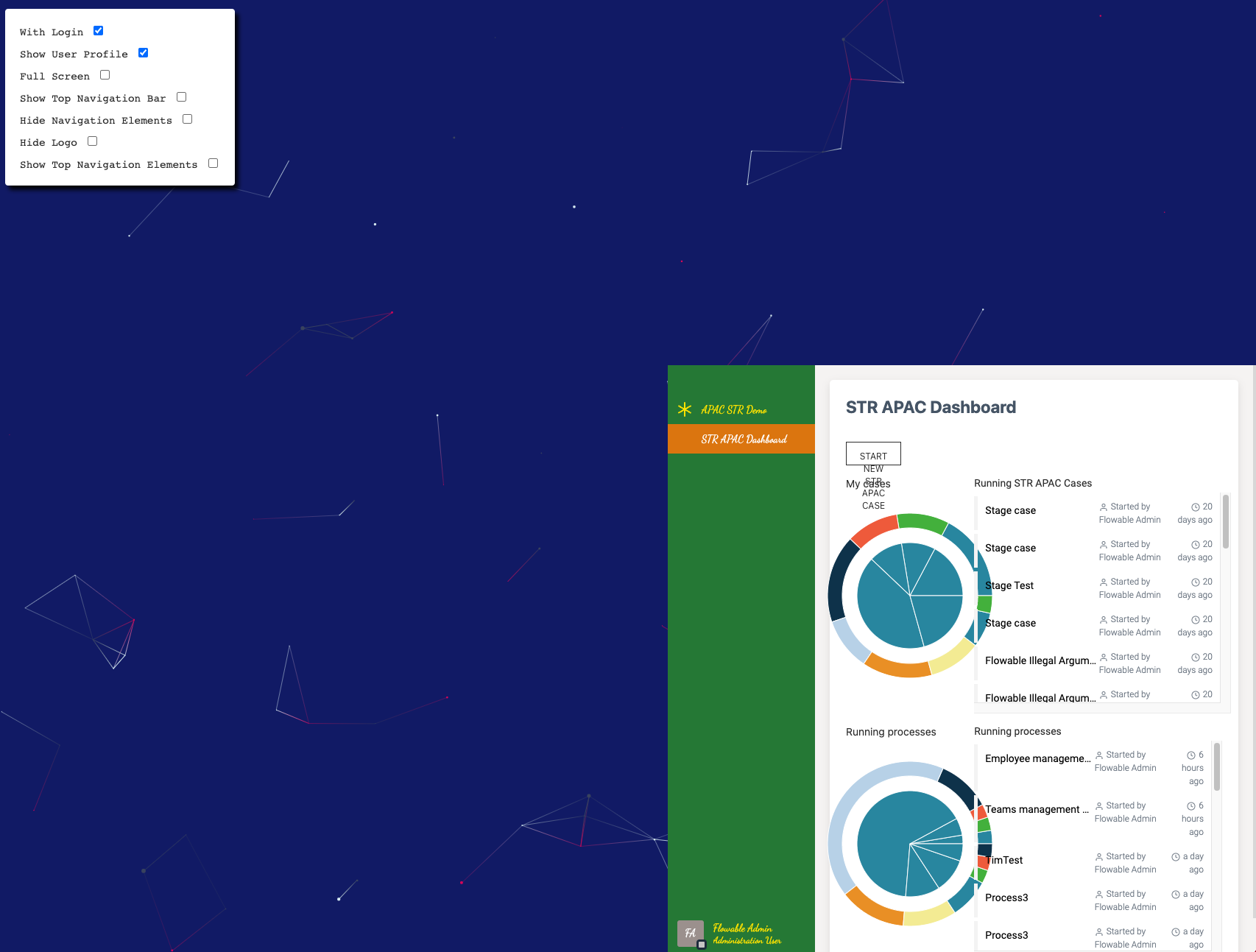
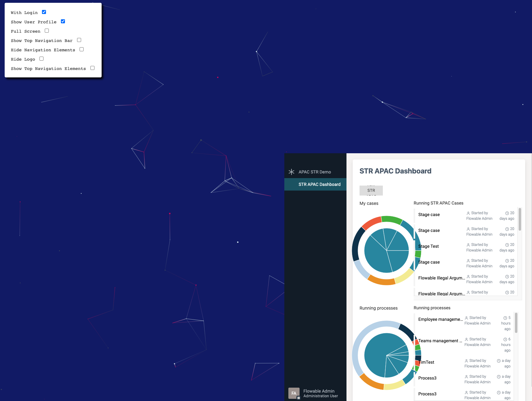
App View Options
| Name | Type | Description | Optional |
|---|---|---|---|
|
| The Flow-app id | Yes (Default |
|
| It will show user avatar in the top navigation bar | Yes (Default |
|
| It will show the top navigation bar with the logo | Yes (Default |
|
| It will show the app view using the whole screen | Yes (Default |
|
| The id of the DOM node where the app view will be rendered | Yes (Default |
|
| It will hide the left hand sidebar | Yes (Default |
|
| It will show the Flowable Login form when the user is not authenticated | Yes (Default |
|
| It will disable url-based navigation | Yes (Default |
|
| It uses the string as URL parameter containing the routing state | Yes (Default |
|
| The window location object will be used instead of react routing location | Yes (Default |
|
| Use hash history mode | Yes (Default |
noteIn some cases, where you want to keep multiple app view instances and navigate trough them, you might need to disable the url-based navigation for the instances that are not being currently rendered. This can be done by updating disableRouting at runtime, using controller's update method (e.g. flwController.update({ disableRouting: !isVisible })).
Controller Methods
| Name | Parameters | Description | Returns |
|---|---|---|---|
| none | It will render the app view inside the provided |
|
|
| It will update the app view options at runtime |
|
| none | It will destroy the app view instance |
|
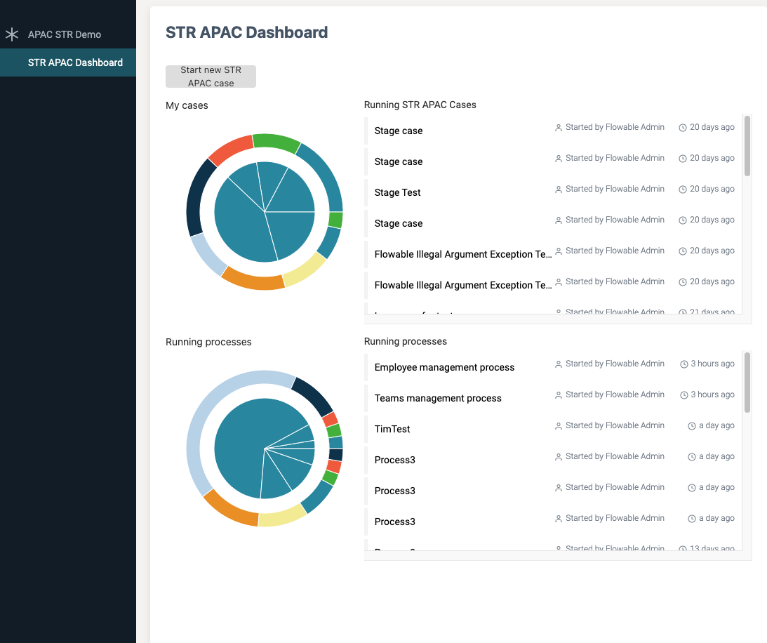
Rendering the App View in a specific node container
Now you can render the App View in any part of your web application when using the javascript API. Using the option container in your controller will render the app view in that specific node of the DOM. By default fullScreen is internally set to true when container is not provided. If fullScreen is set to false and no container is provided then the controller won't find the right place to render the app view.
noteProviding a container id for your app view only makes sense using the javascript API, if you are using the React component, this will be rendered in the parent container when fullScreen is set to false, for backwards compatibility reasons fullscreen mode is the default behaviour when using the React component.
URL Routing v3.15.0+
The App View has its own routing, in order to not break the routing of your web application, we provide an optional parameter that will be used as a string parameter in your application URL. The url parameter you specify with the option urlParameter will contain the routing information that the App View component needs to work properly.
  const propsFlowAppView: FlowableFlowAppOptions = {
    showLogin: true,
    showUserProfile: true,
    fullScreen: false,
    topNavigationBar: false,
    hideNavigationElements: false,
    hideLogo: false,
    showTopNavigationElements: false,
    urlParameter: 'flowAppRouterParam',
  };
it is also possible to use a specific url syntax to navigate to a case or task:
#/?flowAppId=myApp&flowAppSubAppId=taskList&caseInstanceId={{$item.scopeId}}&taskInstanceId={{$item.id}}
URL Routing without hash routing v3.16.12+v3.17.5+
The App view will add an #/ to the URL on load, this because hashHistory is used under the hood. There are cases where this behaviour will create issue (i.e. ERP integrations).
To address this behavior, a new useHash property has been introduced. This property can be configured either in the controller or within the React component.
  const propsFlowAppView: FlowableFlowAppOptions = {
    showLogin: true,
    showUserProfile: true,
    fullScreen: false,
    topNavigationBar: false,
    hideNavigationElements: false,
    hideLogo: false,
    showTopNavigationElements: false,
    useHash: false,
    useWindowLocation: true,
    urlParameter: 'flowAppRouterParam',
  };
When useHash is set to false, useWindowLocation must be set to true, and urlParameter must be defined.
it is also possible to use a specific url syntax to navigate to a case or task:
/?flowAppId=myApp&flowAppSubAppId=taskList&caseInstanceId={{$item.scopeId}}&taskInstanceId={{$item.id}}
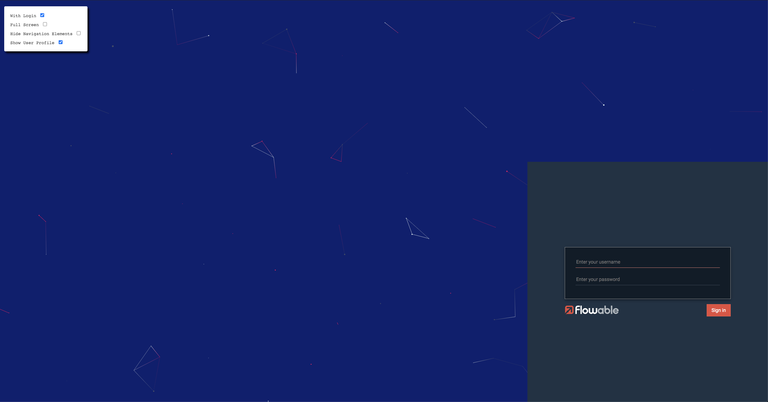
Using the Flowable Login screen
Sometimes it might be useful to provide the standard login screen used in the Flowable Work UI. In order to add it, an optional parameter showLogin can be provided to replace the case view component by the Flowable Login, this will be automatically displayed when no user is authenticated in Flowable.
Common connectivity issues
Sometimes you might want to route the Flowable Work requests from the App View component based on a particular query root, for instance to use a proxy.
If that is the case, the next global variable can be set, for instance in your index.html:
<script type="text/javascript">
  window.flowable = window.flowable || {};
  window.flowable.endpoints = { baseUrl: "/flowable" };
</script>
Proxy sample
const express = require('express');
const proxy = require('http-proxy-middleware');

const app = express();

app.use(
  '/flowable-engage',
  proxy({
    context: ['/flowable-engage'],
    target: 'http://localhost:8090',
    ws: true,
    logLevel: 'info',
    xfwd: true,
    //secure: false,
    cookiePathRewrite: {
      '*': '/'
    }
  })
);

...
Extending the app view
In the Flowable Front End developer guides we explain how to customize the embedded frontend extending your own form engine components or implementing your custom functions.
It is also possible, following similar patterns, to extend the app view with your own form components or additionalData. The main difference is that for your own application you will need to inject the extensions as a script in your index.html. For example:
<script src="./extensions/dist/custom.js"></script>
In the sample above extensions it's just a folder in our custom web application, with a basic frontend scaffold to build the customizations using @flowable/work-scripts and following this guide.
This is the custom Text component:
import React, { useEffect } from "react";

const Text = ({ additionalData }: { additionalData: any }) => {
  useEffect(() => {
    if (additionalData?.log) {
      additionalData.log("it works!");
    }
  }, []);

  return <div>hello world!</div>;
};

const text = ["text", Text];

export default text;
And this is how we are exporting our module:
import text from "./text";

const formComponents = [text];
const additionalData = {
  log: (data: string) => console.log(data),
};

export default {
  formComponents,
  additionalData,
};
You don't need to use @flowable/work-scripts to expose your extensions into the app view. The important part (as explained in this how-to), is that the global window.flowable.externals object is present within your custom logic.
cautionDue to the fact that React cannot be injected globally in the custom logic, the bundle created from work-scripts tries to load React from the global window. In order to facilitate this, there is a polyfill you can import to expose React globally. In an Angular app for instance you can import this into the polyfills.ts file by doing: import “@flowable/work-views/dist/react-polyfill”.
Customize the App view CSS Stylesheet
In the Flowable Front End developer guides we explain how to customize the Default CSS Stylesheet. It is possible to customize the App view CSS stylesheet by creating your own CSS file as described in this guide. Once the CSS is created you will need to include it in your index.html, for example:
@charset "UTF-8";
@font-face {
  font-family: "DancingScript";
  src: url("./fonts/DancingScript/DancingScript-Regular.ttf") format("truetype");
}
:root {
  --flw-switcher-base: #29833d;
  --flw-switcher-item-color: #ffe700;
  --flw-switcher-selected-bgcolor: #e0800d;
  --flw-switcher-selected-color: #fff;
  --flw-subMenu-bgcolor: #fff;
  --flw-subMenu-item-color: #333;
  --flw-subMenu-selected-bgcolor: #ff3101;
  --flw-subMenu-selected-color: #fff;
  --flw-subMenu-action-color: #ff3101;
  --flw-logo-url: ./logo.svg;
  --flw-forms-color: ;
  --flw-forms-color-hover: ;
  --flw-forms-color-secondary: ;
  --flw-forms-selected-row-background-color: ;
  --flw-forms-background-color: ;
  --flw-forms-text-color: ;
  --flw-forms-label-text-color: ;
  --flw-forms-border-color: ;
  --flw-forms-shadow-color: ;
  --flw-forms-muted-text-color: ;
  --flw-forms-muted-background-color: ;
  --flw-color-lightgray: ;
  --flw-forms-error-color: ;
  --flw-forms-red-background-color: ;
  --flw-forms-success-color: ;
  --flw-forms-green-background-color: ;
  --flw-forms-orange-color: ;
  --flw-forms-orange-background-color: ;
  --flw-forms-blue-background-color: ;
  --flw-forms-debug-border: ;
  --flw-font-family: "RDancingScriptoboto";
  --flw-font-family: DancingScript;
  --flw-custom-font-family: DancingScript;
  --flw-switcher-item-color-hover: white;
  --flw-switcher-selected-bgcolor-hover: ;
  --flw-subMenu-item-color-hover: ;
  --flw-subMenu-selected-color-border: ;
  --flw-subMenu-action-color-hover: ;
  --flw-navigationBar-bgcolor: ;
}
<link rel="stylesheet" href="./custom.css" />