Introduction to Flowable front-end
Introduction
Flowable comprises a number of web applications that work together to provide an overall Flowable solution. The user interfaces provided by Flowable Work and Flowable Engage are highly configurable and extensible. Also, the Flowable Forms framework allows complex forms to be used in a wide variety of environments, with full control over behavior.
Overview of layout elements
Before discussing how to customize the frontend, let's review which elements are composing the user interface under various standard scenarios.
User themes can be easily applied to the Flowable products in order to customize the overall style of these layout elements, and some of them can even be replaced or enhanced with custom frontend code.
The out-of-the-box user interface is explained in detail in the user guide:
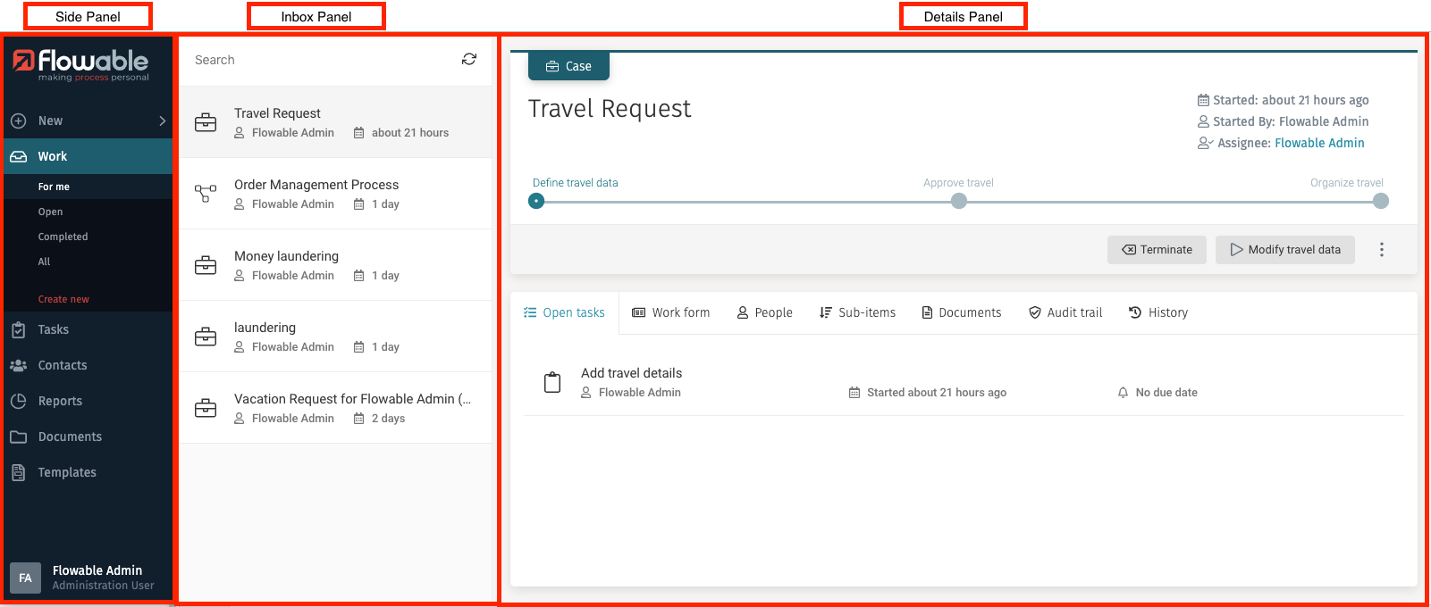
The default Flowable Work layout is mainly composed of:
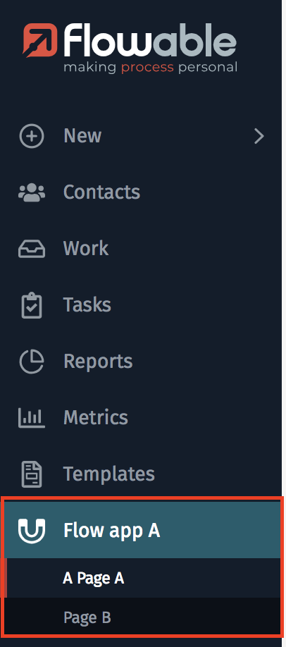
- a side panel, which can be configured as expanded (default) or minimized to icons only, and which allows you to navigate to the various available apps
- a top navigation menu bar, not visible by default
- an inbox panel when inside on of the default apps (such as Work and Tasks)
- a details panel covering the remainder of the screen, itself composed of:
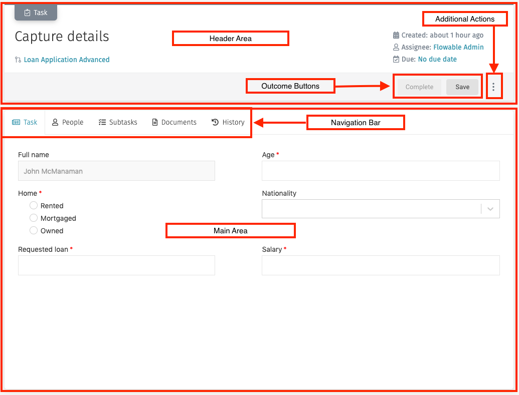
- a header area, which can have 3 heights (small, medium, large) with more or less elements depending on the chosen size
- a main area, which varies depending on the type of screen, and usually contains a tabbed navigation bar with a modelable part, also referred to as "form", in the first or second tab, as well as various useful panels in the other tabs
- default overlay dialogs and modelable ones, which can have various widths (small, medium, large, auto, or a custom width in pixels), depending on the state of the screen
When in a default app or in a custom Flow App, the details panels may look as follows:
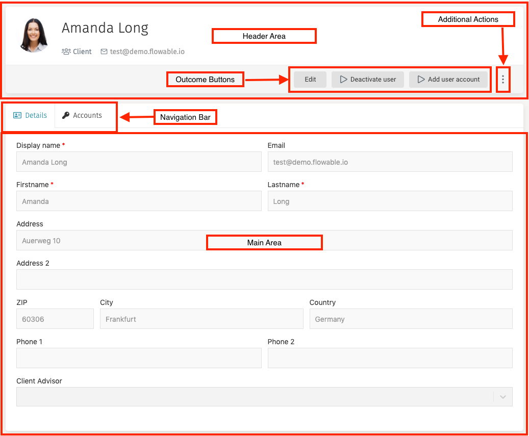
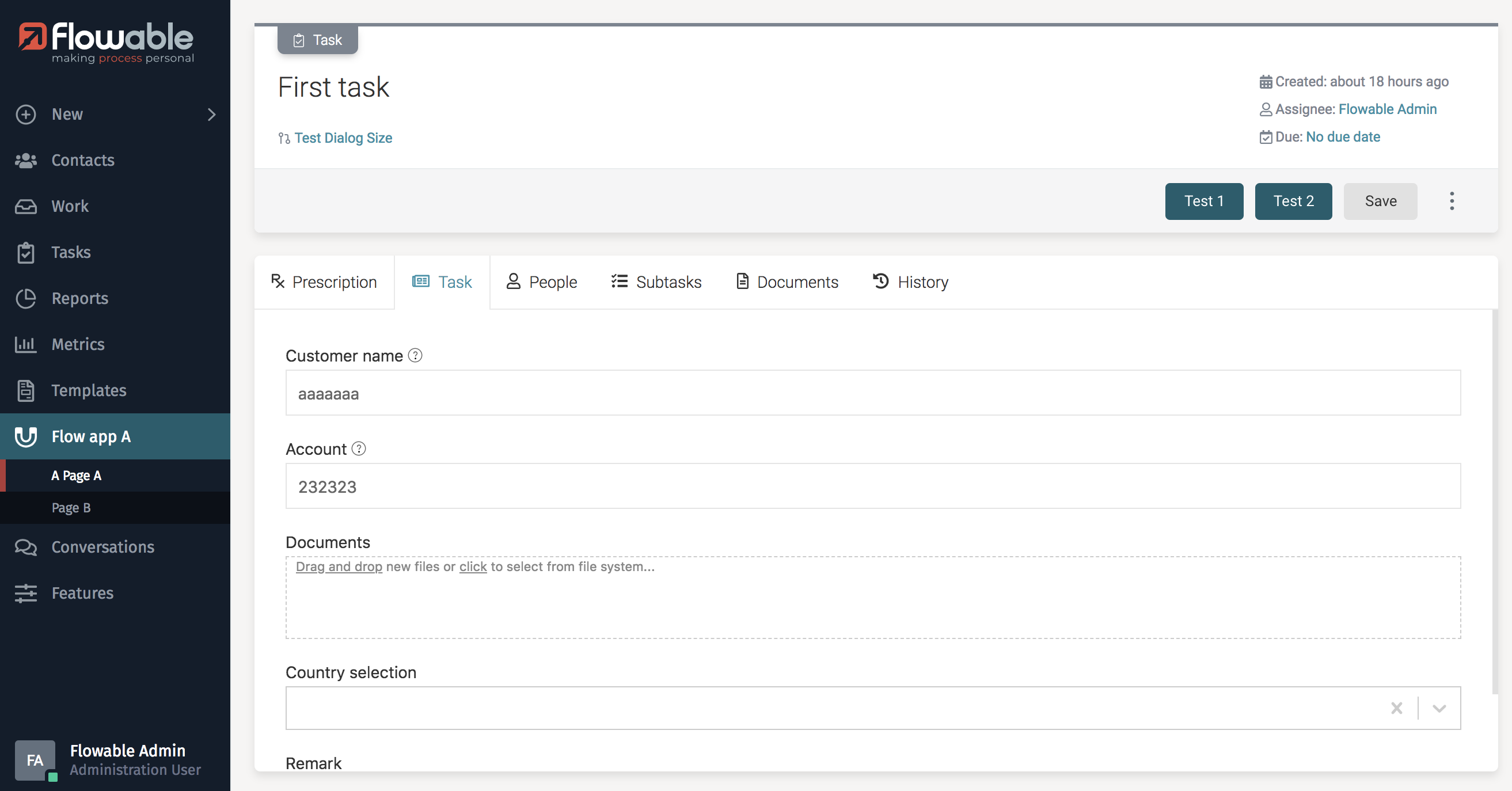
 You can refer to the user guide for more details about all of these graphical elements and their meaning and usage.
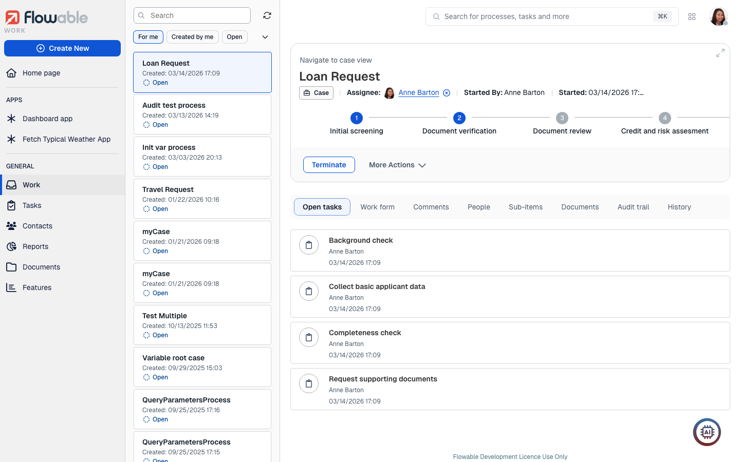
You can also enable the Case View in a custom Flow App, with following layout:
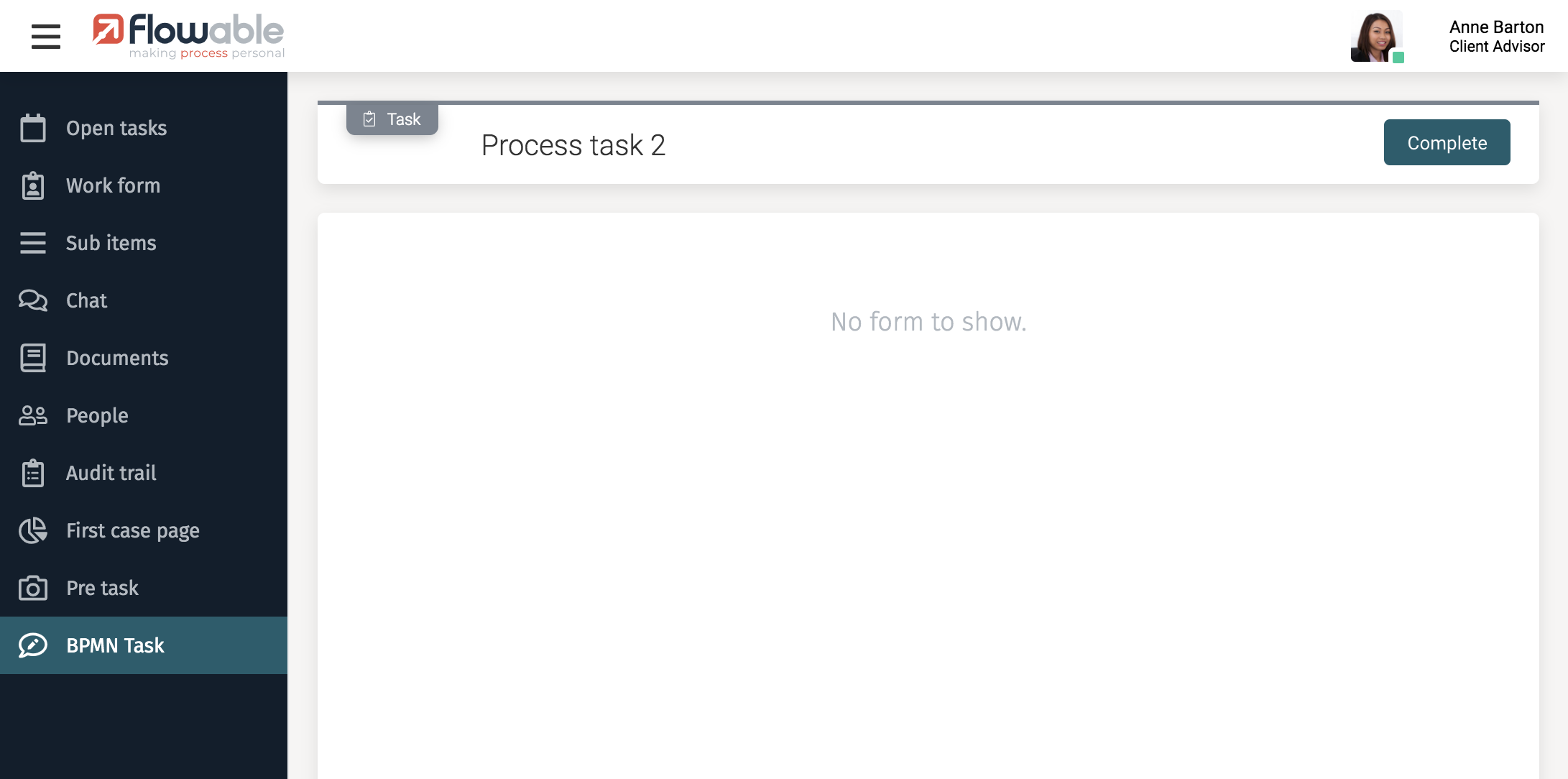
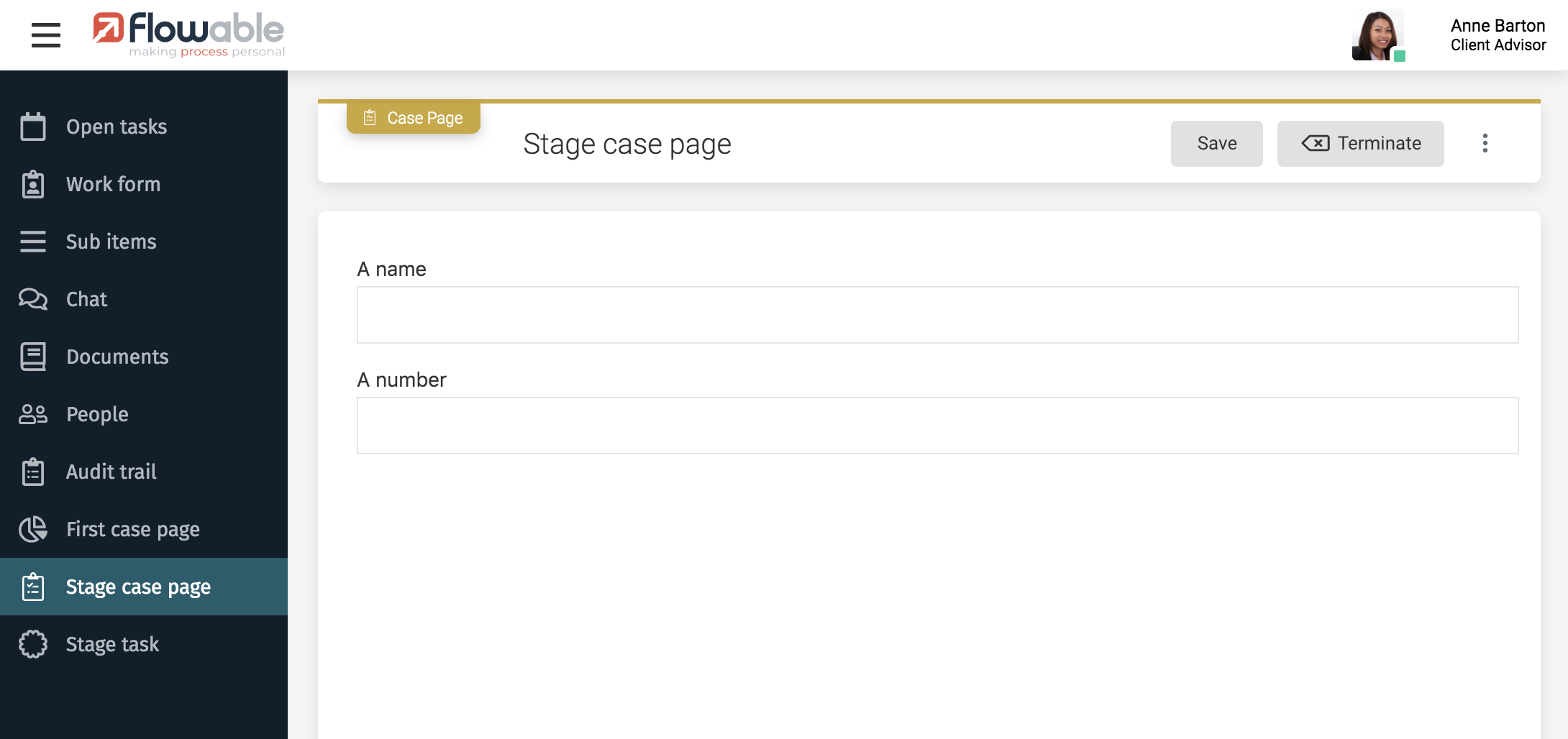 As you can see, the content of the side panel is completely changed, and the main area does not contain a tabbed navigation bar, but only a form.
You can learn more about defining a Case View in the modeler guide.
As you can see, the content of the side panel is completely changed, and the main area does not contain a tabbed navigation bar, but only a form.
You can learn more about defining a Case View in the modeler guide.
With custom frontend code, it is possible to replace the top navigation menu or the header area, and to customize parts of the main area. Such scenarios are covered in this frontend development guide, in particular Customize the Default CSS Stylesheet and Customize User Interface and Flow-Apps.
Forms
The various components which can be rendered in the modelable area (forms or pages) of your screens are defined in the Flowable Forms React library. These forms can be modeled with Flowable Design in a 12-columns canvas, which is then rendered in the Flowable product user interfaces as a flex grid composed of the matching Flowable Forms components. Although CSS can be very powerful and it is possible to customize the style of these components with a custom stylesheet, it may also be that the Flowable Forms components are missing features you need (for example, not all components support tooltips), in which case you have the option to add custom React components to the frontend build and to the Flowable Design palette. You can learn more about existing components, customization and extensibility on the Flowable Forms developer documentation.
Custom frontend layer
It is also worth noting that the Flowable products can be run headless, and that you can replace the Work and Engage user interfaces with custom ones, with or without embedded Flowable Forms. It is moreover possible to embed the Case View in a custom user interface as a standalone React component. For a non-embedded frontend, you can also look at How-To integrate Flowable Forms into an Angular App.