Customize the Default CSS Stylesheet
Flowable CSS should be customized through user themes.
The currentUser.theme property returned by the back end is used by a CSS
class injected in one of the parent DOM nodes. This means it might exist
as many CSS themes as theme configurations exist, e.g., user-1 might be
configured with theme-1, user-2 with theme-2, and so on.
There are specific recommended steps to follow to achieve this successfully:
-
Configure user theme
-
Customize the theme stylesheet
-
Fonts customization
-
Logo customization
Configure User Themes
User themes should be configured as part of a user configuration in the
tenant setup file. For instance, based on the following user configuration,
the user Shane is associated with the my-custom-theme:
{
 "firstName": "Shane",
 "lastName": "Bowen",
 "login": "shane.bowen",
 "personalNumber": "12345678",
 "technicalNumber": "123456",
 "entityId": "HK-030",
 "language": "en",
 "theme": "my-custom-theme",
 "userDefinitionKey": "user-client-advisor"
}
This results in a CSS class applied to the parent DOM component as
follows (note the theme- prefix applied to the specified theme name):
<div className="flw-root-app theme-my-custom-theme">
 ...
</div>
Customize the Theme in Flowable
Option 1 - Customize the Theming Configuration
The Theming Configuration can be configured during Runtime, by adding the allowedFeature = themeManagement.
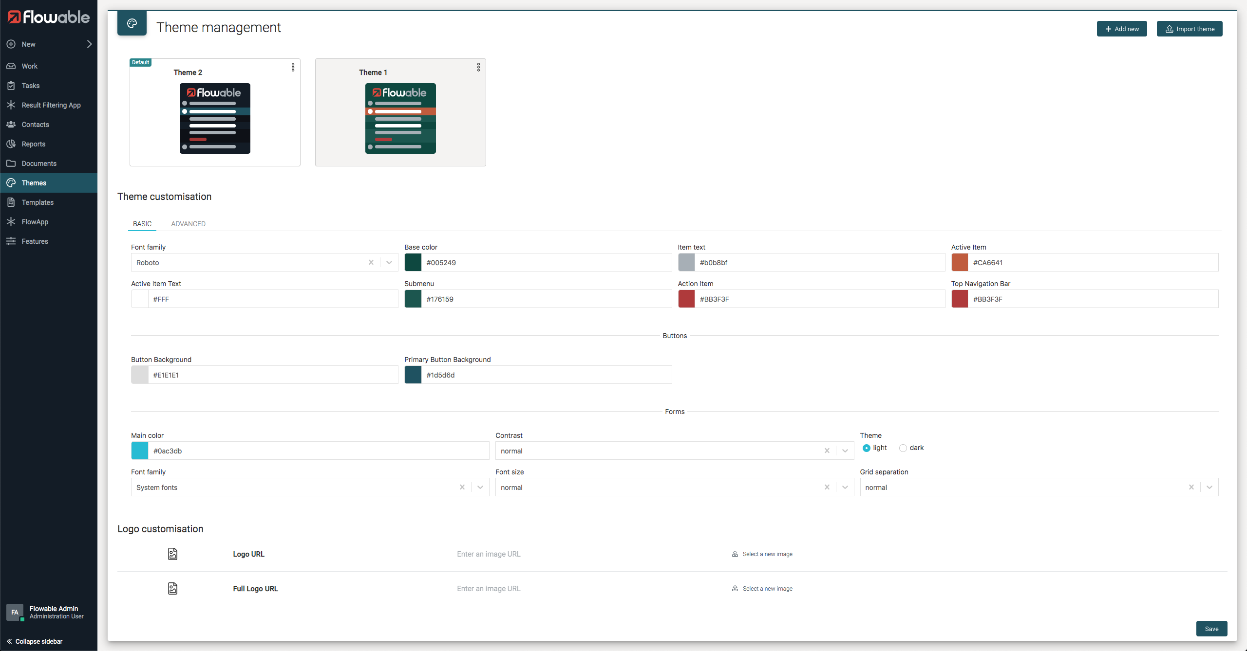
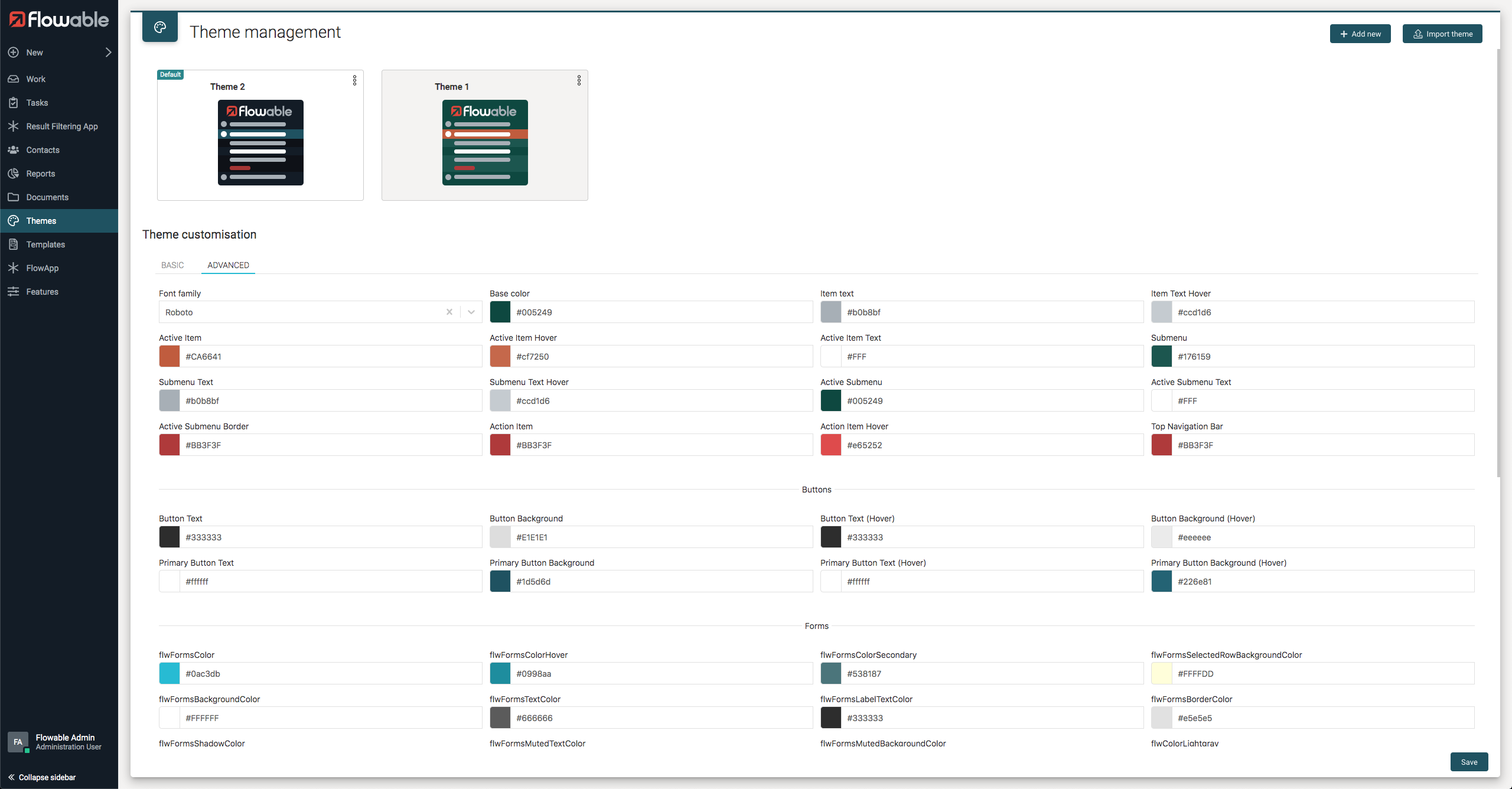
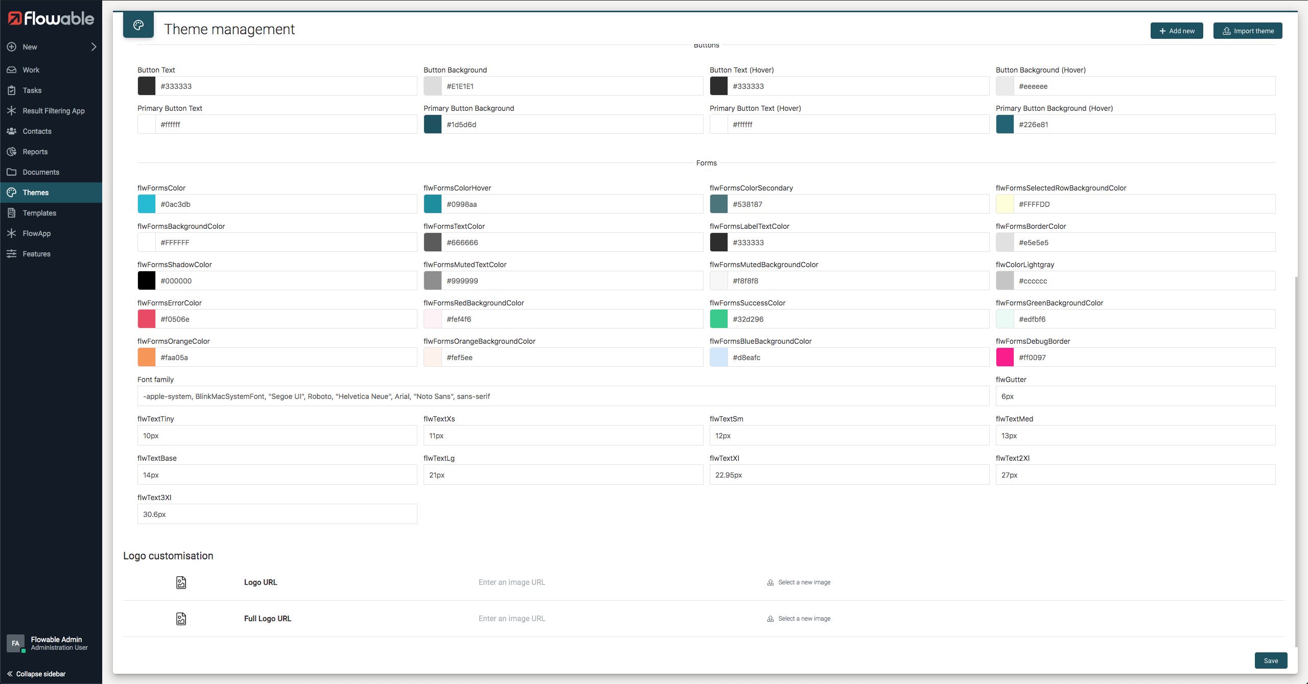
Then the Theme Management app appears in Flowable and the logos as well as several colors can be set.
Auto deploy themes
When the Flowable Application starts it will look for all JSON document in the /themes and com/flowable/themes/custom classpath folders and use them to import the themes.
This location can be changed by using the flowable.platform.theme.resource-locations property. e.g. to only load themes from the my-themes folder you can set the value to: classpath*:/my-themes/.
Additionally, the Flowable Application will look for JSON documents in the com/flowable/themes/default classpath folder. This location can be changed by using the flowable.platform.default-theme.resource-locations property.
The JSON configuration file for the theming has the following format:
{
  "overwrite": true,
  "tenantId": "acme",
  "tenantIds": ["acme", "megacorp"],
  "defaultTheme": "flowable-theming",
  "themes": [
    {
      "name": "flowable-theming",
      "options": {
        "logoUrl": "data:image/svg+xml;base64,<base64-encoded-image>",
        "logoUrlFull": "data:image/svg+xml;base64,<base64-encoded-image>",
        "subMenu": "#0b0f18",
        "topNavBar": "#ffffff",
        "switcherItemFgHover": "#ccd1d6",
        "switcherSelectedBgHover": "#216c7d",
        "subMenuSelectedItemBorder": "#b03b39",
        "subMenuSelectedItemBg": "#111e2c",
        "switcherItemFg": "#b0b8bf",
        "switcherBase": "#111e2c",
        "switcherSelectedFg": "#ffffff",
        "switcherActionHover": "#e54d42",
        "switcherSelectedBg": "#1d5d6d",
        "subMenuSelectedItemFg": "#ffffff",
        "subMenuItemFgHover": "#ccd1d6",
        "switcherAction": "#b03b31",
        "subMenuItemFg": "#b0b8bf",
        "buttonBg": "#E1E1E1",
        "buttonFg": "#333333",
        "buttonHoverBg": "#eeeeee",
        "buttonHoverFg": "#333333",
        "buttonPrimaryBg": "#1d5d6d",
        "buttonPrimaryFg": "#ffffff",
        "buttonPrimaryHoverBg": "#226e81",
        "buttonPrimaryHoverFg": "#ffffff",
        "flwColorLightgray": "#cccccc",
        "flwFontSans": "-apple-system, BlinkMacSystemFont, Segoe UI, Roboto, Helvetica Neue, Arial, Noto Sans, sans-serif",
        "flwFormsBackgroundColor": "#FFFFFF",
        "flwFormsBlueBackgroundColor": "#d8eafc",
        "flwFormsBorderColor": "#e5e5e5",
        "flwFormsColor": "#0ac3db",
        "flwFormsColorHover": "#0998aa",
        "flwFormsColorSecondary": "#538187",
        "flwFormsDebugBorder": "#ff0097",
        "flwFormsErrorColor": "#f0506e",
        "flwFormsGreenBackgroundColor": "#edfbf6",
        "flwFormsLabelTextColor": "#333333",
        "flwFormsMutedBackgroundColor": "#f8f8f8",
        "flwFormsMutedTextColor": "#999999",
        "flwFormsOrangeBackgroundColor": "#fef5ee",
        "flwFormsOrangeColor": "#faa05a",
        "flwFormsRedBackgroundColor": "#fef4f6",
        "flwFormsSelectedRowBackgroundColor": "#FFFFDD",
        "flwFormsShadowColor": "#000000",
        "flwFormsSuccessColor": "#32d296",
        "flwFormsTextColor": "#666666",
        "flwGutter": "6px",
        "flwText2Xl": "27px",
        "flwText3Xl": "30.6px",
        "flwTextBase": "14px",
        "flwTextLg": "21px",
        "flwTextMed": "13px",
        "flwTextSm": "12px",
        "flwTextTiny": "10px",
        "flwTextXl": "22.95px",
        "flwTextXs": "11px",
        "fontFamily": "Roboto"
      }
    }
  ]
}
All properties are optional, and they have the following meanings:
- overwrite - whether the themes in the JSON document should overwrite the values in the database. By default, this is
false. If you set it totruethen any change for the themes in the document done through the UI as explained in the previous section will be overridden when the application boots up. This can also be globally configured by setting the propertyflowable.platform.theme.force-overwritetotrue. - tenantId - The id of tenant in which the themes need to be deployed into. This is optional and mutually exclusive with
tenantIds. If this ortenantIdsis not set, then the themes will be imported in the default empty tenant. - tenantIds - The ids of tenants in which the themes need to be deployed into. This is optional and mutually exclusive with
tenantId. If this ortenantIdis not set, then the themes will be imported in the default empty tenant. - defaultTheme - Optional value indicating the name of the default theme for the configured tenant(s)
- themes - An array of theme objects containing the name of the theme and its options. The options are the values that can be exported as defined in Export a theme customization section
The tenantId and tenantIds properties are not considered for themes in the default-theme classpath folder as themes in this folder will be deployed to the tenantId(s) configured in the flowable.platform.multi-tenant.auto-deploy-tenants property.
If no tenantId is configured in the flowable.platform.multi-tenant.auto-deploy-tenants property, the themes in the default-theme folder will be deployed to the default empty tenant.
The theme auto import functionality can be disabled by setting the flowable.platform.theme.auto-import property to false
Option 2 - Customize the Theme Stylesheet
Custom CSS can be implemented with CSS or Sass which is an
extension of CSS. Any .css or .scss file can be
imported and bundled as part of the application CSS.
In your CSS you can override the CSS variables like this.
:root {
  --flw-font-family: "Roboto";
  --flw-switcher-base: #111e2c;
  --flw-switcher-item-color: #b0b8bf;
  --flw-switcher-item-color-hover: #ccd1d6;
  --flw-switcher-selected-bgcolor: #1d5d6d;
  --flw-switcher-selected-bgcolor-hover: #216c7d;
  --flw-switcher-selected-color: #fff;
  --flw-subMenu-bgcolor: #0b0f18;
  --flw-subMenu-item-color: #b0b8bf;
  --flw-subMenu-item-color-hover: #ccd1d6;
  --flw-subMenu-selected-bgcolor: #111e2c;
  --flw-subMenu-selected-color: #fff;
  --flw-subMenu-selected-color-border: #b03b39;
  --flw-subMenu-action-color: #b03b39;
  --flw-subMenu-action-color-hover: #e54d42;
  --flw-navigationBar-bgcolor: #fff;
  --flw-color-lightgray: #cccccc;
  --flw-button-bg: #e1e1e1;
  --flw-button-fg: #333333;
  --flw-button-hover-bg: #d4d4d4;
  --flw-button-hover-fg: #333333;
  --flw-button-primary-bg: #1d5d6d;
  --flw-button-primary-fg: #ffffff;
  --flw-button-primary-hover-bg: #226e81;
  --flw-button-primary-hover-fg: #ffffff;
  --flw-forms-background-color: #ffffff;
  --flw-forms-blue-background-color: #d8eafc;
  --flw-forms-border-color: #e5e5e5;
  --flw-forms-color: #1e87f0;
  --flw-forms-color-hover: #0f6ecd;
  --flw-forms-color-secondary: #538187;
  --flw-forms-debug-border: #ff0097;
  --flw-forms-error-color: #f0506e;
  --flw-forms-green-background-color: #edfbf6;
  --flw-forms-label-text-color: #333333;
  --flw-forms-muted-background-color: #f8f8f8;
  --flw-forms-muted-text-color: #999999;
  --flw-forms-orange-background-color: #fef5ee;
  --flw-forms-orange-color: #faa05a;
  --flw-forms-red-background-color: #fef4f6;
  --flw-forms-selected-row-background-color: #ffffdd;
  --flw-forms-shadow-color: #000000;
  --flw-forms-success-color: #32d296;
  --flw-forms-text-color: #666666;
}
Notice. For backwards compatibility we still support changing some variables by importing and calling the SASS mixin theme(...). This mechanism is deprecated and support will be removed in a future version.
Export/Import a theme customization
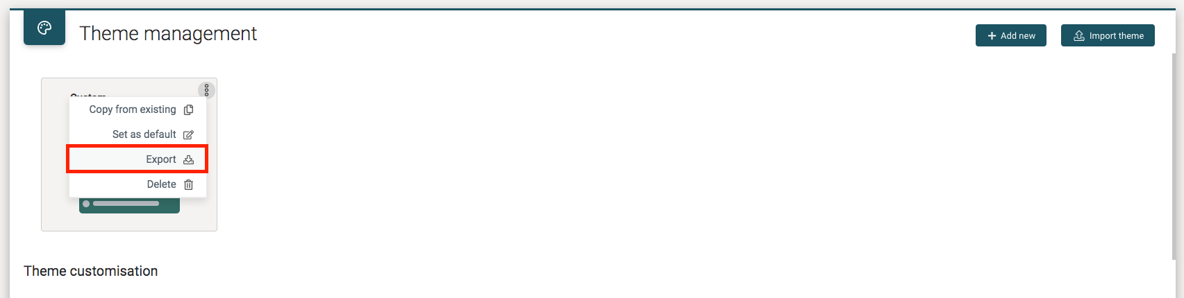
The Theme Customizations can be exported to a Json file using the Export button from the Theme card action menu.
The generated JSON file has the following format:
{
  "logoUrl": "data:image/svg+xml;base64,<base64-encoded-image>",
  "logoUrlFull": "data:image/svg+xml;base64,<base64-encoded-image>",
  "subMenu": "#0b0f18",
  "topNavBar": "#ffffff",
  "switcherItemFgHover": "#ccd1d6",
  "switcherSelectedBgHover": "#216c7d",
  "subMenuSelectedItemBorder": "#b03b39",
  "subMenuSelectedItemBg": "#111e2c",
  "switcherItemFg": "#b0b8bf",
  "switcherBase": "#111e2c",
  "switcherSelectedFg": "#ffffff",
  "switcherActionHover": "#e54d42",
  "switcherSelectedBg": "#1d5d6d",
  "subMenuSelectedItemFg": "#ffffff",
  "subMenuItemFgHover": "#ccd1d6",
  "switcherAction": "#b03b31",
  "subMenuItemFg": "#b0b8bf",
  "buttonBg": "#E1E1E1",
  "buttonFg": "#333333",
  "buttonHoverBg": "#eeeeee",
  "buttonHoverFg": "#333333",
  "buttonPrimaryBg": "#1d5d6d",
  "buttonPrimaryFg": "#ffffff",
  "buttonPrimaryHoverBg": "#226e81",
  "buttonPrimaryHoverFg": "#ffffff",
  "flwColorLightgray": "#cccccc",
  "flwFontSans": "-apple-system, BlinkMacSystemFont, Segoe UI, Roboto, Helvetica Neue, Arial, Noto Sans, sans-serif",
  "flwFormsBackgroundColor": "#FFFFFF",
  "flwFormsBlueBackgroundColor": "#d8eafc",
  "flwFormsBorderColor": "#e5e5e5",
  "flwFormsColor": "#0ac3db",
  "flwFormsColorHover": "#0998aa",
  "flwFormsColorSecondary": "#538187",
  "flwFormsDebugBorder": "#ff0097",
  "flwFormsErrorColor": "#f0506e",
  "flwFormsGreenBackgroundColor": "#edfbf6",
  "flwFormsLabelTextColor": "#333333",
  "flwFormsMutedBackgroundColor": "#f8f8f8",
  "flwFormsMutedTextColor": "#999999",
  "flwFormsOrangeBackgroundColor": "#fef5ee",
  "flwFormsOrangeColor": "#faa05a",
  "flwFormsRedBackgroundColor": "#fef4f6",
  "flwFormsSelectedRowBackgroundColor": "#FFFFDD",
  "flwFormsShadowColor": "#000000",
  "flwFormsSuccessColor": "#32d296",
  "flwFormsTextColor": "#666666",
  "flwGutter": "6px",
  "flwText2Xl": "27px",
  "flwText3Xl": "30.6px",
  "flwTextBase": "14px",
  "flwTextLg": "21px",
  "flwTextMed": "13px",
  "flwTextSm": "12px",
  "flwTextTiny": "10px",
  "flwTextXl": "22.95px",
  "flwTextXs": "11px",
  "fontFamily": "Roboto"
}
Is it possible to import a Custom Theme Json file using the Import button in the theme management view.
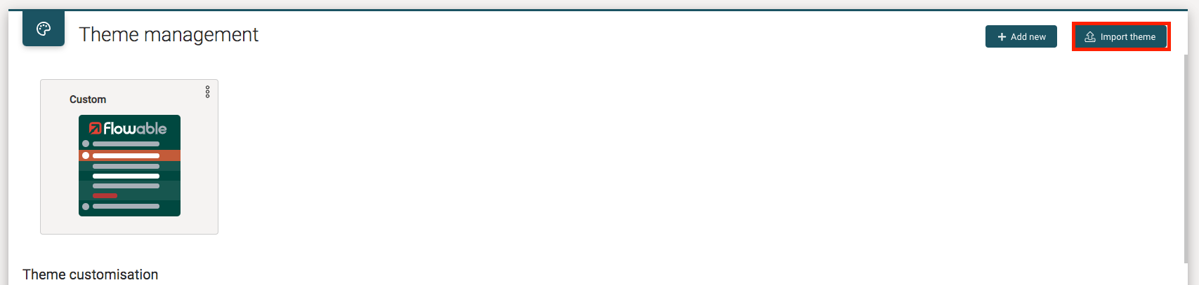
Notice. Once the file has been uploaded, the user will be prompted to add a name for the new theme and any existing theme with the same name will be overridden.
Font Customization
Fonts are exposed through a Sass file within the ../lib folder. This way
the same fonts can be easily used for custom components:
@import "../lib/_fonts.scss";
.my-custom-component {
 font-family: $flowable-fonts-roboto;
 ...
}
...
Customize Font Family
We can also set the font family for the whole application. As mentioned above, you can use the --flw-font-family and --flw-font-sans CSS root variables to set the font family to any of the natively supported fonts (Roboto or Fira Sans).
You can also add external font families to your project and configure it to use them in the same way.
To add an external font family, we can create a ./src/fonts/ folder and then copy the font files inside. You can organize these font families creating a folder for each one with the font family name, e.g: ./src/fonts/DancingScript
To make use of this font we need to expose it through the @font-face API. E.g:
  @font-face {
    font-family: 'DancingScript';
    src: url('src/fonts/DancingScript/DancingScript-Regular.ttf') format('truetype');
  }

  :root {
    --flw-font-family: "DancingScript"
  }
The fonts folder will be copied to dist folder as static assets when we execute work-scripts flowbuild build command to generate custom.js and custom.css files. All generated files should be copied to the server external folder as usual.
NOTE
For a complete list of free font families, you can visit Google Fonts page.
You can learn more about @font-face API and browser support here.
Logo and Favicon Images
If you defined a user theme or set both --flw-logo-url and --flw-logo-url-full
CSS variables, then your custom application logo will be used directly.
If you did not define any user theme or use the logo root CSS variables, the application
logo can be customized by overwriting certain CSS classes with the code below. The image
files should be available under the resources folder in the web application,
e.g. /src/main/resources/static/ext.
@media all and (-ms-high-contrast: none), (-ms-high-contrast: active) {
 /* SideBar logo */
 .flw-switcher__nav {
  &__logo {
   background-image: url("./logo_full.png");
   background-size: auto;
   svg {
    display: none;
   }
  }
  &__collapsed .flw-switcher__nav__logo {
   background-image: url("./logo.png");
   background-size: auto;
  }
 }
 /* Login logo */
 .flw-login__logo {
  background-image: url("./logo_full.png");
  background-size: auto;
  svg {
   display: none;
  }
 }
/* Top navigation bar logo */
.flw-navigationBar {
  &__logo {
   background-image: url("./logo_full.png");
   background-size: auto;
   svg {
    display: none;
   }
  }
 }
}
Up to version 3.11.4, you need to overwrite some CSS classes in the following way if you defined the logo root CSS classes:
/* SideBar logo */
.flw-switcher__nav__logo {
background-image: var(--flw-logo-url-full);
}
.flw-switcher__nav__collapsed .flw-switcher__nav__logo {
background-image: var(--flw-logo-url);
}
.flw-switcher__nav__logo svg {
display: none;
}

/* Login logo */
.flw-login__logo {
background-image: var(--flw-logo-url-full);
}
.flw-login__logo svg {
display: none;
}

/* Top NavBar logo */
.flw-navigationBar__logo {
background-image: var(--flw-logo-url-full);
}
.flw-navigationBar__logo svg {
display: none;
}
The favicon can be customized by adding the favicon.ico file into following
classpath folder /src/main/resources/public.
The desktop notification logo can be overwritten by adding a custom image file in the
configured folder path for this, there is an application property to specify the
notification logo path: flowable.frontend.notificationLogoUrl. As fallback, the
Flowable logo is used if no notification.png file is found.