Create a Custom Design Palette
There have been minor changes when a custom palette is used in the new Design application. See the New Design Migration Guide for more details.
Palette Definitions
In the next sections, the concept of a palette definition is used. A palette definition
- defines what elements are visible on the left-hand side in Flowable Design and what properties these element have.
- extends or changes any other (including the default) palette definition.
Palette definitions are placed on the classpath and read on bootup. Flowable Design has a set of default palette definitions (such as the process, case, form, etc. palette definition) exposing everything that is capable to run on the Flowable runtime environments.
In the context of the palette definitions, the notion of a stencil is used, which means an element plus it's properties.
Historically, palette definitions were done in an XML file. Alternatively (and more recent), palette definitions can also be done in a JSON file. Often they are less verbose than their XML counterparts. There is still full support for the XML palette definitions and everything possible that was possible in XML is possible in the JSON counterpart (but not always the other way around). However, we do advise to use the JSON approach going forward.
In the sections below, the JSON approach is described. The XML counterpart is shown in the section following it.
Location of the Palette Definition
By default, Flowable Design scans the following classpath locations looking for additional palette definition files:
com/flowable/config/custom/palette
The filename of a palette definition file has the form: <name>.palette or <name>.palette.json.
As a custom service task is added to the process palette the typical file
name is of the form: <name>.process.palette or <name>.process.palette.json.
For example, given the "Acme Service Task", the palette definition file is
named acme.process.palette.json (or acme.process.palette.xml when using XML). Assuming that Flowable Design is deployed in
a servlet container such as Tomcat the file can be placed in a location such as:
<TomcatRoot>webapps/flowable-design/WEB-INF/classes/com/flowable/addons/palette.- a jar containing the palette definition in the correct package (as stated above) as a dependency of your custom project or any other way that puts the jar on the classpath.
 XML Alternative
The filename of a palette definition file has the form: <name>.palette.xml.
As a custom service task is added to the process palette the typical file
name is of the form: <name>.process.palette.xml.
Additional Directories and Files
Taking as an example the directory location of com/flowable/config/custom/palette, there
are additional directories for icons, images, and translation files relative to
the base directory. The complete directory/file layout for this particular
directory is:
-
com/flowable/config/custom/palette -
com/flowable/config/custom/palette/i18n -
com/flowable/config/custom/palette/i18n/translation.properties -
com/flowable/config/custom/palette/component-presentations -
com/flowable/config/custom/palette/component-presentations/palette-icons -
com/flowable/config/custom/palette/component-presentations/palette-icons/<item>.png -
com/flowable/config/custom/palette/component-presentations/palette-icons/<item>.svg
The same layout of i18n and component-presentations directories applies to
any of the classpath locations noted above.
General Palette Definition JSON Structure
There is a helper JSON schema (not officially supported) that can be used when creating and modifying palettes. The schema can be found here.
All palette definitions defined in the JSON below (process, case, form and page palettes) follow the same structure:
{
  "$schema": "https://developer-docs.flowable.com/schemas/palette.json",
  "Palette-Id": "<unique-id>",
  "title": "<title>",
  "patchPalettes": ["<default-name>"],
  "resourceBundles": ["<resourceBundle>"],
  "groups": {
    "<groupName>": {
      "index": 1
    }
  },
  "stencils": [
    {
      "id": "<unique-stencil-id>",
      "name": "<stencil-name>",
      "superId": "<super-id>",
      "groups": ["<groups>"],
      "properties": [
        {
          "id": "<unique-property-id>",
          "value": "<property-value>",
          "index": 1
        },
        ...
      ]
    }
  ]
}
$schemareferences the JSON schema of the Flowable palettes and enables auto-completion in many IDEs.Palette-idneeds to be unique in the system and is similar to a process/case/decision model key.titleis a custom name that can be given to the palette.patchPalettes(optional) is an array of existing palette ids that are extended by this palette definition. Omit this if you're creating a new palette instead of tweaking an existing one.- Default palettes are:
flowable-case-palette,flowable-process-palette,flowable-form-paletteandflowable-page-palette.
- Default palettes are:
resourceBundles(optional) references an i18n file (see below).groups(optional) is an array that can be used to add new groups to that palette. The order of groups is controlled by theindex.stencilsis an array definition the elements of the palette. Every stencil element has- a unique
id - a
name - an (optional)
superIdwhich is used to extend or overwrite an existing element. groupsis an array definiting of which groups the element is part of (an element can be in more than one group).- an array of
properties:- every property has a unique
id. - a property can have a default or fixed
value. - the order is controlled with the
indexinteger value.
- every property has a unique
- a unique
Add a Custom Service Task to the Flowable Design Process Palette
When specific custom service beans (see Implement a Custom Service Task) are used regularly, it is convenient to extend the process palette in Flowable Design to include the customized service tasks for common use cases.
JSON Approach
The core requirement for adding a custom service task to the process palette is associating
the new task with the custom logic. This is done by overriding one of the
following attributes: class, expression, or delegateExpression:
-
classis when you implement theorg.flowable.engine.delegate.JavaDelegateinterface and want to use an instance of the value ofclass. -
expressionis an expression and can be${execution.setVariable('hello', 'world')}or other invocations on (Spring) beans like${myBean.someMethod()}. -
delegateExpressionis when you want to reference a spring bean, but not tie it to a specific class, but rather its id. For example,${conversationService}is a Spring bean, which implements the same delegate interface as in point 1. This option is the most flexible and upgrade friendly as it is not tied to hardcoded classnames.
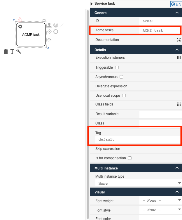
For example to add the Acme service task to the Flowable Design process palette
using the expression option, the following definition is used:
{
  "$schema": "https://developer-docs.flowable.com/schemas/palette.json",
  "Palette-Id": "my-palette",
  "title": "My BPMN Palette Extension",
  "patchPalettes": ["flowable-process-palette"],
  "stencils": [
    {
      "id": "AcmeServiceTask",
      "name": "AcmeServiceTask",
      "superId": "ServiceTask",
      "groups": [
        "flowable-activities",
        "flowable-quick-draw"
      ],
      "properties": [
        {
          "id": "expression",
          "value": "${myService.callMethod()}"
        }
      ]
    }
  ]
}
This will palette definition will:
- Extend the existing Flowable process palette (
flowable-process-palette) - Add a new service task with id
AcmeServiceTaskto theActivitiesandQuick-drawgroup - The expression is set to
${myService.callMethod()}
If you want to add an i18n label to the element, create a file named translation.properties next to the palette definition file and add the following to the json:
"resourceBundles": ["com/flowable/config/custom/palette/translation"],
Note that you can refer to any .properties file on the classpath. Also note it shouldn't contain the .properties suffix.
In the translation.properties file, add the following:
AcmeServiceTask.title=Acme Service Task
AcmeServiceTask.description=My custom service task example
(the description will be shown when hovering over the element)
Typically, it is desirable to hide the expression, class or delegateExpression property for a custom service task. After all, the expression or class is fixed to the actual implementation. To do this, add visible: false to the property:
 "properties": [
        {
          "id": "expression",
          "value": "${myService.callMethod()}",
          "visible": false
        },
        {
          "id": "class",
          "visible": false
        },
        {
          "id": "delegateExpression",
          "visible": false
        }
      ]
Finally, it's often needed to add custom properties to the service task (either hard-coded or editable).
{
  "id": "customSetting",
  "type": "SimpleTextExpression"
}
This will add a property with a textfield edit field (due to the "type": "SimpleTextExpression" definition) when clicked to the property panel on the right-hand side.
Other often-used types are:
-
Boolean
-
Integer
-
TextArea
-
Multiline
-
Complex
Name Type Example complexItems Property { "id": "someId", "type": "SimpleText" } -
RestCombobox
Name Type Example restURL string /{{$workspaceKey}}/apps/{{$appKey}}/users?searchText={{$searchText}}restDataPath string datarestItemValuePath string idrestItemLabelPath string name -
... (check the default palette json files for possible types)
The property can be translated in the translation.properties file with:
property.customSetting.title=Test
property.customSetting.description=Test description
The property will be exported in the BPMN 2.0 XML in the design namespace and can be read at runtime from the model extension elements:
<serviceTask id="acmeServiceTask1" name="Acme Service Task" flowable:expression="${myService.callMethod()}">
  <extensionElements>
    <design:stencilid><![CDATA[AcmeServiceTask]]></design:stencilid>
    <design:stencilsuperid><![CDATA[ServiceTask]]></design:stencilsuperid>
    <design:customsetting><![CDATA[myValue]]></design:customsetting>
  </extensionElements>
</serviceTask>
XML Approach
The XML format for new elements is the following:
<xml version="1.0" encoding="UTF-8"?>
<palette id="<NAME-OF-PROCESS-PALETTE>" hide-parent-palette-elements="true"
           xmlns="http://www.edorasware.com/schema/vis/palette"
           xmlns:xsi="http://www.w3.org/2001/XMLSchema-instance"
           xsi:schemaLocation="http://www.edorasware.com/schema/vis/palette http://www.edorasware.com/schema/vis/edoras-vis-process-palette-2.0.60.xsd"
           apply-patch-to-palette="flowable-process-palette"
           resource-bundle="translation">

    <component-presentations base-editor-view-path="component-presentations/editor-views" base-palette-icon-path="component-presentations/palette-icons">
        <component-presentation id="<ID-OF-PRESENTATION>" palette-big-icon-path="<BIG-IMAGE.svg>" palette-icon-path="<IMAGE.png>"/>
    </component-presentations>

    <group id="<TASK-ID>" index="<INDEX-VALUE>">
        <component attribute-groups="<ATTRIBUTE-GROUPS>" extends="ServiceTask" id="<ID>"
                   presentation-id="<ID-OF-PRESENTATION">
          <attribute id="<ATTRIBUTE-ID>" category="<CATEGORY>" type="<TYPE>"
                     title="<TRANSLATION-KEY>"
                     description="<TRANSLATION-KEY>"
                     value="<DEFAULT-VALUE>"
                     .... additional keywords
                     />
      </component>
    </group>
</palette>
As an example:
<?xml version="1.0" encoding="UTF-8"?>
<palette id="acme-process-palette" hide-parent-palette-elements="true"
           xmlns="http://www.edorasware.com/schema/vis/palette"
           xmlns:xsi="http://www.w3.org/2001/XMLSchema-instance"
           xsi:schemaLocation="http://www.edorasware.com/schema/vis/palette http://www.edorasware.com/schema/vis/edoras-vis-process-palette-2.0.60.xsd"
           apply-patch-to-palette="flowable-process-palette"
           resource-bundle="translation">

    <component-presentations base-editor-view-path="component-presentations/editor-views" base-palette-icon-path="component-presentations/palette-icons">
        <component-presentation id="Acme.presentation" palette-big-icon-path="serviceTask.svg" palette-icon-path="serviceTask.png"/>
    </component-presentations>

    <!-- palette configuration... -->
    <group id="acmeTasks" index="309">
        <component attribute-groups="oneBaseAttributes,activitiMultiInstanceAttributes" extends="ServiceTask" id="Acme"
                   presentation-id="Acme.presentation">

          <!-- Provide suitable default values for base attributes -->
          <attribute id="name" category="common" type="SimpleText"
                     title="acme-tasks.title"
                     description="acme-tasks.description"
                     value="ACME task"
                     readonly="false"
                     optional="true"
                     ref-to-view="text_name"/>

          <!-- use a fixed expression to invoke the service -->
          <attribute id="expression" category="edoras" type="SimpleText"
                     value="#{acmeService.invoke(execution)}"
                     readonly="true"
                     optional="false"
                     visible="false"/>

          <!-- add a custom attribute that we can access in the service -->
          <attribute id="tag" category="edoras" type="SimpleText"
                     title="acme-tag.title"
                     description="acme-tag.description"
                     value="default"
                     export="true"
                     readonly="false"
                     optional="false"/>
      </component>
    </group>
</palette>
The only change in the header of the basic format outlined early is the addition of the
id of the palette definition. In this example the value is set to acme-process-palette.
Also of note is that this file:
-
is "patching" or extending the system
flowable-process-palette. -
is "replacing" the existing elements via
hide-parent-palette-elements="true" -
is specifying the base name of the translation resource property file as
translation
<?xml version="1.0" encoding="UTF-8"?>
<palette id="acme-process-palette" hide-parent-palette-elements="true"
           xmlns="http://www.edorasware.com/schema/vis/palette"
           xmlns:xsi="http://www.w3.org/2001/XMLSchema-instance"
           xsi:schemaLocation="http://www.edorasware.com/schema/vis/palette http://www.edorasware.com/schema/vis/edoras-vis-process-palette-2.0.60.xsd"
           apply-patch-to-palette="flowable-process-palette"
           resource-bundle="translation">
The next section describes the general presentation of the palette addition. Once again much of
the content is "fixed". The base-editor-view-path and base-palette-icon-path are relative
paths specifying where to find view and icons related to this particular definition file.
An identifier, Acme.presentation is associated with the particular definition,
and the names
of the associated icons are defined. In this example, the system default images for a
service task are used: serviceTask.svg and serviceTask.png.
<component-presentations base-editor-view-path="component-presentations/editor-views" base-palette-icon-path="component-presentations/palette-icons">
    <component-presentation id="Acme.presentation" palette-big-icon-path="serviceTask.svg" palette-icon-path="serviceTask.png"/>
</component-presentations>
The top of the next section defines a unique identifier for the group and specifies it
position within the process palette. In this example, index="309" places the new task
between Flowable Engage Activities and Structural. The unique id, acmeTasks is also
used as a key into the translation.properties file to find the appropriate text to display.
Note, the .title suffix is added to the identifier before looking up the text.
<group id="acmeTasks" index="309">
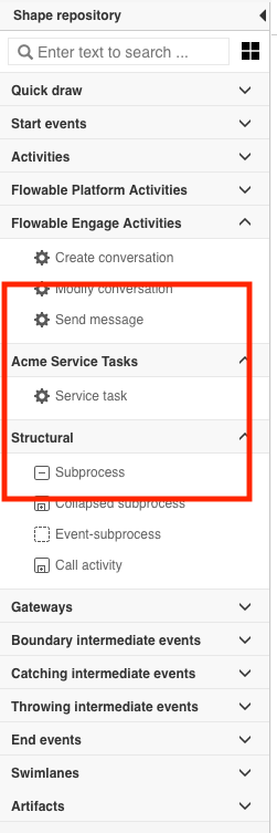
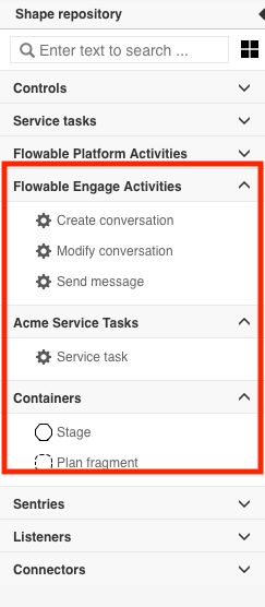
How was the index value determined? Each section of the palette is associated with a unique index value. The values are shown below, so any index value greater than 302 and less than 400 places this new item as shown in the image.
| Index Value | Section |
|---|---|
| 100 | Quick draw |
| 200 | Start events |
| 300 | Activities |
| 301 | Flowable Platform Activities |
| 302 | Flowable Engage Activities |
| 400 | Structural |
| 500 | Gateways |
| 600 | Boundary intermediate events |
| 700 | Catching intermediate events |
| 800 | Throwing intermediate events |
| 900 | End Events |
| 1000 | Swimlanes |
| 1100 | Artifacts |
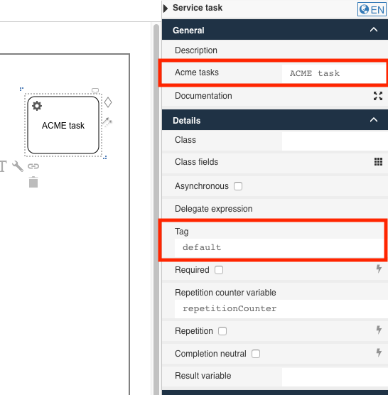
The final section of the file defines the contents of the details section at the right side of the Design window.
 <component attribute-groups="oneBaseAttributes,activitiMultiInstanceAttributes" extends="ServiceTask" id="Acme"
             presentation-id="Acme.presentation">

    <!-- Provide suitable default values for base attributes -->
    <attribute id="name" category="common" type="SimpleText"
               title="acme-tasks.title"
               description="acme-tasks.description"
               value="ACME task"
               readonly="false"
               optional="true"
               ref-to-view="text_name"/>

    <!-- use a fixed expression to invoke the service -->
    <attribute id="expression" category="edoras" type="SimpleText"
               value="#{acmeService.invoke(execution)}"
               readonly="true"
               optional="false"
               visible="false"/>

    <!-- add a custom attribute that we can access in the service -->
    <attribute id="tag" category="edoras" type="SimpleText"
               title="acme-tag.title"
               description="acme-tag.description"
               value="default"
               export="true"
               readonly="false"
               optional="false"/>
</component>
The first parameter, attribute-groups, specifies which typical attributes are associated
with this new modeling element. In this example, oneBaseAttributes and
activitiMultiInstanceAttributes indicate that the same basic information that is associated
with the default service task is used. Again a unique identifier is assigned and an
association made via, Acme.presentation to the component-presentation item defined
earlier.
The first attribute definition overrides the default Name entry field in the General
section. The parameters are described in the table below.
| Parameter | Description |
|---|---|
| id | The unique id of the attribute. In this example, the id of the field that we want to modify. The id of the name field is name |
| category | The category where the property should be located. common represents the "General" section, and edoras represents the "Details" section. |
| type | The type of the attribute. In this example, SimpleText |
| title | The key to find the text in the translation.properties. If not set the key is property.<id>.title |
| description | The key to find the text for the tooltip help in the translation.properties. If not set the key is property.<id>.description |
| value | The default text value to display in the input field |
| readonly | Boolean value specifying whether the field is modifiable |
| optional | Boolean value specifying if whether or not the field is required. Default is true. |
| ref-to-view | Specifies whether or not the value of this field is displayed as the contents of the image. |
The final two attributes share much of the same definition as name with the following
additions:
| Parameter | Description |
|---|---|
| visible | The boolean value specifying whether or not the attribute is visible in the property window |
| export | The boolean value specifying whether or not the value of the attribute is passed to the service |
Additional Data Types
The SimpleText data type is very common, but it does not always meet every need
for data collection. There are many data types available, but the following list addresses
many common needs:
-
TextArea: a multiline text input area
-
Integer: a spinner widget for selecting integer values
-
Boolean: a checkbox widget for select true and false
-
ComboBox: a drop-down combo box widget
-
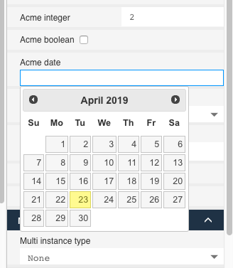
Date: a calendar data selection widget
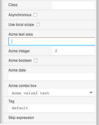
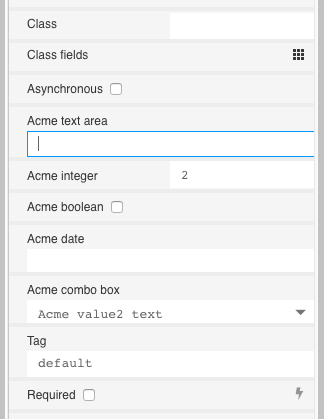
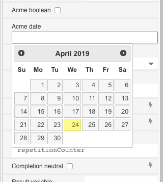
The Date type provides a date picking calendar widget:
The following code snippet defines the widgets shown in the images. The majority
of the parameters for each data type were previously defined for the SimpleText element.
The most significant addition is the use of <items></items> to define the contents
of the combo box. Each entry in the combo is defined in a <item></item> element. As seen
previously, each item has a unique id value. The value of the title element is what is
shown to the user, and if the value is found in the translation file, it is shown; otherwise,
the literal value is used. The value element is the constant provided to the task for
the given combo box selection.
<!-- TextArea -->
<attribute id="textArea" category="edoras" type="TextArea"
           title="acme-textArea.title"
           description="acme-textArea.description"
           value=""
           readonly="false"
           optional="true"/>
<!-- Integer -->
<attribute id="integer" category="edoras" type="Integer"
           title="acme-integer.title"
           description="acme-integer.description"
           value="2"
           readonly="false"
           optional="true"/>
<!-- Boolean -->
<attribute id="bool" category="edoras" type="Boolean"
           title="acme-bool.title"
           description="acme-bool.description"
           constant="true"
           value="false"
           readonly="false"
           optional="true"/>
<!-- ComboBox -->
<attribute id="combo" type="ComboBox" value="value2" readonly="false" category="edoras" optional="false"
           title="acme-combo.title"
           description="acme-combo.description">
    <items>
        <item id="c1" title="value-0" value="value0"/>
        <item id="c2" title="value-1" value="value1"/>
        <item id="c3" title="acme-combo.value2.title" value="value2"/>
        <item id="c4" title="acme-combo.value3.title" value="value3"/>
    </items>
</attribute>
<!-- Date -->
<attribute id="date" category="edoras" type="Date"
           title="acme-date.title"
           description="acme-date.description"
           value=""
           readonly="false"
           optional="true"/>
Translation Properties File
The translation.properties file associated with this example is:
acmeTasks.title = Acme Service Tasks
acme-tasks.title = Acme tasks
acme-tasks.description = This is the Acme service task.
acme-tag.title = Tag
acme-tag.description = Custom attributes accessed in the service.
acme-textArea.title = Acme text area
acme-textArea.description = Acme text area description.
acme-integer.title = Acme integer
acme-integer.description = Acme integer description.
acme-bool.title = Acme boolean
acme-bool.description = Acme boolean description.
acme-date.title = Acme date
acme-date.description = Acme date description.
acme-combo.title = Acme combo box
acme-combo.description = Acme combo box description.
acme-combo.value2.title = Acme value2 text
acme-combo.value3.title = Acme value3 text
Add a Custom Service Task to the Flowable Design Case Palette
When specific custom service beans (see Implement a Custom Service Task) are used regularly, it is convenient to extend the case palette in Flowable Design to include the customized service tasks for common use cases.
JSON Approach
The core requirement for adding a custom service task to the process palette is associating
the new task with the custom logic. This is done by overriding one of the
following attributes: class, expression, or delegateExpression:
-
classis when you implement theorg.flowable.cmmn.api.delegate.PlanItemJavaDelegateinterface and want to use an instance of the value ofclass. -
expressionis an expression and can be${caseInstance.setVariable('hello', 'world')}or other invocations on (Spring) beans like${myBean.someMethod()}. -
delegateExpressionis when you want to reference a spring bean, but not tie it to a specific class, but rather its id. For example,${conversationService}is a Spring bean, which implements the same delegate interface as in point 1. This option is the most flexible and upgrade friendly as it is not tied to hardcoded classnames.
For example to add the Acme service task to the Flowable Design process palette
using the expression option, the following definition is used:
{
  "$schema": "https://developer-docs.flowable.com/schemas/palette.json",
  "Palette-Id": "my-case-palette",
  "title": "My CMMN Palette Extension",
  "patchPalettes": ["flowable-case-palette"],
  "stencils": [
    {
      "id": "AcmeServiceTask",
      "name": "AcmeServiceTask",
      "superId": "ServiceTask",
      "groups": ["ServiceTasks"],
      "properties": [
        {
          "id": "expression",
          "value": "${myService.callMethod()}"
        }
      ]
    }
  ]
}
This will palette definition will:
- Extend the existing Flowable case palette (
flowable-process-palette) - Add a new service task with id
AcmeServiceTaskto theService tasksgroup - The expression is set to
${myService.callMethod()}
If you want to add an i18n label to the element, create a file named translation.properties next to the palette definition file and add the following to the json:
"resourceBundles": ["com/flowable/config/custom/palette/translation"],
Note that you can refer to any .properties file on the classpath. Also note it shouldn't contain the .properties suffix.
In the translation.properties file, add the following:
AcmeServiceTask.title=Acme Service Task
AcmeServiceTask.description=My custom service task example
(the description will be shown when hovering over the element)
Typically, it is required to hide the expression, class or delegateExpression property for a custom service task. After all, the expression or class is fixed to the actual implementation. To do this, add visible: false to the property:
 "properties": [
        {
          "id": "expression",
          "value": "${myService.callMethod()}",
          "visible": false
        },
        {
          "id": "class",
          "visible": false
        },
        {
          "id": "delegateExpression",
          "visible": false
        }
      ]
Finally, it's often wanted to add custom properties to the service task (either hard-coded or editable).
{
  "id": "customSetting",
  "type": "SimpleTextExpression"
}
This will add a property with a textfield edit field (due to the "type": "SimpleTextExpression" definition) when clicked to the property panel on the right-hand side.
Other often-used types are:
-
Boolean
-
Integer
-
TextArea
-
Multiline
-
Complex
Name Type Example complexItems Property { "id": "someId", "type": "SimpleText" } -
RestCombobox
Name Type Example restURL string /{{$workspaceKey}}/apps/{{$appKey}}/users?searchText={{$searchText}}restDataPath string datarestItemValuePath string idrestItemLabelPath string name -
... (check the default palette json files for possible types)
The property can be translated in the translation.properties file with:
property.customSetting.title=Test
property.customSetting.description=Test description
The property will be exported in the BPMN 2.0 XML in the design namespace and can be read at runtime from the model extension elements:
<task id="acmeServiceTask1" name="sdsd" flowable:type="java" flowable:expression="${myCustomServiceTask}">
  <extensionElements>
    <design:stencilid><![CDATA[AcmeServiceTask]]></design:stencilid>
    <design:stencilsuperid><![CDATA[ServiceTask]]></design:stencilsuperid>
    <design:customsetting><![CDATA[123]]></design:customsetting>
  </extensionElements>
</task>
XML Approach
The basic form of a palette extension modules is:
<?xml version="1.0" encoding="UTF-8"?>
<palette id="<NAME-OF-CASE-PALETTE>" hide-parent-palette-elements="true"
         xmlns="http://www.edorasware.com/schema/vis/palette"
         xmlns:xsi="http://www.w3.org/2001/XMLSchema-instance"
         xsi:schemaLocation="http://www.edorasware.com/schema/vis/palette http://www.edorasware.com/schema/vis/edoras-vis-case-palette-2.0.21.xsd"
         apply-patch-to-palette="edoras-one-case-palette"
         resource-bundle="translation">

    <component-presentations base-editor-view-path="component-presentations/editor-views" base-palette-icon-path="component-presentations/palette-icons">
        <component-presentation id="<ID-OF-PRESENTATION>" palette-big-icon-path="<BIG-IMAGE.svg>" palette-icon-path="<IMAGE.png>"/>
    </component-presentations>

    <group id="<TASK-ID>" index="<INDEX-VALUE>">
        <component attribute-groups="<ATTRIBUTE-GROUPS>" extends="ServiceTask" id="<ID>"
                   presentation-id="<ID-OF-PRESENTATION">
          <attribute id="<ATTRIBUTE-ID>" category="<CATEGORY>" type="<TYPE>"
                     title="<TRANSLATION-KEY>"
                     description="<TRANSLATION-KEY>"
                     value="<DEFAULT-VALUE>"
                     .... additional keywords
                     />
      </component>
    </group>
</palette>
The core requirement for adding a custom service task to the case palette is associating
the new task with the custom definition. This is done by overriding one of the
following attributes: class, expression, or delegateExpression:
-
classis when you implement theorg.flowable.cmmn.api.delegate.PlanItemJavaDelegateinterface and want to use an instance of the value ofclass. -
expressionis an expression and can be${planItemInstance.setVariable('hello', 'world')}or even beans${myBean.someMethod()}. -
delegateExpressionis when you want to reference a spring bean, but not tie it to a specific class, but rather its id. For example,${conversationService}is a Spring bean, which implements the same delegate interface as in point 1. This option is the most flexible and upgrade friendly as it is not tied to hardcoded classnames.
For example to add the Acme service task to the Flowable Design case palette
using the expression option, the following definition is used:
<?xml version="1.0" encoding="UTF-8"?>
<palette id="acme-case-palette" hide-parent-palette-elements="true"
         xmlns="http://www.edorasware.com/schema/vis/palette"
         xmlns:xsi="http://www.w3.org/2001/XMLSchema-instance"
         xsi:schemaLocation="http://www.edorasware.com/schema/vis/palette http://www.edorasware.com/schema/vis/edoras-vis-case-palette-2.0.21.xsd"
         apply-patch-to-palette="edoras-one-case-palette"
         resource-bundle="translation">

    <component-presentations base-editor-view-path="component-presentations/editor-views" base-palette-icon-path="component-presentations/palette-icons">
        <component-presentation id="Acme.presentation" palette-big-icon-path="serviceTask.svg" palette-icon-path="serviceTask.png"/>
    </component-presentations>

    <!-- palette configuration... -->
    <group id="acmeTasks" index="205">
        <component attribute-groups="baseAttributes" extends="ServiceTask" id="Acme"
                   presentation-id="Acme.presentation">

          <!-- Provide suitable default values for base attributes -->
          <attribute id="name" category="common" type="SimpleText"
                     title="acme-tasks.title"
                     description="acme-tasks.description"
                     value="ACME task"
                     readonly="false"
                     optional="true"
                     ref-to-view="text_name"/>

          <!-- use a fixed expression to invoke the service -->
          <attribute id="expression" category="edoras" type="SimpleText"
                     value="#{acmeService.invoke(execution)}"
                     readonly="true"
                     optional="false"
                     visible="false"/>

          <!-- add a custom attribute that we can access in the service -->
          <attribute id="tag" category="edoras" type="SimpleText"
                     title="acme-tag.title"
                     description="acme-tag.description"
                     value="default"
                     export="true"
                     readonly="false"
                     optional="false"/>
      </component>
    </group>
</palette>
The only change in the header of the basic format outlined early is the addition of the
id of the palette definition. In this example the value is set to acme-case-palette.
Also of note is that this file:
-
is "patching" or extending the system
edoras-one-case-palette. -
is "replacing" the existing elements via
hide-parent-palette-elements="true" -
is specifying the base name of the translation resource property file as
translation
<?xml version="1.0" encoding="UTF-8"?>
<palette id="acme-case-palette" hide-parent-palette-elements="true"
       xmlns="http://www.edorasware.com/schema/vis/palette"
       xmlns:xsi="http://www.w3.org/2001/XMLSchema-instance"
       xsi:schemaLocation="http://www.edorasware.com/schema/vis/palette http://www.edorasware.com/schema/vis/edoras-vis-case-palette-2.0.21.xsd"
       apply-patch-to-palette="edoras-one-case-palette"
       resource-bundle="translation">
The next section describes the general presentation of the palette addition. Once again much of
the content is "fixed". The base-editor-view-path and base-palette-icon-path are relative
paths specifying where to find view and icons related to this particular definition file.
An identifier, Acme.presentation is associated with the particular definition,
and the names
of the associated icons are defined. In this example, the system default images for a
service task are used: serviceTask.svg and serviceTask.png.
<component-presentations base-editor-view-path="component-presentations/editor-views" base-palette-icon-path="component-presentations/palette-icons">
    <component-presentation id="Acme.presentation" palette-big-icon-path="serviceTask.svg" palette-icon-path="serviceTask.png"/>
</component-presentations>
The top of the next section defines a unique identifier for the group and specifies it
position within the case palette. In this example, index="205" places the new task
between Flowable Engage Activities and Containers. The unique id, acmeTasks is also
used as a key into the translation.properties file to find the appropriate text to display.
Note, the .title suffix is added to the identifier before looking up the text.
<!-- palette configuration... -->
<group id="acmeTasks" index="205">
How was the index value determined? Each section of the palette is associated with a unique index value. The values are shown below, so any index value greater than 202 and less than 300 places this new item as shown in the image.
| Index Value | Section |
|---|---|
100 | Controls |
200 | Service tasks |
201 | Flowable Platform Activities |
202 | Flowable Engage Activities |
300 | Containers |
400 | Sentries |
500 | Listeners |
600 | Connector |
The final section of the file defines the contents of the details section at the right side of the Design window.
 <component attribute-groups="baseAttributes" extends="ServiceTask" id="Acme"
             presentation-id="Acme.presentation">

    <!-- Provide suitable default values for base attributes -->
    <attribute id="name" category="common" type="SimpleText"
               title="acme-tasks.title"
               description="acme-tasks.description"
               value="ACME task"
               readonly="false"
               optional="true"
               ref-to-view="text_name"/>

    <!-- use a fixed expression to invoke the service -->
    <attribute id="expression" category="edoras" type="SimpleText"
               value="#{acmeService.invoke(execution)}"
               readonly="true"
               optional="false"
               visible="false"/>

    <!-- add a custom attribute that we can access in the service -->
    <attribute id="tag" category="edoras" type="SimpleText"
               title="acme-tag.title"
               description="acme-tag.description"
               value="default"
               export="true"
               readonly="false"
               optional="false"/>
</component>
The first parameter, attribute-groups specifies which typical attributes are associated
with this new modeling element. In this example, baseAttributes indicates that the
same basic information that is associated
with the default service task is used. Again a unique identifier is assigned and an
association made via, Acme.presentation to the component-presentation item defined
earlier.
The first attribute definition overrides the default Name entry field in the General
section. The parameters are described in the table below.
| Parameter | Description |
|---|---|
id | The unique id of the attribute. In this example, the |
category | The value is either |
type | The |
title | The key to find the text in the translation.properties file. |
description | The key to find the text in the translation.properties file. This text is typically displayed as tooltip help. |
value | The default text value to display in the input field. |
readonly | Boolean value specifying whether the field is modifiable. |
optional | Boolean value specifying whether or not the field is required. |
ref-to-view | Specifies whether or not the value of this field is displayed as the contents of the image. |
The final two attributes share much of the same definition as name with the following
additions:
Parameter | Description |
visible | The boolean value specifies whether or not the attribute is visible in the property window. |
export | The boolean value specifies whether or not the value of the attribute is passed to the service. |
Additional Data Types
The SimpleText data type is very common, but it does not always meet every need
for data collection. There are many data types available but the following list addresses
many common needs:
-
TextArea: a multiline text input area
-
Integer: a spinner widget for selecting integer values
-
Boolean: a checkbox widget for select true and false
-
ComboBox: a drop-down combo box widget
-
Date: a calendar data selection widget
The Date type provides a date picking calendar widget:
The following code snippet defines the widgets shown in the images. The majority
of the parameters for each data type were previously defined for the SimpleText element.
The most significant addition is the use of <items></items> to define the contents
of the combo box. Each entry in the combo is defined in a <item></item> element. As seen
previously, each item has a unique id value. The value of the title element is what is
shown to the user, and if the value is found in the translation file, it is shown; otherwise,
the literal value is used. The value element is the constant provided to the task for
the given combo box selection.
<!-- TextArea -->
<attribute id="textArea" category="edoras" type="TextArea"
           title="acme-textArea.title"
           description="acme-textArea.description"
           value=""
           readonly="false"
           optional="true"/>
<!-- Integer -->
<attribute id="integer" category="edoras" type="Integer"
           title="acme-integer.title"
           description="acme-integer.description"
           value="2"
           readonly="false"
           optional="true"/>
<!-- Boolean -->
<attribute id="bool" category="edoras" type="Boolean"
           title="acme-bool.title"
           description="acme-bool.description"
           constant="true"
           value="false"
           readonly="false"
           optional="true"/>
<!-- ComboBox -->
<attribute id="combo" type="ComboBox" value="value2" readonly="false" category="edoras" optional="false"
           title="acme-combo.title"
           description="acme-combo.description">
    <items>
        <item id="c1" title="value-0" value="value0"/>
        <item id="c2" title="value-1" value="value1"/>
        <item id="c3" title="acme-combo.value2.title" value="value2"/>
        <item id="c4" title="acme-combo.value3.title" value="value3"/>
    </items>
</attribute>
<!-- Date -->
<attribute id="date" category="edoras" type="Date"
           title="acme-date.title"
           description="acme-date.description"
           value=""
           readonly="false"
           optional="true"/>
Translation Properties File
The translation.properties file associated with this example is:
acmeTasks.title = Acme Service Tasks
acme-tasks.title = Acme tasks
acme-tasks.description = This is the Acme service task.
acme-tag.title = Tag
acme-tag.description = Custom attributes accessed in the service.
acme-textArea.title = Acme text area
acme-textArea.description = Acme text area description.
acme-integer.title = Acme integer
acme-integer.description = Acme integer description.
acme-bool.title = Acme boolean
acme-bool.description = Acme boolean description.
acme-date.title = Acme date
acme-date.description = Acme date description.
acme-combo.title = Acme combo box
acme-combo.description = Acme combo box description.
acme-combo.value2.title = Acme value2 text
acme-combo.value3.title = Acme value3 text
Add a Custom Widget to the Flowable Design Form Palette
When specific widgets are customized regularly, it is convenient to extend the form palette in Flowable Design to include the customized widget to ensure consistency and reuse.
JSON Approach
Adding a custom form component to the form palette follows the same patterns as the descriptions above.
This example will add a new custom group to the palette, with one special password component that has two custom properties:
{
  "$schema": "https://developer-docs.flowable.com/schemas/palette.json",
  "Palette-Id": "my-form-palette",
  "title": "My Form Palette Extension",
  "patchPalettes": ["flowable-form-palette"],
  "resourceBundles": ["com/flowable/config/custom/palette/translation"],
  "groups": {
    "custom": {
      "index": 10
    }
  },
  "stencils": [
    {
      "id": "AcmePassword",
      "name": "AcmePassword",
      "superId": "base-password",
      "groups": ["custom"],
      "properties": [
        {
          "id": "minimumLength",
          "value": "8",
          "index": 10
        },
        {
          "id": "maximumLength",
          "value": "64",
          "index": 20
        }
      ]
    }
  ]
}
If you want to add an i18n label to the element, create a file named translation.properties next to the palette definition file and add the following to the json:
"resourceBundles": ["com/flowable/config/custom/palette/translation"],
Note that you can refer to any .properties file on the classpath. Also note it shouldn't contain the .properties suffix.
In the translation.properties file, add the following:
AcmePassword.title=Acme Service Task
AcmePassword.description=My custom service task example
property.minimumLength.title=Minimum length
property.minimumLength.description=Minimum length description
property.maximumLength.title=Maximum length
property.maximumLength.description=Minimum length description
(the description will be shown when hovering over the element)
XML Approach
The basic form of a palette extension modules is:
<?xml version="1.0" encoding="UTF-8"?>
<palette xmlns:xsi="http://www.w3.org/2001/XMLSchema-instance" id="<NAME-OF-FORM-PALETTE>"
         xmlns="http://www.edorasware.com/schema/vis/palette"
         xsi:schemaLocation="http://www.edorasware.com/schema/vis/palette
         http://www.edorasware.com/schema/vis/edoras-vis-form-palette-2.0.63.xsd"
         apply-patch-to-palette="flowable-form-palette"
         resource-bundle="translation>

  <component-presentations base-palette-icon-path="component-presentations/palette-icons" base-editor-view-path="component-presentations/editor-views">
    <component-presentation id="<ID-OF-PRESENTATION>" palette-icon-path="<BIG-IMAGE.svg>" palette-big-icon-path="<BIG-IMAGE.svg>" editor-view-path="<BIG-IMAGE.svg>"/>
  </component-presentations>

  <group id="<FORM-ID>" index="<INDEX-VALUE>">

    <component id="<WIDGET-ID>" ref="<BASE-WIDGET>" presentation-id="<ID-OF-PRESENTATION">
        <attribute id="<ATTRIBUTE-ID>" value="<VALUE>" readonly="<VALUE>"/>
    </component>
  </group>
</palette>
The core requirement for adding a custom widget to the form palette is associating the new widget with an existing widget definition. This is done by overriding attributes specified in the widget defined by the ref= parameter in the component definition.
<?xml version="1.0" encoding="UTF-8"?>
<palette xmlns:xsi="http://www.w3.org/2001/XMLSchema-instance" id="flowable-acme-form-palette"
         xmlns="http://www.edorasware.com/schema/vis/palette" xsi:schemaLocation="http://www.edorasware.com/schema/vis/palette
         http://www.edorasware.com/schema/vis/edoras-vis-form-palette-2.0.63.xsd"
         apply-patch-to-palette="flowable-form-palette"
         resource-bundle="translation">

  <component-presentations base-palette-icon-path="component-presentations/palette-icons" base-editor-view-path="component-presentations/editor-views">
    <component-presentation id="acme-password.presentation" palette-icon-path="password.png" palette-big-icon-path="password.png" editor-view-path="password.svg"/>
    <component-presentation id="acme-date.presentation" palette-icon-path="date.png" palette-big-icon-path="date.png" editor-view-path="date.svg"/>
  </component-presentations>

  <group id="acmeForm" index="199">

    <component id="acme-password" ref="base-password" presentation-id="acme-password.presentation">
        <attribute id="min-length" value="8" readonly="true"/>
        <attribute id="max-length" value="24" readonly="true"/>
    </component>

    <component id="acme-date" ref="base-date" presentation-id="acme-date.presentation">
        <attribute id="format" value="dddd DD MMM, YYYY"/>
        <attribute id="enable-time" value="true"/>
        <attribute id="time-interval" value="10"/>
    </component>
  </group>
</palette>
The only change in the header of the basic format outlined early is the addition of the
id of the palette definition. In this example, the value is set to acme-form-palette.
Also of note is that this file:
-
is "patching" or extending the system
flowable-form-palette. -
is specifying the base name of the translation resource property file as
translation
<?xml version="1.0" encoding="UTF-8"?>
<palette xmlns:xsi="http://www.w3.org/2001/XMLSchema-instance" id="flowable-acme-form-palette"
         xmlns="http://www.edorasware.com/schema/vis/palette" xsi:schemaLocation="http://www.edorasware.com/schema/vis/palette
         http://www.edorasware.com/schema/vis/edoras-vis-form-palette-2.0.63.xsd"
         apply-patch-to-palette="flowable-form-palette"
         resource-bundle="translation">
The next section describes the general presentation of the palette additions. Once again much of
the content is "fixed". The base-editor-view-path and base-palette-icon-path are relative
paths specifying where to find view and icons related to this particular definition file.
There are two presentations defined. The first presentation is for "acme-password" which defines a company-wide minimum and maximum length for passwords and another for "acme-date" which defines a company-wide default date format.
An identifier, acme-password.presentation is associated with the password definition and the names
of the associated icons are defined. In this example, the system default images for a
service task are used: password.svg and password.png.
Similarly, acme-date.presentation is associated with the date definition,
and the default system images are used.
<component-presentations base-palette-icon-path="component-presentations/palette-icons" base-editor-view-path="component-presentations/editor-views">
  <component-presentation id="acme-password.presentation" palette-icon-path="password.png" palette-big-icon-path="password.png" editor-view-path="password.svg"/>
  <component-presentation id="acme-date.presentation" palette-icon-path="date.png" palette-big-icon-path="date.png" editor-view-path="date.svg"/>
</component-presentations>
The top of the next section defines a unique identifier for the group and specifies it
position within the form palette. In this example, index="199" places the new widgets
between Data entry and Selection. The unique id, acmeForm is also
used as a key into the translation.properties file to find the appropriate text to display.
Note, the .title suffix is added to the identifier before looking up the text.
<group id="acmeForm" index="199">
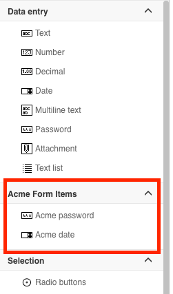
How was the index value determined? Each section of the palette is associated with a unique index value. The values are shown below, so any index value greater than 100 and less than 200 places this new item as shown in the image.
| Index Value | Section |
|---|---|
100 | Data entry |
200 | Selection |
300 | Display |
400 | Container |
999 | Flowable Work |
The final section of the file defines the contents of the details section at the right side of the Design window.
<group>
  <component id="acme-password" ref="base-password" presentation-id="acme-password.presentation">
      <attribute id="min-length" value="8" readonly="true"/>
      <attribute id="max-length" value="24" readonly="true"/>
  </component>

  <component id="acme-date" ref="base-date" presentation-id="acme-date.presentation">
      <attribute id="format" value="dddd DD MMM, YYYY"/>
      <attribute id="enable-time" value="true"/>
      <attribute id="time-interval" value="10"/>
  </component>
</group>

The first parameter, id specifies the identifier of the new widget; in this example, acme-password or
acme-date. The ref parameter specifies which Flowable supplied form element to modify. In this
example, base-password and base-date (more later on finding the names and attributes of the available
widgets. Finally, an association made via, acme-password.presentation and acme-date.presentation
to the component-presentation items defined earlier.
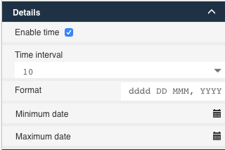
For the acme-password widget, a minimum and maximum length are set and made
read-only to match the corporate standards. Likewise, for acme-date, the default
format is set, the date includes the time, and the default interval is set to 10.
Translation Properties File
The translation.properties file associated with this example is:
acmeForm.title = Acme Form Items
acme-password.title= Acme password
acme-password.description = Ame password description.
acme-date.title = Acme date
acme-date.description = Acme date description.
Flowable Form Elements
The available elements provided by the system are found in the form.template.palette
file found in the flowable-vis-palettes-<version>.jar.
This list of elements includes:
-
base-accordion
-
base-attachment
-
base-button-group
-
base-checkbox
-
base-component
-
base-datatable
-
base-date
-
base-float-number
-
base-galleries
-
base-hline
-
base-html-component
-
base-iFrame
-
base-image
-
base-integer-number
-
base-link
-
base-link-button
-
base-multi-select
-
base-number
-
base-outcome-button-group
-
base-output
-
base-panel
-
base-password
-
base-pdf
-
base-radiobuttons
-
base-rest-button
-
base-rest-list
-
base-rich-text
-
base-script-button
-
base-single-select
-
base-string-list
-
base-sub-form
-
base-sub-panel
-
base-tab-panel
-
base-tabs
-
base-text
-
base-text-area
-
base-wizard
A completely new element can be created by modeling the existing options and modifying as needed.
Add a Custom Widget to the Flowable Design Pages Palette
When specific widgets are customized regularly, it is convenient to extend the pages palette in Flowable Design to include the customized widget to ensure consistency and reuse.
Changing the page palette follows the same steps as the form palette, with the exception of using the flowable-page-palette to extend from.
Hiding an Element From the Palette
To remove an element from the palette, add the following to your palette definition:
"removeStencils": ["ServiceTask", "OtherId"]
(this will for example remove the default service task and the element with id OtherId)
or in XML:
<remove-stencils stencil-ids=ServiceTask,OtherId/>
Hiding a Property From an Element
In case you want to hide properties from the default set of properties, the following must be done:
- Create a new stencil with a unique id, but extend from the element you want to overwrite the property of using the
superId. - Add
"visible": falseto the property you want to overwrite. - Remove the original stencil by id in the
removeStencilsarray.
For example, if you want to remove from the process palette the class property:
{
  "$schema": "https://developer-docs.flowable.com/schemas/palette.json",
  "Palette-Id": "my-palette",
  "title": "My BPMN Palette Extension",
  "patchPalettes": ["flowable-process-palette"],
  "stencils": [
    {
      "id": "LimitedServiceTask",
      "name": "LimitedServiceTask",
      "superId": "ServiceTask",
      "groups": [
        "flowable-activities",
        "flowable-quick-draw"
      ],
      "properties": [
        {
          "id": "class",
          "visible": false
        }
      ]
    }
  ],
  "removeStencils": ["ServiceTask"]
}
Adding a Property to an Existing Stencil
v3.14.0+noteThis functionality is only available for the React-based Design
To add new properties to an existing stencil in Flowable:
- Create a new object property called
additionalPropertieson the same level as your stencils. - For each stencil that you want to extend, add a key.
- The value is a list of properties that you want to extend. The syntax for the properties is the same as explained above
For example, if you want to add a new property called MyNewProperty to all Service tasks:
{
  "$schema": "https://developer-docs.flowable.com/schemas/palette.json",
  "Palette-Id": "my-palette",
  "patchPalettes": ["flowable-process-palette"],
  "additionalProperties": {
    "ServiceTask": [
      {
        "id": "MyNewProperty",
        "title": "My New Property",
        "type": "SimpleTextExpression",
        "value": "Default Value",
        "category": "commonDetails"
      }
    ]
  }
}
Sharing Properties Across Stencils With Property Packages
A propertyPackage is a named, reusable bundle of properties that can be attached to one or more stencils. Instead of redefining the same property on every custom stencil, define it once in a property package and reference the package from each stencil that needs it.
A palette definition declares property packages at the top level with propertyPackages. Each entry has a unique name and an array of properties using the same property syntax described in the previous sections. A stencil then references one or more packages by name through its own propertyPackages array — all properties defined in the referenced packages are added to the stencil at runtime.
For example, to share an acme-icon ComboBox property between two custom form components, both extending the built-in cloud-text component:
{
  "$schema": "https://developer-docs.flowable.com/schemas/palette.json",
  "Palette-Id": "acme-form-palette",
  "title": "Acme Form Palette Extension",
  "patchPalettes": ["flowable-work-form-palette", "flowable-work-page-palette"],
  "resourceBundles": ["com/flowable/config/custom/palette/translation"],
  "groups": {
    "acme-components": {
      "index": 10
    }
  },
  "presentations": [
    {
      "id": "acme-component.presentation",
      "icon": "component-presentations/palette-icons/acme-component.png",
      "bigIcon": "component-presentations/palette-icons/acme-component.svg"
    }
  ],
  "stencils": [
    {
      "id": "acme-component-one",
      "groups": ["acme-components"],
      "superId": "cloud-text",
      "presentationId": "acme-component.presentation",
      "propertyPackages": ["acmeIconProperties"]
    },
    {
      "id": "acme-component-two",
      "groups": ["acme-components"],
      "superId": "cloud-text",
      "presentationId": "acme-component.presentation",
      "propertyPackages": ["acmeIconProperties"]
    }
  ],
  "propertyPackages": [
    {
      "name": "acmeIconProperties",
      "properties": [
        {
          "id": "acme-icon",
          "type": "ComboBox",
          "path": "extraSettings.acmeIcon",
          "value": "",
          "category": "commonDetails",
          "items": [
            {
              "id": "1",
              "value": "icn_access_circle",
              "title": "Access Circle"
            },
            {
              "id": "2",
              "value": "icn_add_circle",
              "title": "Add Circle"
            }
          ]
        }
      ]
    }
  ]
}
This palette definition will:
- Extend the Flowable Platform form and page palettes (
flowable-work-form-palette,flowable-work-page-palette) - Add two new components (
acme-component-one,acme-component-two) to a newacme-componentsgroup, both extending the built-incloud-textcomponent - Define a single
acmeIconPropertiespackage containing anacme-iconComboBox, and apply it to both components without repeating the property definition
A stencil can also declare properties directly alongside the propertyPackages reference. If a directly-defined property uses the same id as one provided by a referenced package, the package property is taken as the base and the stencil's property selectively overrides individual fields on it (for example, changing the default value or marking it visible: false for a specific stencil).