Flowable Work User Guide
This user guide explains the concepts and features of Flowable Work. All of the features provided in Flowable Work are also available in Flowable Engage.
What is Flowable Work?
Flowable Work is a flexible technology for delivering dynamic and adaptive process and case management solutions.
With Flowable Work you can model your business application, through processes, decision rules, case structures and forms. Visual editing tools make it easy for the business modeler – expert or citizen developer – to create rich and sophisticated business models. These models can then be executed dynamically by Flowable Work to deliver an adaptable business application. This enables a solution to be continuously improved, being as agile as the circumstances require. Flowable Work is built on the trusted and highly scalable open source Flowable Engine, which provides the engines for driving models defined with the open standards BPMN, CMMN and DMN.
Main Concepts
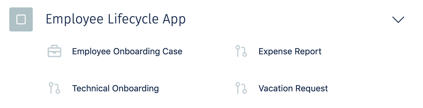
Flowable App
A Flowable App contains all types of models and configurations to support a specific aspect or area of your organization. An App can be deployed and all of its models become available to drive the behavior of your work items. For instance, you could have a Flowable App that contains all the work items related to an Employee Lifecycle.
Work Item
Flowable organizes everything you do around the concept of work items. No matter whether you start a new case or process, both are work items and support a common set of functionalities like ownership and assignment, due date and priority. Forms are used to manage the data associated with work items. Work items can have relations with each other and support hierarchies. The behavior of a work item is driven by its model, which is called a definition. For instance, a process is driven by its process definition, which is modeled using the modeling standard BPMN 2. These models can be designed and configured within the Flowable Design application.
Case
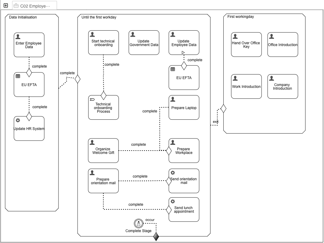
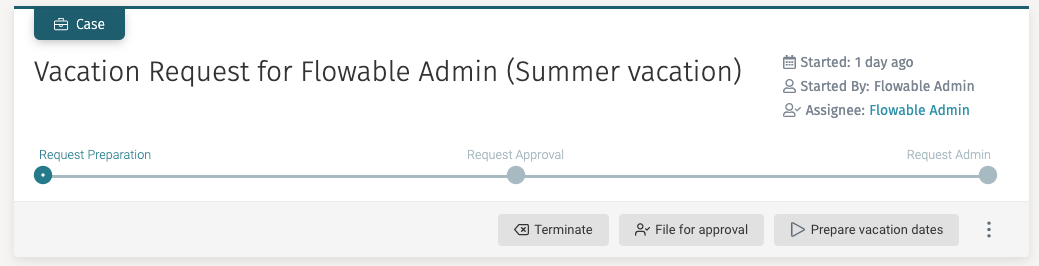
A case (also referred to as a CMMN case) acts as the main context around a collection of work items and information. A case can represent many things, depending on how you define it. Think of a case like a box with a label where you can find everything that you need to work on a particular task. There are small and large boxes, square and round ones, boxes with one compartment only or boxes with many compartments to organize the contents. For example, if you handle customer complaints with Flowable Work, a single "complaint" could become a case and everything that happens while solving that complaint can be stored in and made available in that case. Alternatively, if you use Flowable Work for your recruiting, each job applicant is represented by a case where all structured data like name, birthday, etc. for the applicant is part of the case form and documents like CV and references are simply stored within the case as attachments. Another excellent fit for Flowable Work is request and approval handling where a vacation request, a travel request or even a request for a quote from a customer becomes a case, supporting the handling and approval process through Flowable Work. The lifecycle of a case is represented by Stages that allow you to break the business problem down into a set of phases to resolve a case.
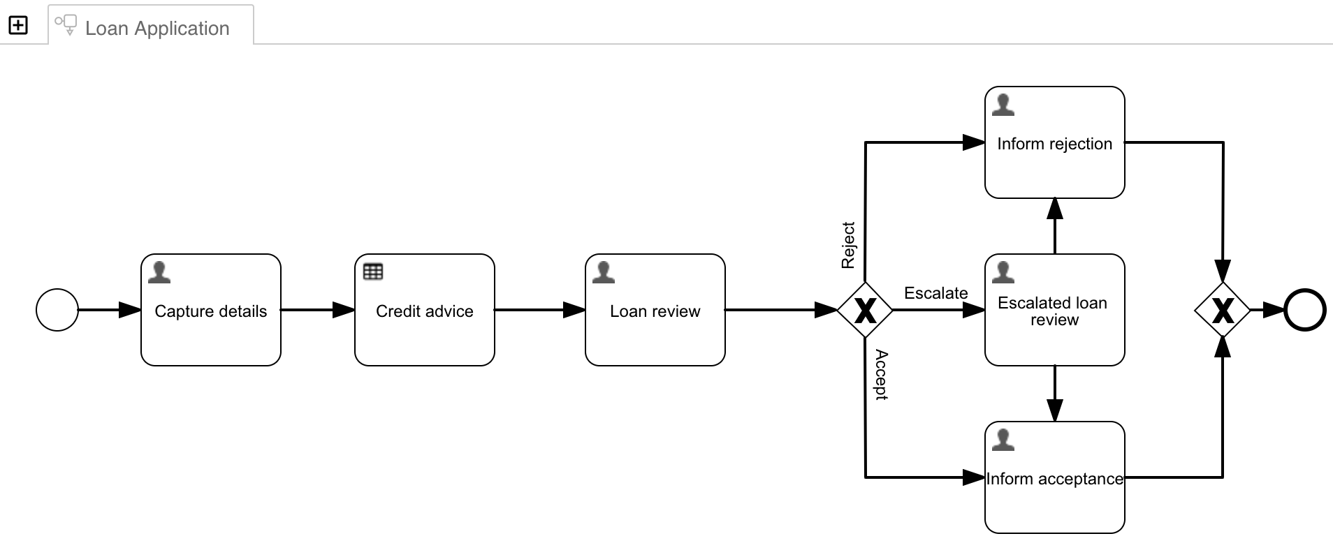
Process
A process describes the tasks and steps that must be followed, including collecting information from people and interacting with other computer systems and services, in order to fulfill a specific objective. A process model encapsulates best practices or mandatory procedures for an organization.
Task
A task (also referred to as a human task) is a step that can be inside a case, a process or completely isolated. At its bare minimum, a task should contain a name, an assignee and either a description of what needs to be done to complete the task or a form that the assignee needs to fill to complete the task.
Getting Started
To access Flowable Work you need to type in the navigation URL into your browser. Once the page is loaded, the login page appears.
Your system administrator should provide you with the URL. The URL is typically
something like https://<hostmachine>:<port>/flowable-work/.
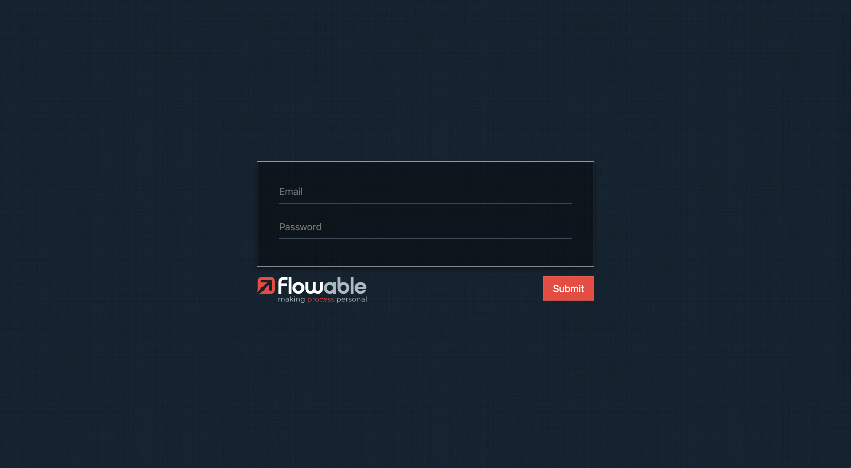
In order to log in, you need to type in your login and password on the form and
click on the Submit button.
User Interface
This is the main Flowable Work web interface that appears after logging in:
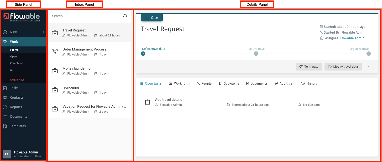
Side Panel
The side panel contains the main navigation of Flowable Work. It helps you to orient yourself within the application.
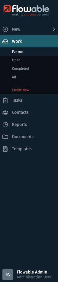
On the top you can find the New button. It allows you to create work
items (cases or processes).
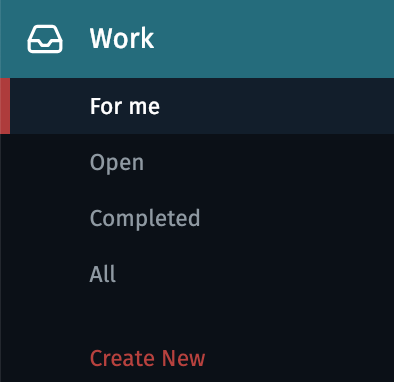
The next button is Work. When clicking on it, you are routed to your
work Inbox, that displays all your work items. It also expands the Work
menu to show different submenu items. Each of the submenu items is configured
to only display a specific subset of work items in your inbox, e.g., show only
work items where you are involved or show only completed work items.
For more information see the section Work.
Below the Work button is the Tasks button. When clicking on
the button you are
routed to your task Inbox, which displays all your tasks. It also expands the
Tasks menu to show different submenu items. Each of the submenu items is
configured to only display a specific subset of tasks in your inbox, e.g., show only
tasks where you are involved or show only tasks that are not assigned to anybody.
For more information see the section Tasks.
In the Contacts section you can manage your contacts, e.g., you can
find the details of the user profiles with which you can interact.
To discover all features of the contact management have a look at the chapter
about Contacts.
The Reports section lets you access a dashboard that provides a
quick overview of application usage.
If you want to know more see Reports.
Depending on the configuration of your web application and the individual user permissions, you may only see some of the menu items in the side panel.
Besides the default menu, other applications of the Flowable Portfolio can be integrated into the user interface.
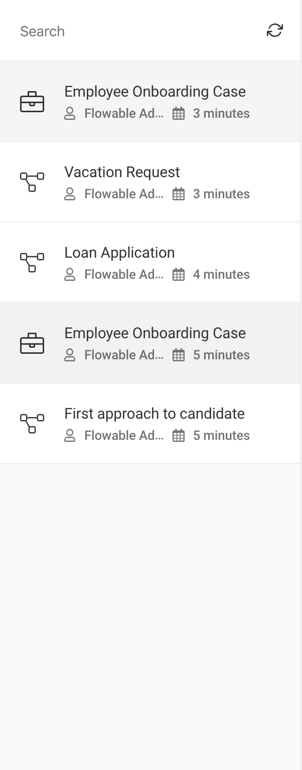
Inbox Panel
The inbox panel has two main areas: a search box and a list section. In the list section items that match the selected criteria from the selected option of the side panel combined with the typed search characters are shown. For example, if you select Work and For me in the submenu, you only see work items where you are involved.
You can resize the inbox panel to make it wider by placing your mouse in the dividing line between the inbox and the details panel until it changes to a horizontal resize one, then click and resize to your liking.
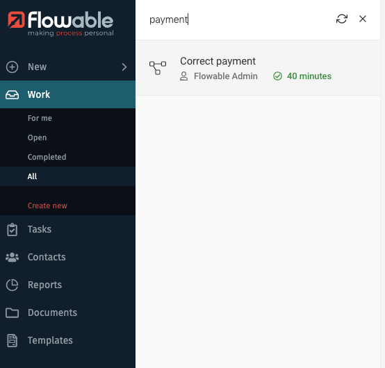
Search Box
At the top of the inbox, you can find a search field that lets you search by name in the displayed list and a refresh button. You can type the full name or even a part of it. To clear your search, press the X button.
Details Panel
The details panel shows the information on the selected item from the inbox panel, letting you overview all case related data, interact with a form if there is one, view the different steps of a process, etc. You can find more information about each variant of the details panel in the specific sections: Work details panel, Task details panel, Contacts details panel.
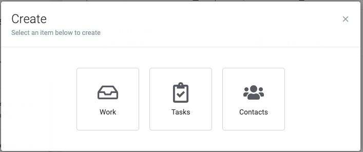
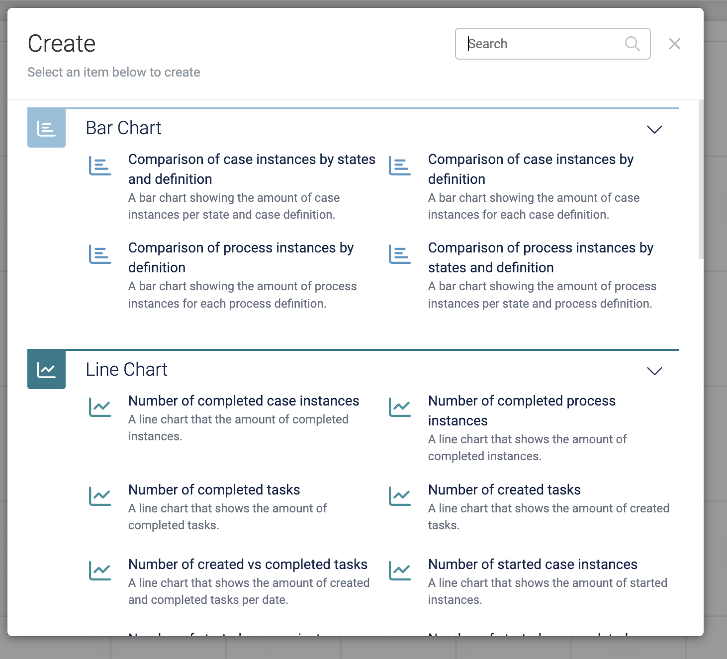
Create New Items
The New function lets you create a new Work, Task or Contact item.

When clicked, a dialog opens in the middle on the screen to select which item you want to create:
New Work
The New function lets you create new a Work, Task, or Contact item.
When clicked, a dialog opens in the middle of the screen to select which item you want to create:
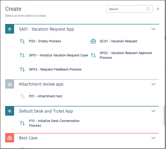
If the first option Work is chosen, the list of available cases and processes are shown, grouped by Flowable App, letting you select which one you want to create. The list is scrollable using your mouse wheel and contains a search box to search by name. You can also collapse app sections for better reading.
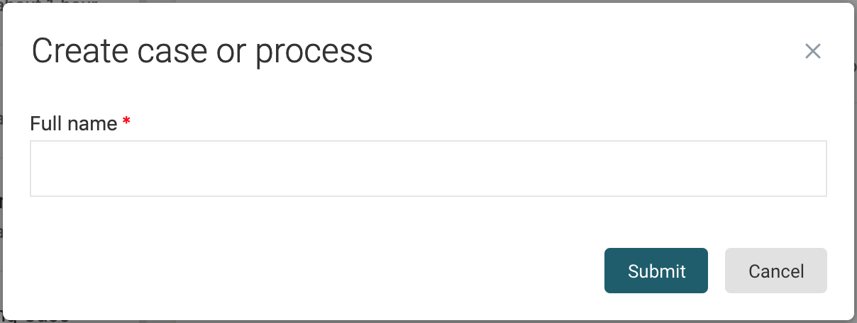
After selecting which work item you want to create, if there is an init form associated to the work item, it would open as a new dialog showing the form so that you can enter the initial values for it, for example:
After filling the init form (if there is one), the navigation would take you to the corresponding section of the side panel according to the item you have created, have it selected in the inbox panel, and it is shown in the details panel.
New Tasks
The New function lets you create new a Work, Task, or Contact item.
When clicked, a dialog opens in the middle of the screen to select which item you want to create:
If the second option Tasks is chosen, the window for creating a new Ad hoc task
appears with a simple form that you need to fill to create it. Only the name is
required, as it serves to identify the task in the tasks list. The other two optional
fields are Assignee, in case you want to assign the task to a particular member of your
organization, and Description, which you can use to describe what the task involves, and
what needs to be accomplished for someone to complete the task. Once you have
filled the fields, you can press the Submit button to create it. At any time you can
click on Cancel and the task is not created.
You can use some Markdown features to format the description message.
After creating the ad hoc task, the Task main option is selected, and the task is shown in the inbox list, and its details are shown in the details panel. The description of an ad hoc task is displayed below its title.
New Contacts
The New function lets you create new a Work, Task, or Contact item.
When clicked, a dialog opens in the middle of the screen to select which item you want to create:
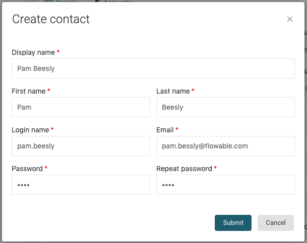
If the third option Contacts is chosen, a window appears which lets you select the profile (also called technically user definition) of the user you want to create. The profile of the contact determines which functions he can access and perform.
After selecting the profile, the window shows the fields needed for creating the
contact. Mandatory fields are marked with a red asterisk (*) and the fields that are
shown are determined by the profile that was selected. For example, to create an
external client, you need to select a Client advisor for him. Once you have filled in all
mandatory fields, you can press the Submit button.
After creating the contact, the window closes, the Contacts main option is selected in the side panel, and your recently created contact is loaded into the details pane.
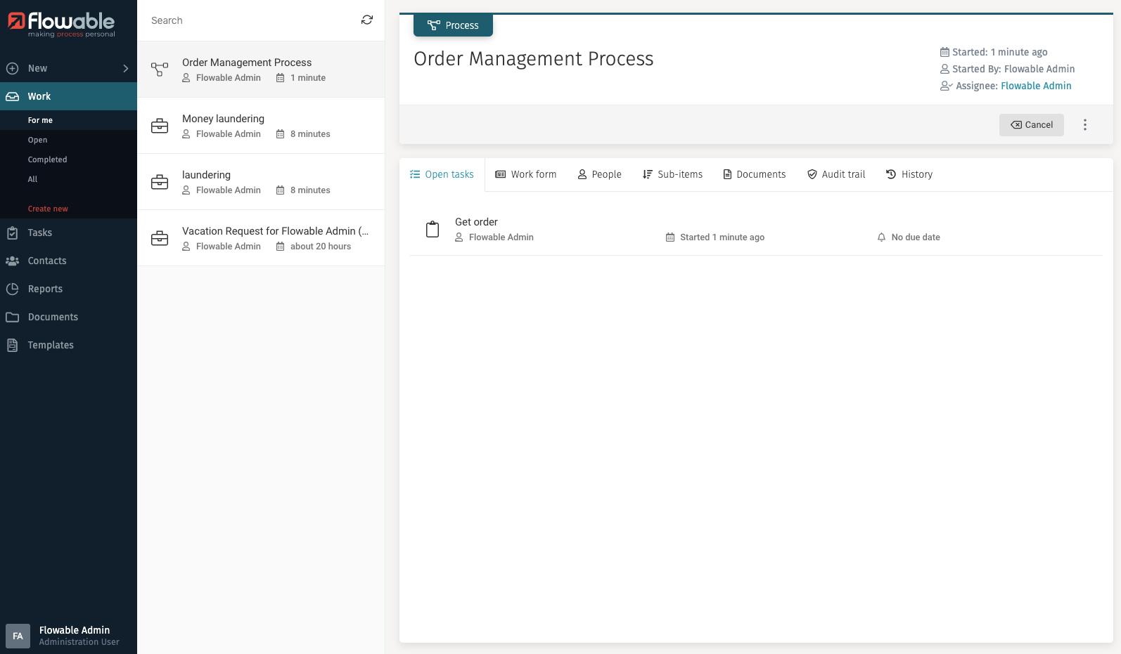
Work
The Work button lets you access the list of created work items.

When you click on Work the inbox loads the list of work items that are for me,
and it expands the list of other available filters for work items. The button
for creating a new work item is also shown.
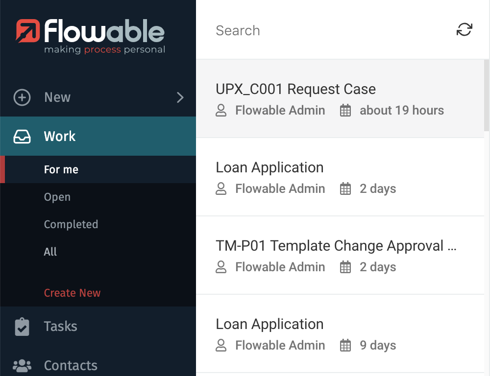
Work Inbox
The Work Inbox shows you work items based on the filter you have selected in the expanded list. For example, if the For me filter is selected in the submenu, you only see work items where you are involved.
The work items are ordered by Creation date descending, thus showing the most recent items first.
Creating New Work
Similar to the New button, when you click on Create new, a window appears to select which case or process you want to start. The list is scrollable using your mouse wheel and contains a search box to search by name.
After selecting which work item you want to create, if there is an init form associated to the work item, it would open as a new modal window showing the form so that you can enter the initial values for it, for example:
After filling the init form (if there is one), the navigation would take you to the corresponding section of the side panel according to the item you have created, it is selected in the inbox panel, and it is shown in the details panel.
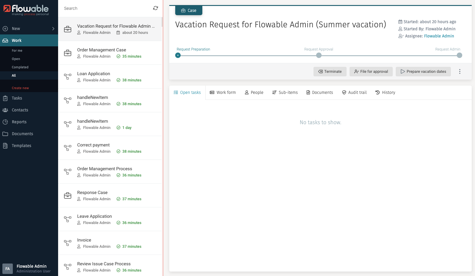
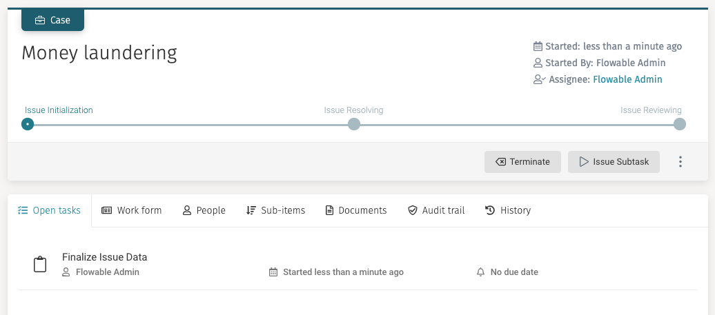
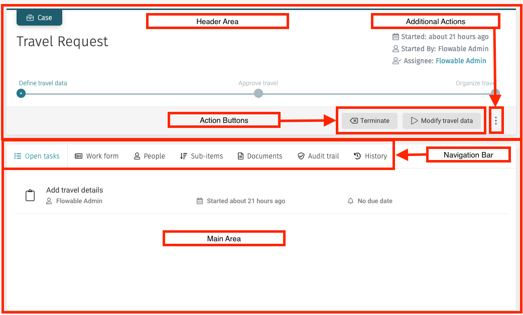
Work Details
The details panel of a selected work item contains all the information about the item, a navigation bar to see more details, a button for additional actions, and a main area to interact with the selected work item.
The Work Details panel differs from a case to a process slightly:
Case
Process
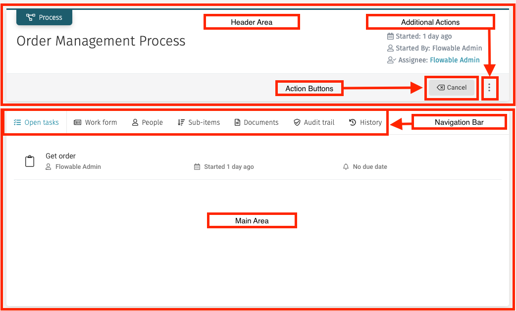
Header
The header contains the name of the work item when it was started and by whom, and a button to perform additional actions.
If the work item is a case, it might show the action buttons that have been modeled for it as well as its stages, which are shown in the form of a multistep diagram, showing completed and pending stages.
If the work item is a descendant of another work item (for example, a process that is created inside a case), a navigation link to the parent work item is shown and clicking on it loads the details of that work item, similar to the one that appears when selecting a task inside a case.
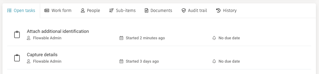
Open Tasks
If the Open Tasks tab the list of visible open tasks from the work item is displayed in list form. You can then click on a task, and the task details view is shown. Refer to Task Details for more information about this view.
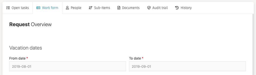
Work Form
A work item can have a work form, that is designed in the Flowable Modeler. When selecting this option, the work form is displayed.
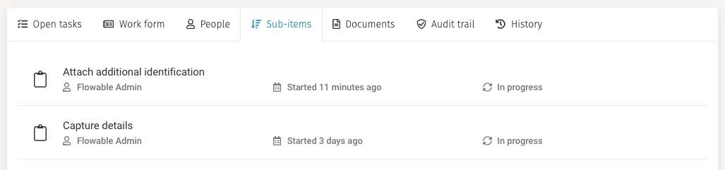
Sub-items
In this tab, you can view the hierarchy of work items and tasks that are descendants of the selected work item. For example, you can view the tasks that are part of your process. This list is scrollable.
Documents
In the documents tab, you can attach files to the work item, view already attached files and delete attached files.
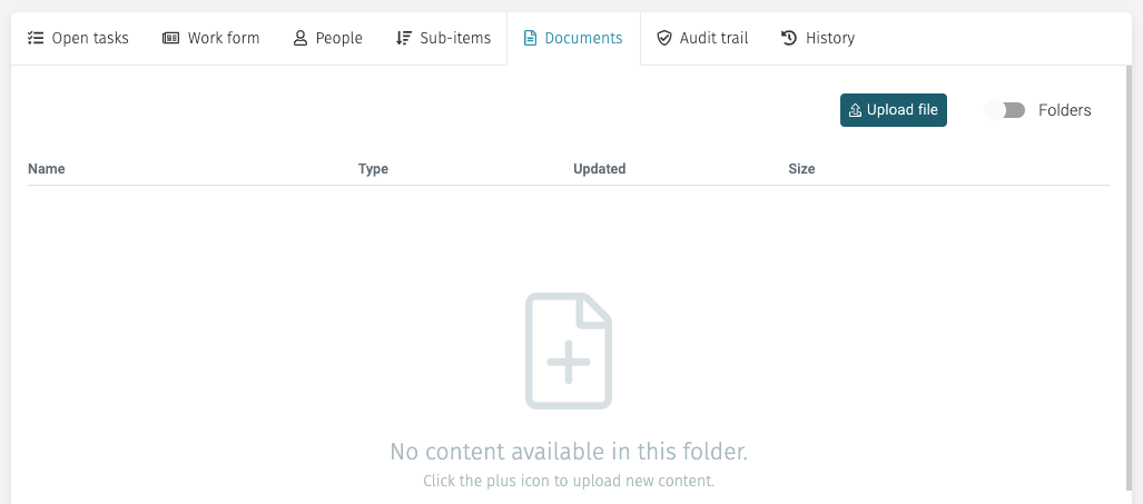
To attach a new file, you can drag and drop new files into the dotted box or click on the link, and a window for choosing the file from your system is opened.
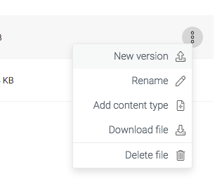
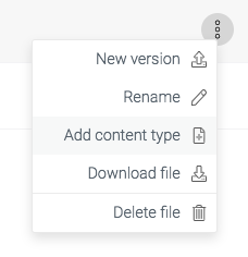
To delete a document, click on the button represented by the three dots and select Delete file.
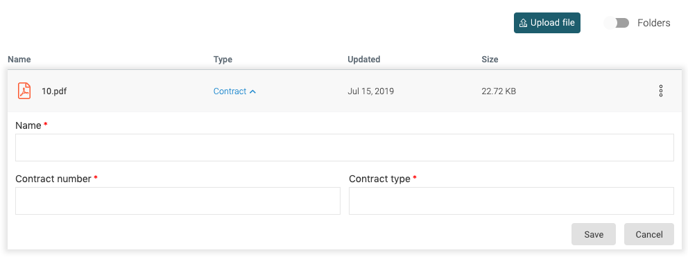
You can add metadata to document by same button and select Add content type.
This selection opens a
panel below where you can enter the content type (for example Contract) and based on
the selected content, additional fields appear. To save your metadata,
you have to press the Save button in the header area.
History
The history tab contains several subtabs:
Diagram
The diagram tab shows the CMMN or BPMN diagram of the respective work item, showing in different colors the steps that are completed, active, and pending.
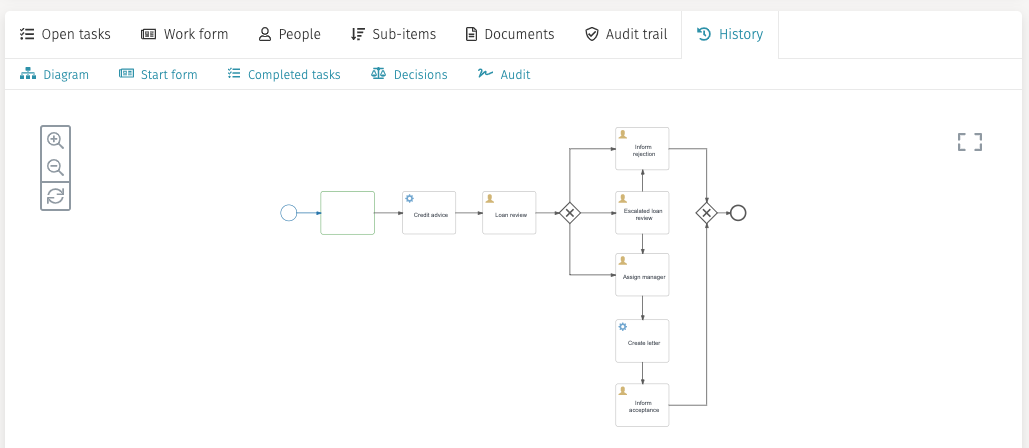
You can zoom in or out by using your mouse scroll wheel or the buttons.
You can move around the diagram by left-clicking and dragging in the diagram area.
You can view the diagram in full screen by clicking the upper-right corner frame icon. To exit from the full screen view, click the X button in the upper-right corner.
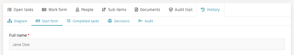
Start form
The start form tab shows the data that was filled in the start form when the work item was created.
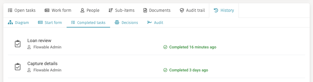
Completed tasks
In the completed tasks tab, you can view all the previously completed tasks of the work item and review their forms.
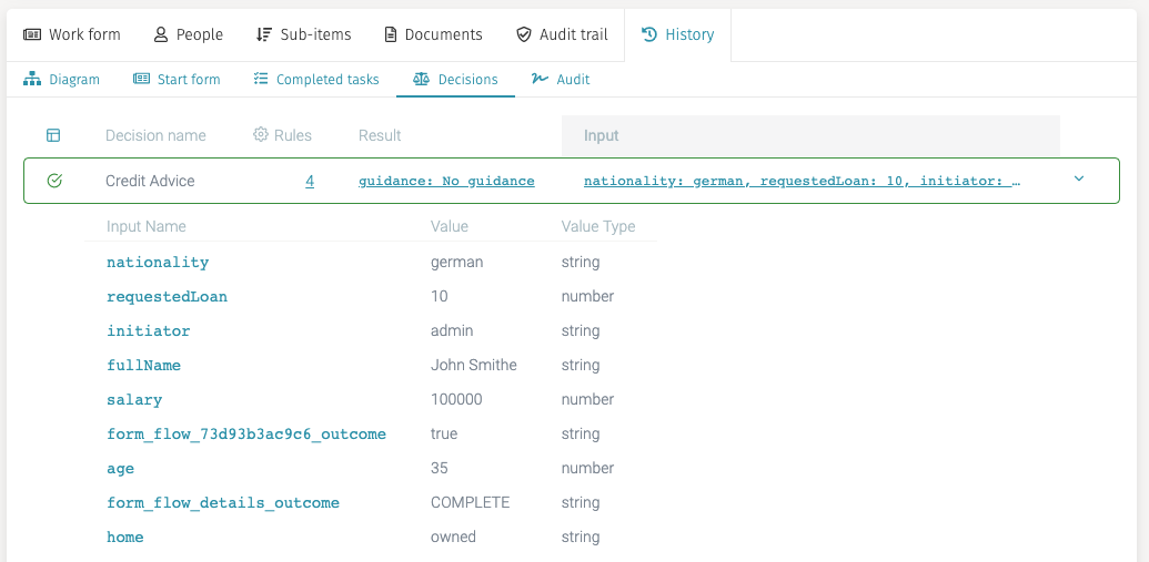
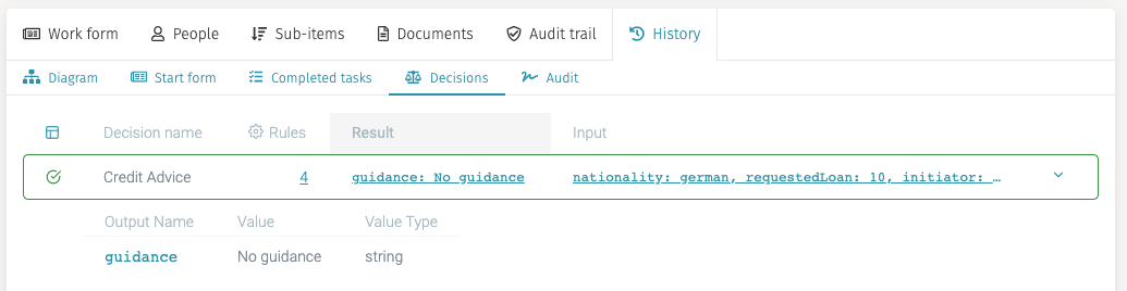
Decisions
If your work item has executed at least one decision table (also referred to as a DMN table), this tab shows a detailed analysis of the decisions that were taken based on them.
When you click on the rules column value for a particular decision table execution, the DMN table is shown, highlighting the matching rules and the outcome.
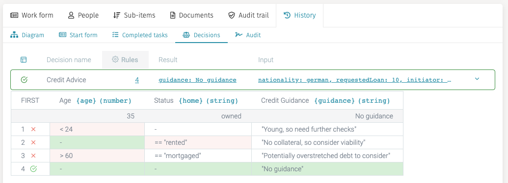
You can also click on the input to review the values that were in the process and so potentially taken into account by the decision table to match its rules by clicking on the value in the input column.
Finally, if you click on the result value, the results of the decision table are shown.
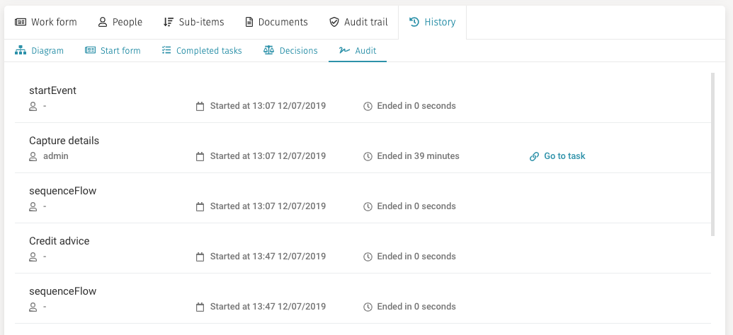
Audit
The audit tab shows a scrollable list of all the different events that have happened to the work item, ordered by creation date ascending.
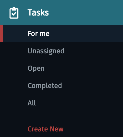
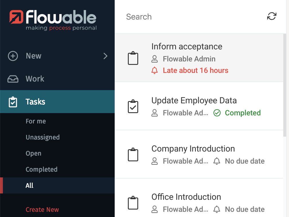
Tasks
The Tasks button lets you access the list of created tasks.

A work item most probably contains some tasks that must be completed by you or your team in order to accomplish the objective of that work item. For example, if you have a Loan Review process, it is very likely that you have a task that revolves around collecting the requestor financial information, such as income, the amount requested, nationality, etc.
When you click on Tasks the inbox loads the list of tasks that are for me,
and it expands the list of other available filters for tasks. The button for
creating a new task is also shown. But keep in mind that this newly created
task is somehow special: it creates what is called an ad hoc task. An ad hoc
task is different from a task in the sense that it does not belong to the
hierarchy of a work item: it is not part of a process or a case. Also,
an ad hoc task does not have a form associated to it. It only contains
four fields: name of the task, assignee, due date, and description
(only the name is required).
Task Inbox
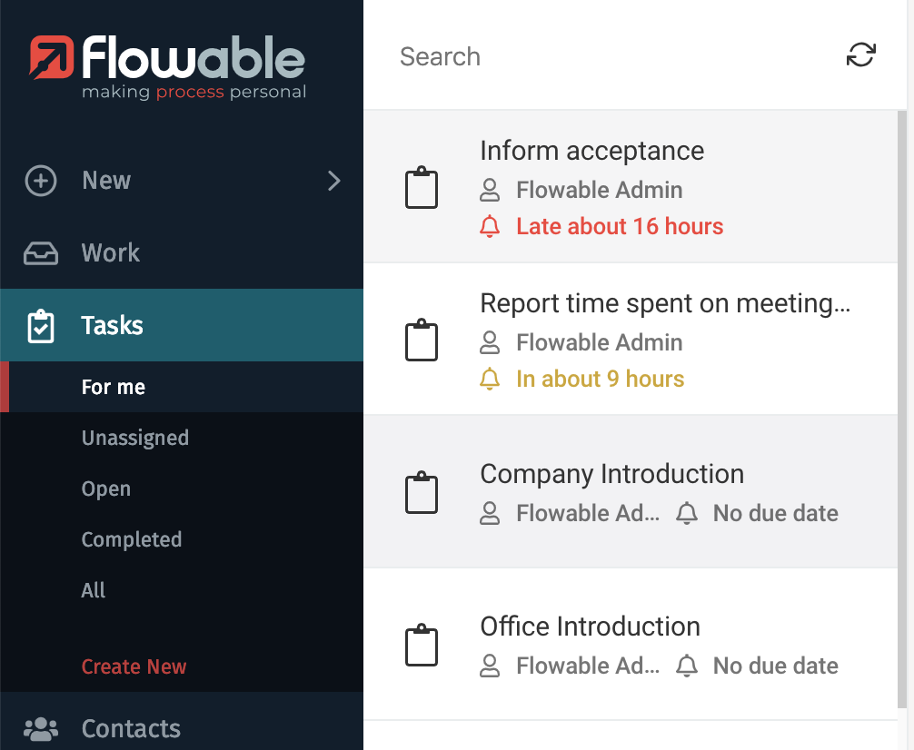
The Tasks Inbox shows you tasks based on the filter you have selected in the expanded list. For example, if the For me filter is selected in the submenu, you only see tasks you are assigned to.
The ordering of the tasks depends on the filter you have selected:
- For the filters For me, Unassigned, or Open tasks the order is the combination of: by due date ascending, by priority descending and by creation time descending. This means that tasks that have their due date close are on top, then for the ones that have the same due date the ones with highest priority and then the ones that were most recently created.
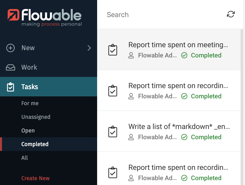
- For the filter Completed tasks the order is by completion date descending, meaning that most recently completed tasks are shown on top of the list.
- For the filter All tasks the order is by creation date descending, meaning that most recently created tasks are shown on top of the list.
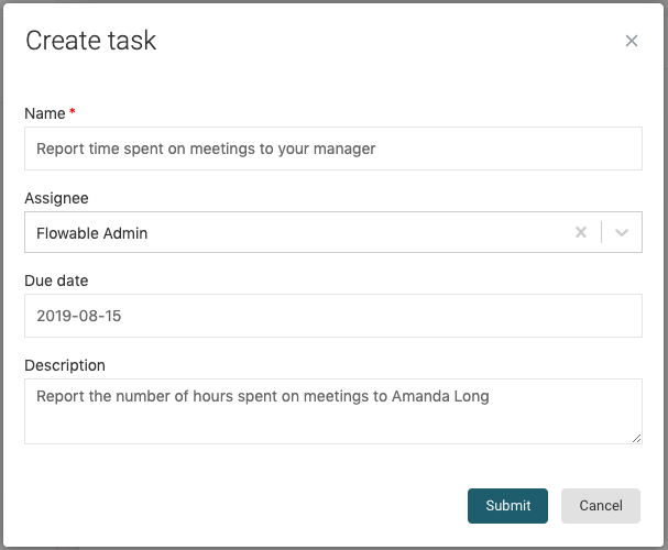
Creating New Ad Hoc Tasks
When you click on the Create new item under the Tasks section, a window appears with
a simple form that you need to fill to create a new ad hoc task. Only the name is
required, as it serves to identify the task in the tasks list. The other two optional
fields are Assignee, in case you want to assign the task to a certain member of your
organization, and Description, which you can use to describe what the task involves,
and what needs to be accomplished in order for someone to complete the task. Once you
have filled the fields you can press the Submit button to create it. At any
time you can click on Cancel and the task is not created.
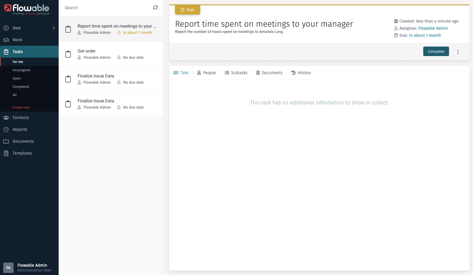
After creating the ad hoc task, it appears in the inbox list, and its details are shown in the details panel.
If you look at the top right of the details panel, there is a Complete button.
By clicking on this button, you are informing that the task has been performed and
mark the task as completed.

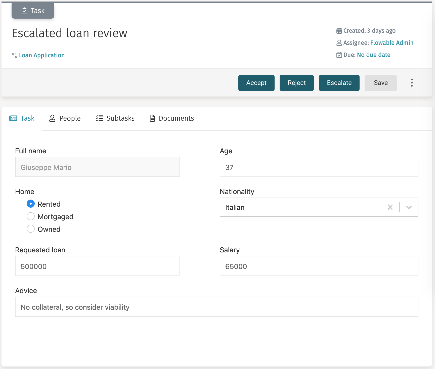
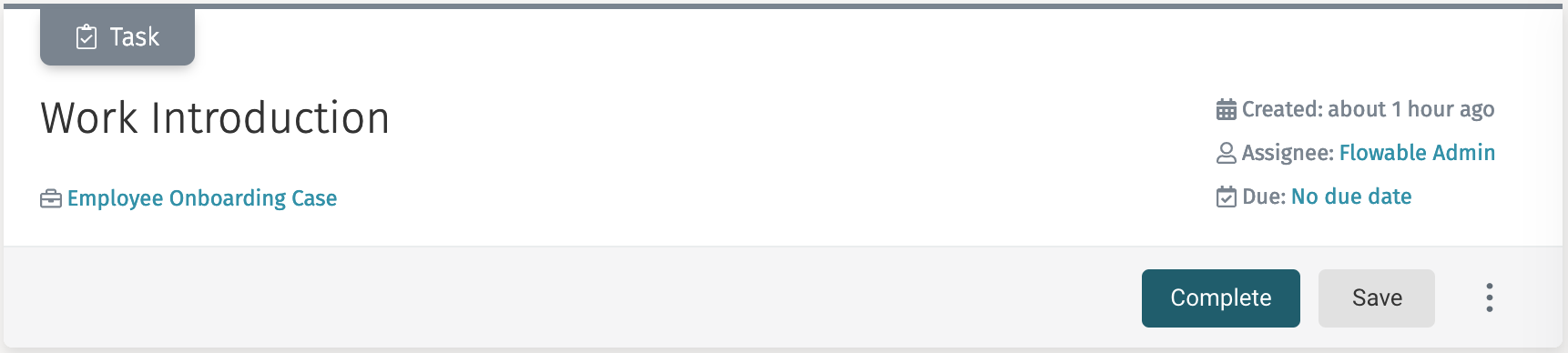
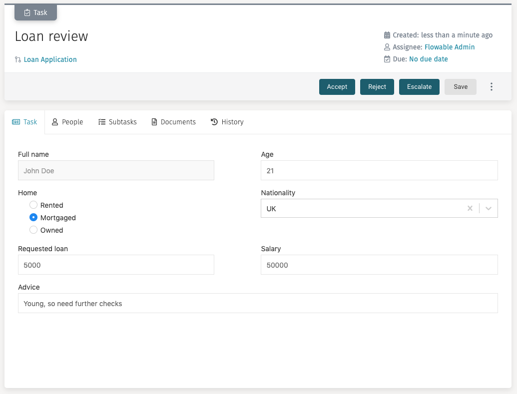
Task Details
The details panel of a selected task contains all the information about the task, a navigation bar to see more details, a button for additional actions, and a main area to interact with the selected task.
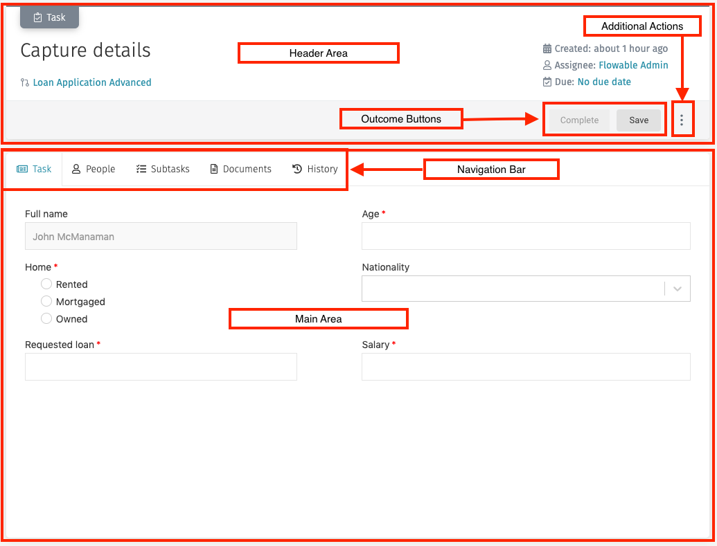
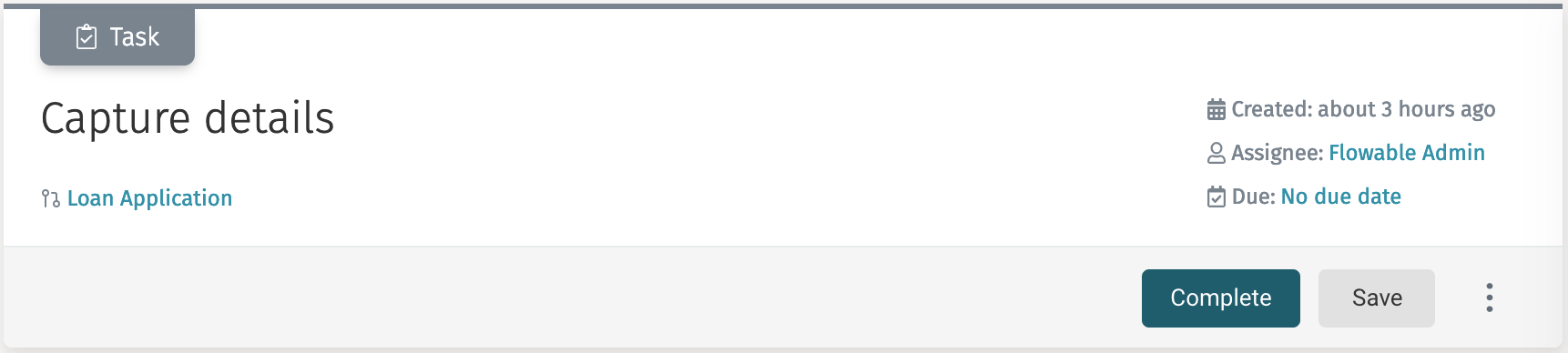
Header
The header contains the name of the task, when it was started and by whom, a link to the work item that contains the task (not shown if the task is an ad hoc tasks as ad hoc tasks are not related to a work item), a button to perform additional actions, and the outcome buttons.
If you click on the link to the work item, it navigates to the corresponding work item to display its details panel and the Work inbox is displayed.
The Task ribbon on top of the header is shown in different colors to quickly display information about the task
| Task Condition | Ribbon Color |
|---|---|
| Assignee set, no due date | 52 tasks details header task grey |
| Due date set in the future | 52 tasks details header task yellow |
| No assignee | 52 tasks details header task yellow |
| Due date reached | 52 tasks details header task red |
Assignee
The assignee field in the header shows the current assignee of the task.
If there is no assignee, the text nobody is shown, and the outcome buttons are
replaced by a Claim button.
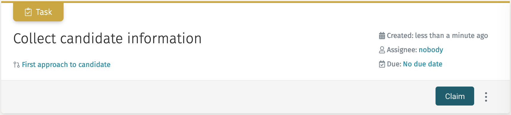
If there is no assignee, the Task ribbon on top of the header is shown as yellow.
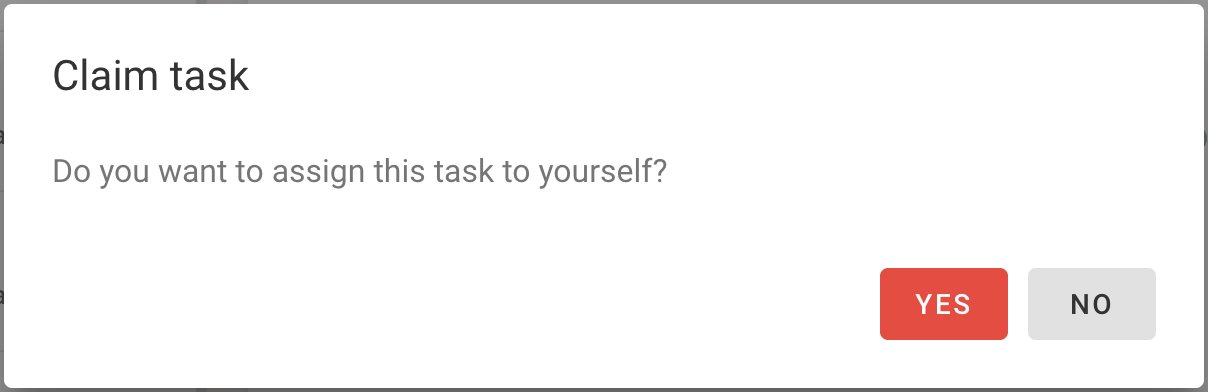
Claim lets you set yourself as assignee. When you click the Claim button,
a window for you to confirm that you want to assign the task to yourself.
Once you click on Yes, you are the assignee of the task,
and the outcome buttons are replaced back.
A task cannot be completed without an assignee.
If you have the appropriate permissions, you can change the assignee of the task at any moment by clicking on the name of the assignee. Once you click, a search list appears where you can select directly which user you want to set as assignee.
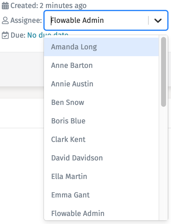
You can type some letters of the user name you want to search for to aid you in the selection.
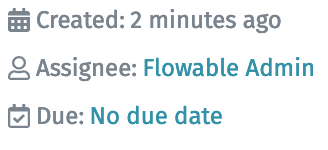
Due date
The Due date field (shown as Due) in the header displays the due date of the task. This is an additional information attribute that you can use to specify when a task should be completed.
If no due date is set, No due date is shown.
Once you click on the due date value, a date picker appears and you can select the day you want to set as the due date.
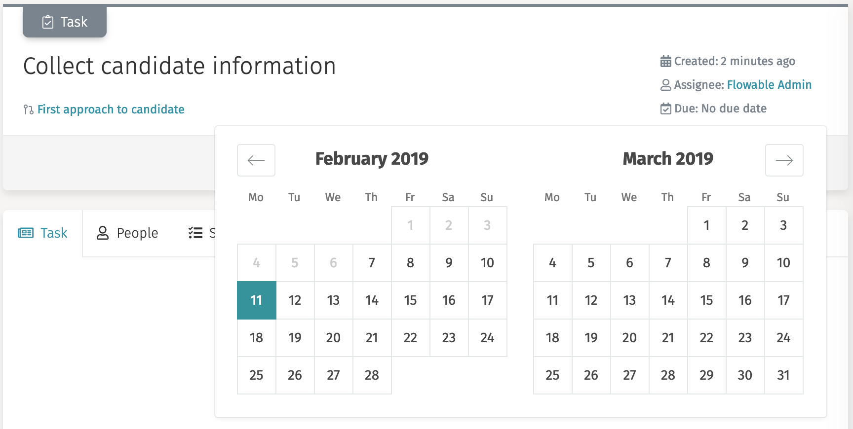
By selecting a day in the calendar the due date is set. The due date can be modified at any time by clicking again on the field. If you place your mouse on top of the due date, the actual date is shown, and a X button appears that lets you remove the due date completely.
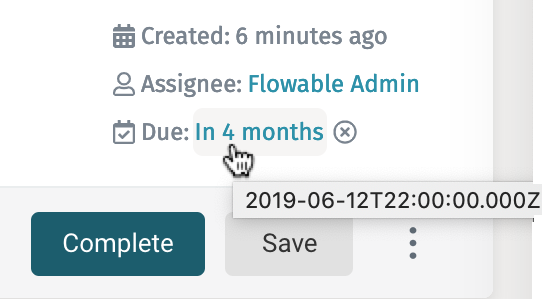
This attribute is just informative. Tasks are available for completion even past the specified due date.
Outcomes
By default, the outcome buttons of a task are Complete and Save.
The
Completebutton saves the form and completes the task, making the work item continue to the next step.The
Savebutton saves the form, but does not complete the task, thus the task remains opened to be completed on a next step.
If a task has custom outcome buttons, those buttons also complete the task, but add a variable to the process that signals which option was selected. For example, Accept or Reject a loan request. This outcome variable can then be read in the process in order to use it in a conditional flow to model which is the next step that should happen in the process.
Additional actions
If the task has additional modeled actions, they are displayed when you click on the button represented by the three dots. You can then select which action you want to execute by clicking on it.
Navigation Bar
When you click on a task and the details panel loads its information, a navigation bar is shown on the main area. This bar acts as tabs from where you can perform additional actions on the task.

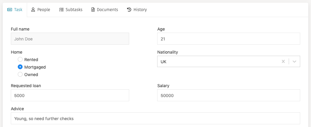
Task
The task tab is the default tab of the task details view. It shows the corresponding form of the task, so the assignee user can interact with it, fill the appropriate fields, and save or complete the task. This area is scrollable when needed.
If the task tab is not selected, you do not see the outcome buttons in the header area to be able to complete the task.
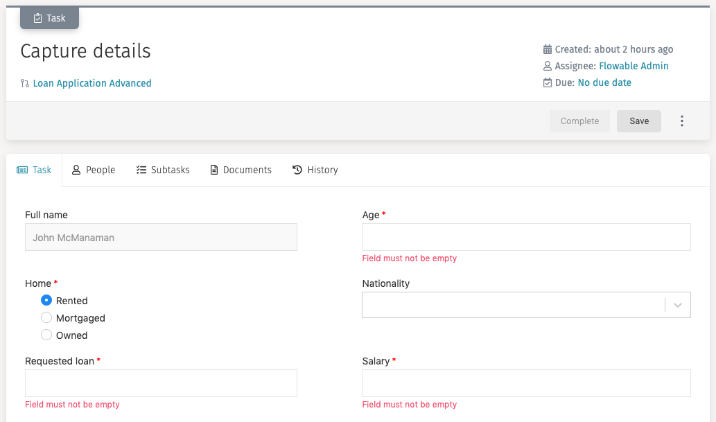
A task form can have mandatory fields. The mandatory fields are marked with a
red asterisk (*). A task cannot be completed (the Complete button is
disabled) until all mandatory fields have been filled in, and a message appears under
them asking you to fill them.
You can always save a form without filling in all mandatory fields.
People
When you are working on a task, you might want to involve other members of your team in it, so they can help you, add additional information or documents. From this tab you can view who is involved in the task.
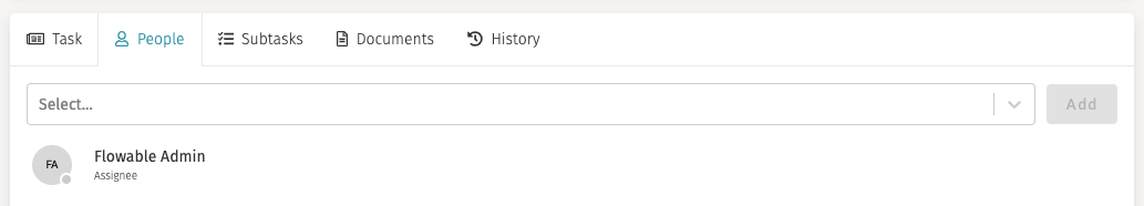
If you want to involve someone in the task, you just have to type his name in the
input search combo, select him and click on Add. You can add as many people
as you want.
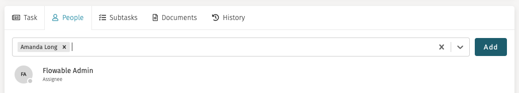
Every user that you involve in the task are set as a candidate for the task, and if they have the appropriate permissions, they can complete the task. The task is listed in their open tasks list.
If you want to remove someone from the task you can place your mouse over its row,
and then on the right side a button Remove appears.
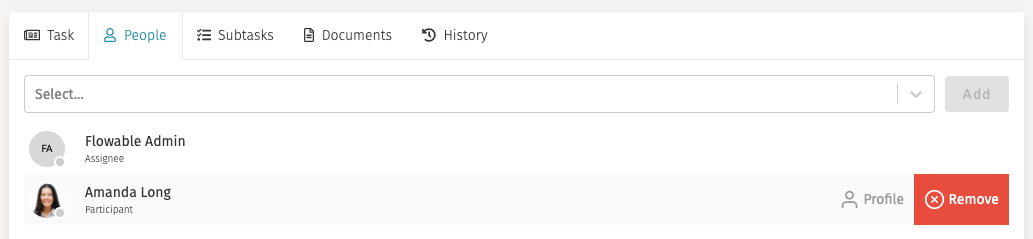
You can only add or remove people from open tasks. You cannot modify who is involved after a task has been completed.
Subtasks
Similar to ad hoc tasks (see Creating New Ad Hoc Tasks), you are able to create new subtasks. When clicking on the subtasks tab, you see the list of subtasks.
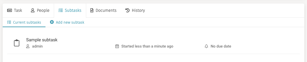
If you want to create a new subtask, you can click on the Add new subtask button
and a form loads where you can enter the basic information for it
(only Name is mandatory). After you are done filling the form in, click on
Create subtask.
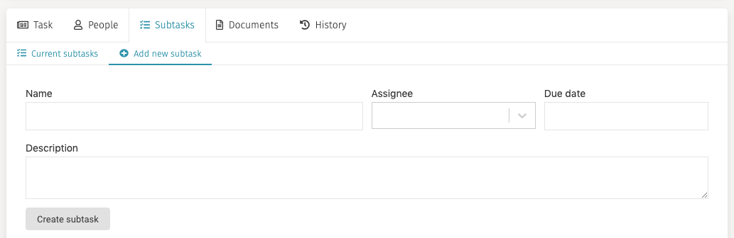
The description field supports a small subset of Markdown. For example, you can use *My text* to bold what is between the asterisks: My text.
Documents
In the documents tab you can attach files to the task, view already attached files and delete attached files.
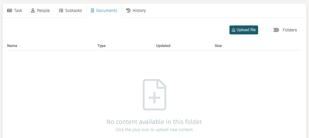
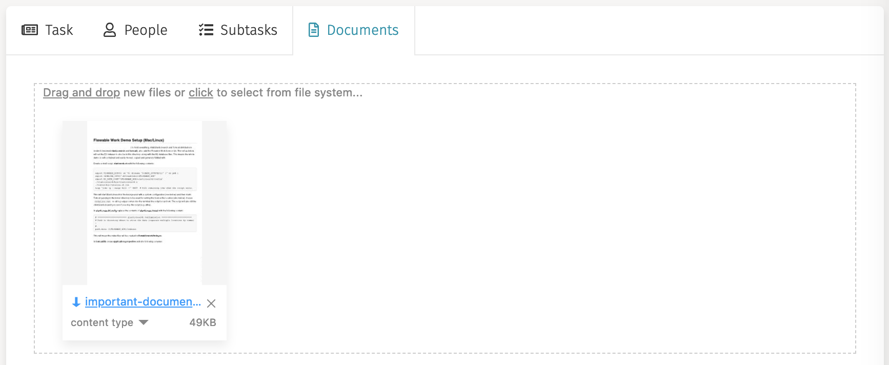
To attach a new file, either click the plus sign in the window or click on
the Upload file button and a window for choosing the file from your system opens.
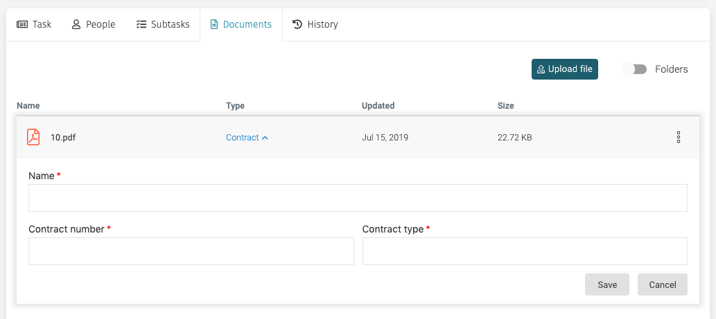
To delete a document, simply slick the item, click the three dots menu at the right of the line and then select Delete file.
You can add metadata to document by clicking the three dots menu and selecting the
Add content type item. This opens
a panel below where you can enter the content type (for example Contract) and based
on the selected content additional fields appear. In order to save your metadata,
you have to press the Save button on the header area.
Contacts
The Contacts button gives you access to the list of contacts.

When you click on Contacts the inbox loads the list of all your contacts with
their respective roles.
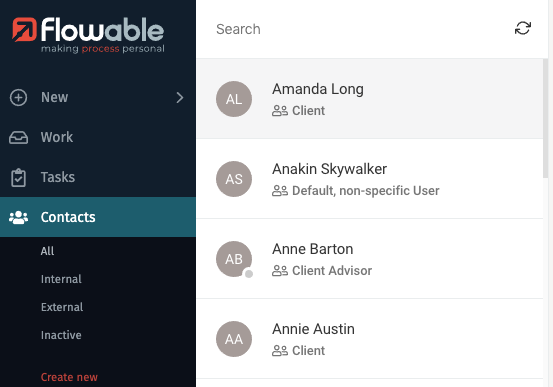
If there are any visible filters for contacts, they are also shown. For example, the filter Internal only shows contacts of your organization, while the filter external shows you external clients. The button for creating a new contact is also shown.

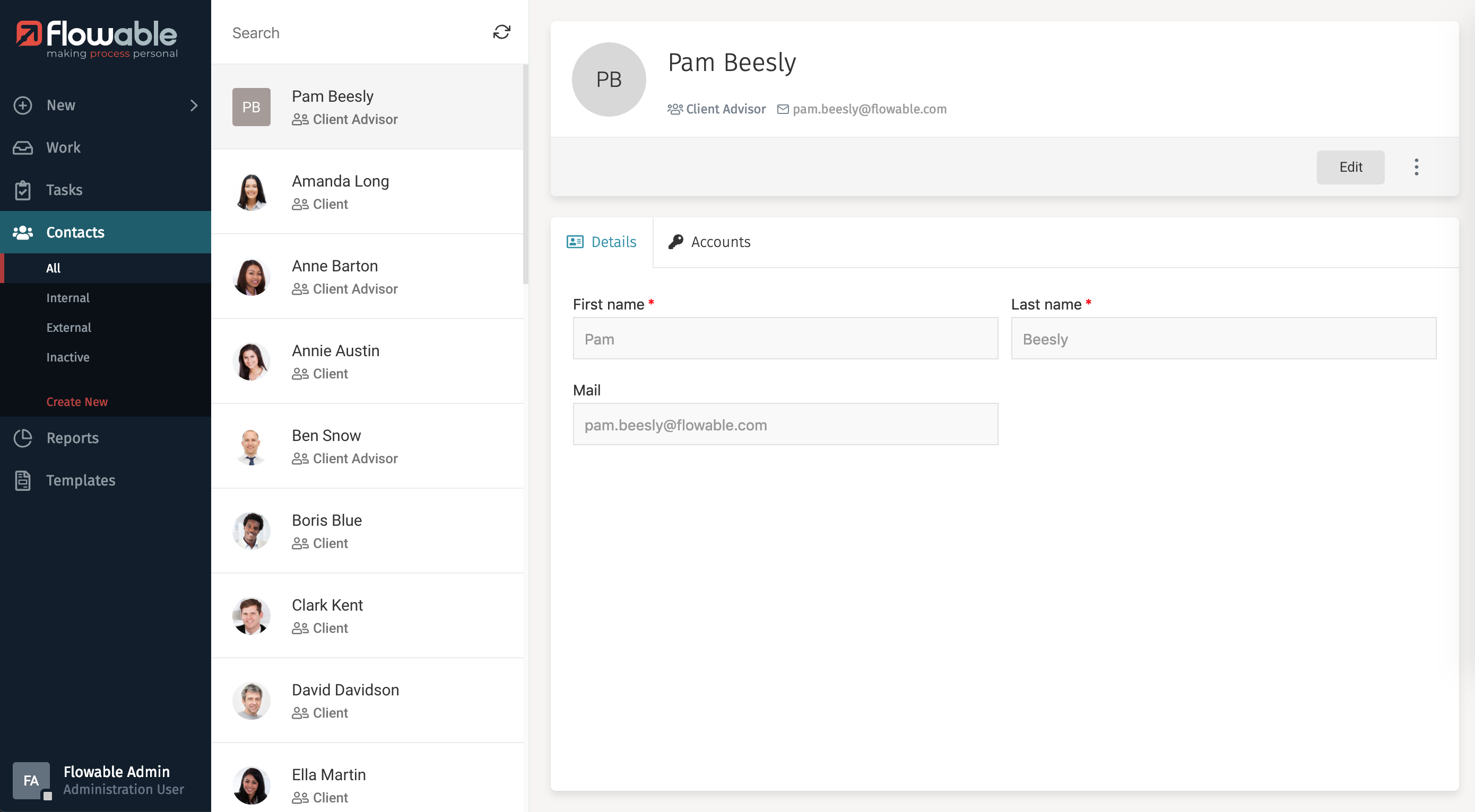
Contact Details
The details panel of a selected contact contains all the information about the contact,
a navigation bar to choose between contact details and accounts, an Edit button
(if you have the appropriate permissions to do so), a button for additional actions,
and a main area to interact with the selected contact.
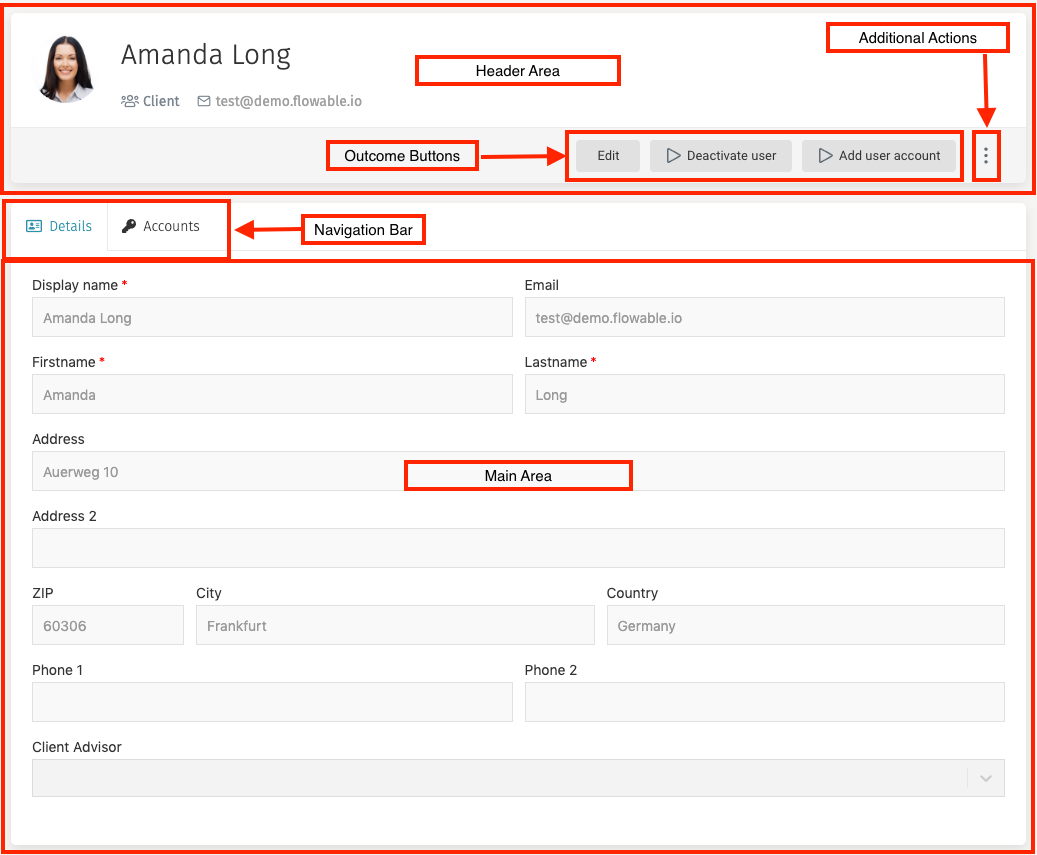
Header
The header contains the display name of the user, their role, their email, an Edit
button and additional actions menu dropdown.

If you click on the email of the contact, you can send him an email using your favorite email software.
Navigation Bar
When you have a contact selected in the inbox and the details panel loads its information, a navigation bar is shown on the main area. This bar provides you access to the details of the contact and their accounts.

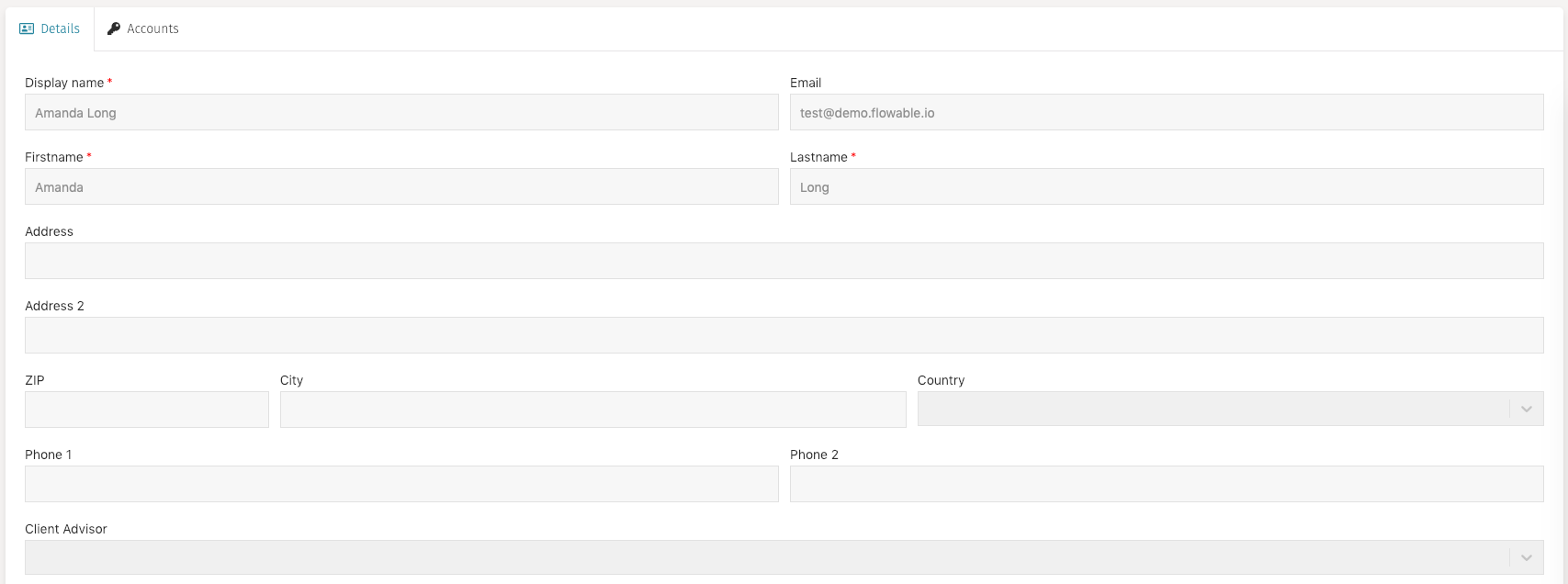
Details
The details tab is the default tab of the contact details view. It shows all the main information of the contact: First name, Last name, email as well as additional information that is only shown if the contact has a specific role. For example, a client contact has fields for their address, and a selection field to specify the client advisor of the contact.
Accounts
The accounts tab shows the accounts of the contact, if any.
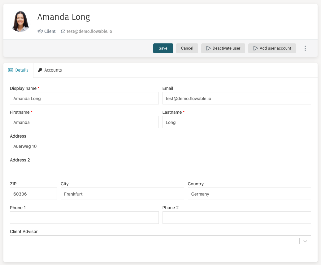
Editing a Contact
While visualizing the details of a contact you can click on the Edit button on
the header area to make modifications to their information. The details panel
then changes to an edit mode that lets you modify the fields, and the
Edit button is replaced by a Save button and a Cancel button.
Once you have finished the modifications, you can save them by clicking on Save.
In case you want to discard the modifications, you can press Cancel
and any unsaved changes are not applied.
If you have created a custom contact form, then define the keys of the forms you want, along with the permissions in the user definition model, as below:
{
"key": "contact",
"name": "Contact User",
"description": "Creates a new contact user.",
"forms":
{ "init": "F01_userInitFormDefault", "view": "F02_userViewFormDefault", "edit": "F03_userEditFormDefault" }

,
"actionPermissions":
{ "create": [ "flowableAdministrator" ], "edit": [ "flowableAdministrator" ] }

}
]
You will also need to ensure that the additional variables from the custom form are explicitly added to the restVariables property of the user definition model:
"restVariables": {
 "all": [
 "clientAdvisorId", "address", "address2", "zip", "city", "country", "phone1", "phone2"
 ]
},
If the variables are not here, then they will be ignored and you will not be able to update them.
The following variables are added by default: “email”, “firstName”, “lastName”, “displayName”, “language” and “theme”.
Deactivate User
The Deactivate user button provides a way to deactivate a contact and their
associated accounts.
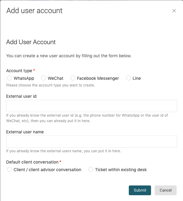
Add User Account
Clicking the Add user account opens a dialog where various account information
can be provided.
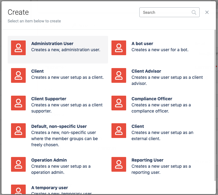
Creating New Contacts
When you click on the Create new item in the Contacts section, a window appears which lets you select the profile (also called technically user definition) of the user you want to create. The profile of the contact determines which functions he is able to access and perform.
After selecting the profile, the window shows the fields needed for creating the
contact. Mandatory fields are marked with a red asterisk (*), and the fields
that are shown are determined by the profile that was selected. For example, in
order to create an external client you need to select a Client advisor for him.
Once you have filled in all mandatory fields, you can press on the Submit
button. The window closes and your recently created contact is loaded into
the details pane.
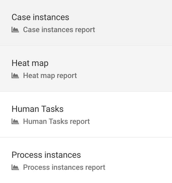
Reports
In the Reports section you can access several application usage diagrams, to get a quick visual understanding of the execution of your work items and tasks.

When you click on Reports, the inbox panel shows you the available items you can get visualizations of.
Process Instances
With this visualization, you can obtain information about your process instances.
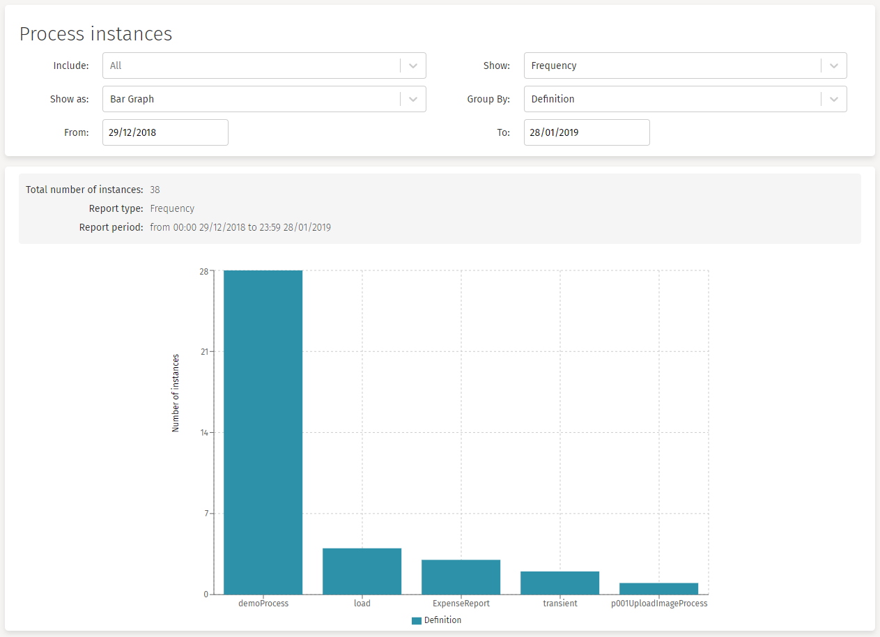
The available options you can use to narrow your diagram are:
Include: This option lets you choose a specific process. By default, all processes are included in the graph. After selecting a process, if you want to go back and show all processes again, you can click the X button at the right of the dropdown to deselect the chosen process.
Show: With this option you can choose if you want to see the number of instances created (Frequency) or the execution time (Duration). When you choose the Duration option, the Calculate filter appears.
Calculate: (Show only if Duration is chosen on the Show filter)
Average: Shows the average execution time of the process instances.
Minimum: Shows the minimum execution time of the process instances.
Maximum: Shows the maximum execution time of the process instances.
Total: Shows the total execution time of the process instances.
Show as: With this option you can choose the type of report to obtain. The available graphs are: Bar Graph, Line Graph or Pie Chart.
Group by: With this option you can group the report values by Definition, or by Hour, Month, Year, or Week.
From - To: With these two options you can narrow the time range where you want your data to be obtained from.
Case Instances
With this visualization, you can obtain information about your case instances.
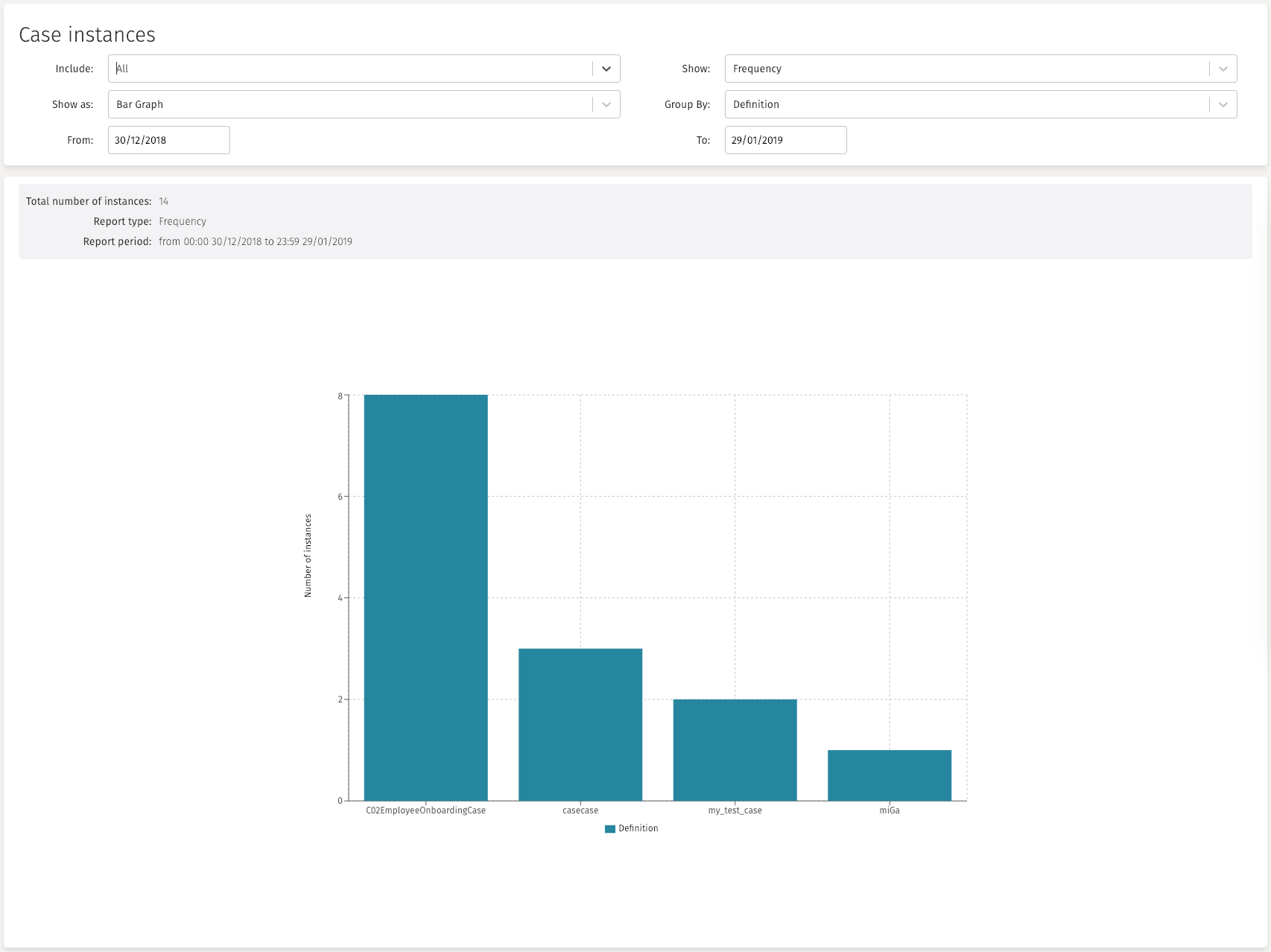
The available options you can use to narrow your diagram are:
Include: This option lets you choose a specific process. By default, all processes are included in the graph. After selecting a process, if you want to go back and show all processes again, you can click the X button at the right of the dropdown to deselect the chosen process.
Show: With this option you can choose if you want to see the number of instances created (Frequency) or the execution time (Duration). When you choose the Duration option, the Calculate filter appears.
Calculate: (Show only if Duration is chosen on the Show filter)
Average: Shows the average execution time of the process instances.
Minimum: Shows the minimum execution time of the process instances.
Maximum: Shows the maximum execution time of the process instances.
Total: Shows the total execution time of the process instances.
Show as: With this option you can choose the type of report to obtain. The available graphs are: Bar Graph, Line Graph or Pie Chart.
Group by: With this option you can group the report values by Definition, or by Hour, Month, Year, or Week.
From - To: With these two options you can narrow the time range where you want your data to be obtained from.
Human Tasks
With this visualization, you can obtain information about your human task instances.
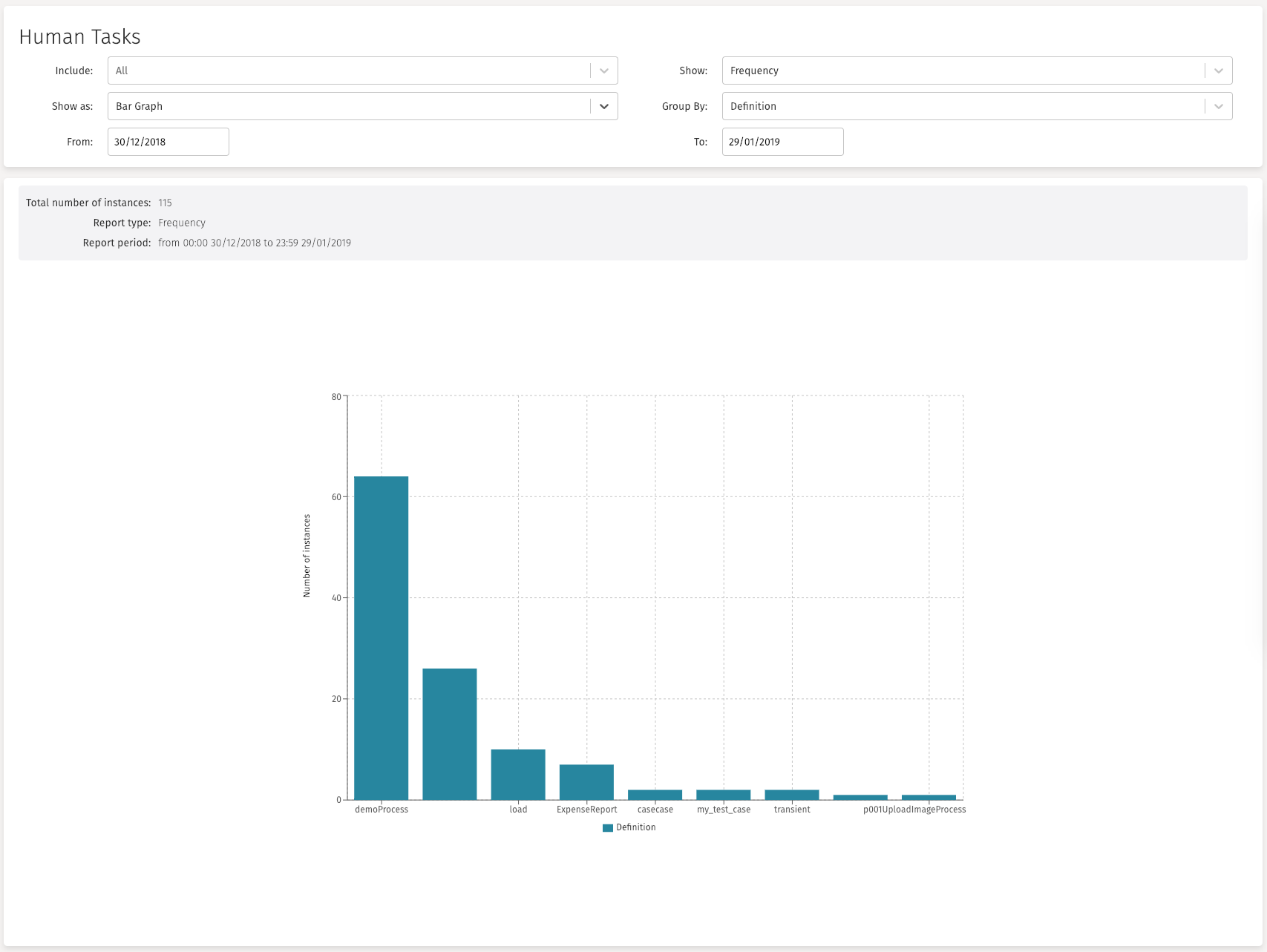
The available options you can use to narrow your diagram are:
Include: This option lets you choose a specific process. By default, all processes are included in the graph. After selecting a process, if you want to go back and show all processes again, you can click the X button at the right of the dropdown to deselect the chosen process.
Show: With this option you can choose if you want to see the number of instances created (Frequency) or the execution time (Duration). When you choose the Duration option, the Calculate filter appears.
Calculate: (Show only if Duration is chosen on the Show filter)
Average: Shows the average execution time of the process instances.
Minimum: Shows the minimum execution time of the process instances.
Maximum: Shows the maximum execution time of the process instances.
Total: Shows the total execution time of the process instances.
Show as: With this option you can choose the type of report to obtain. The available graphs are: Bar Graph, Line Graph or Pie Chart.
Group by: With this option you can group the report values by Definition, or by Hour, Month, Year, or Week.
From - To: With these two options you can narrow the time range where you want your data to be obtained from.
Heat Map
This visualization lets you select all process instances of a given definition and show in a process diagram the number of human tasks that are created (frequency) or the amount of time that is spent on each task.
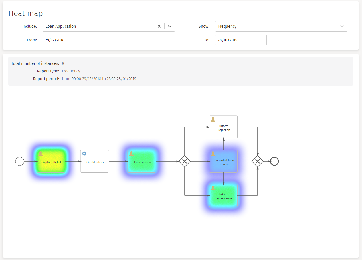
The available options you can use to narrow your diagram are:
Include: This option lets you choose a specific process. By default, all processes are included in the graph. After selecting a process, if you want to go back and show all processes again, you can click the X button at the right of the dropdown to deselect the chosen process.
Show: With this option you can choose if you want to see the number of instances created (Frequency) or the execution time (Duration). When you choose the Duration option, the Calculate filter appears.
Calculate: (Show only if Duration is chosen on the Show filter)
Average: Shows the average execution time of the process instances.
Minimum: Shows the minimum execution time of the process instances.
Maximum: Shows the maximum execution time of the process instances.
Total: Shows the total execution time of the process instances.
From - To: With these two options you can narrow the time range where you want your data to be obtained from.
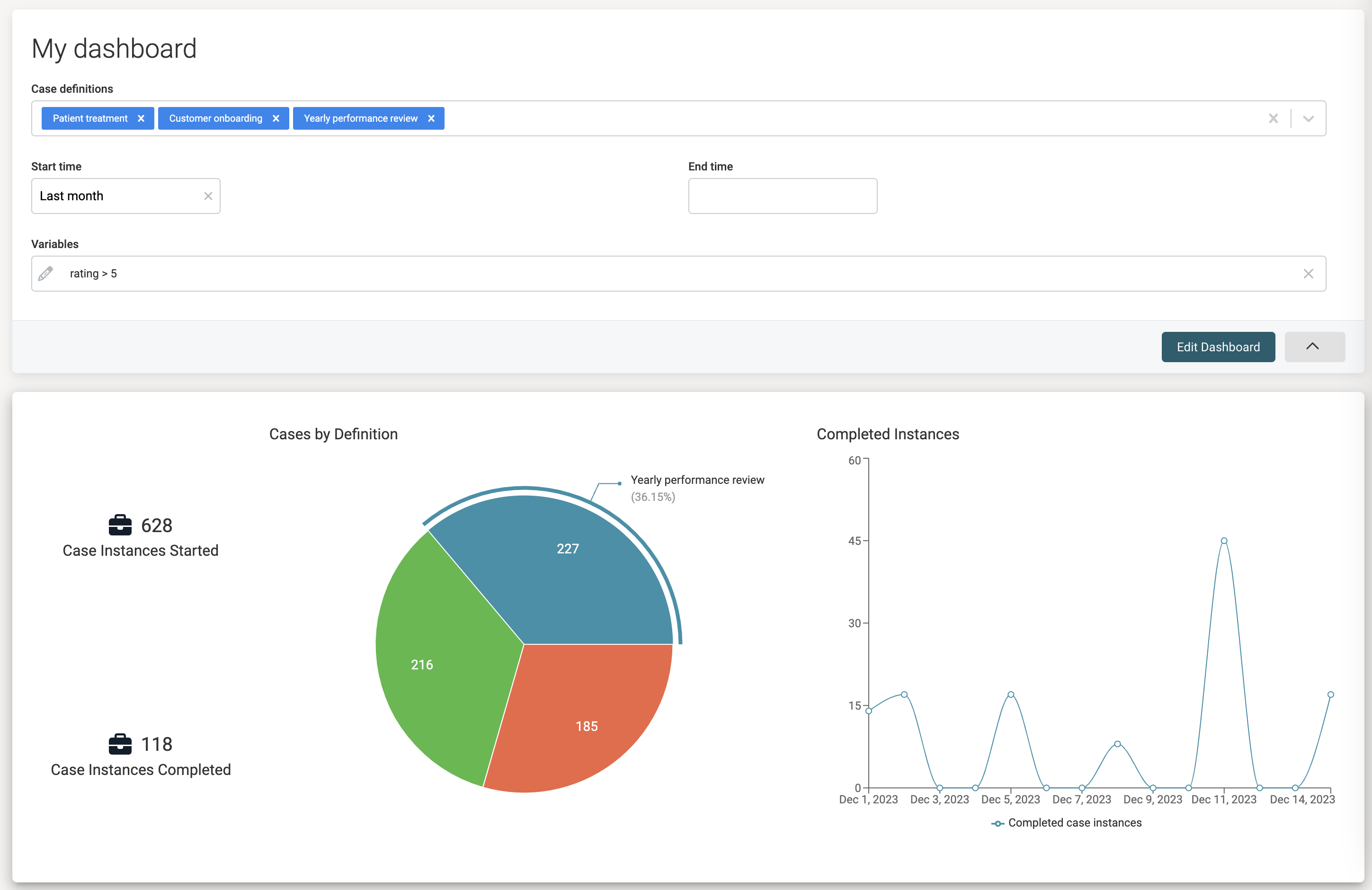
Dashboards
If dashboards aren't visible, they might need to be enabled by an administrator user. See the admin guide for more details
The Dashboards option allows a user to create dashboards using a catalog of dashboard components. Flowable Work ships with a set of out-of-the-box components, but custom ones can easily be created using customized query models and dashboard component models.
Dashboards are user-bound.
The dashboard UI has two high-level UI parts: the Header with filters and the Component Canvas:
After creating a new dashboard, click the Edit dashboard button. Three buttons appear in the header, while the canvas goes into edit-mode:
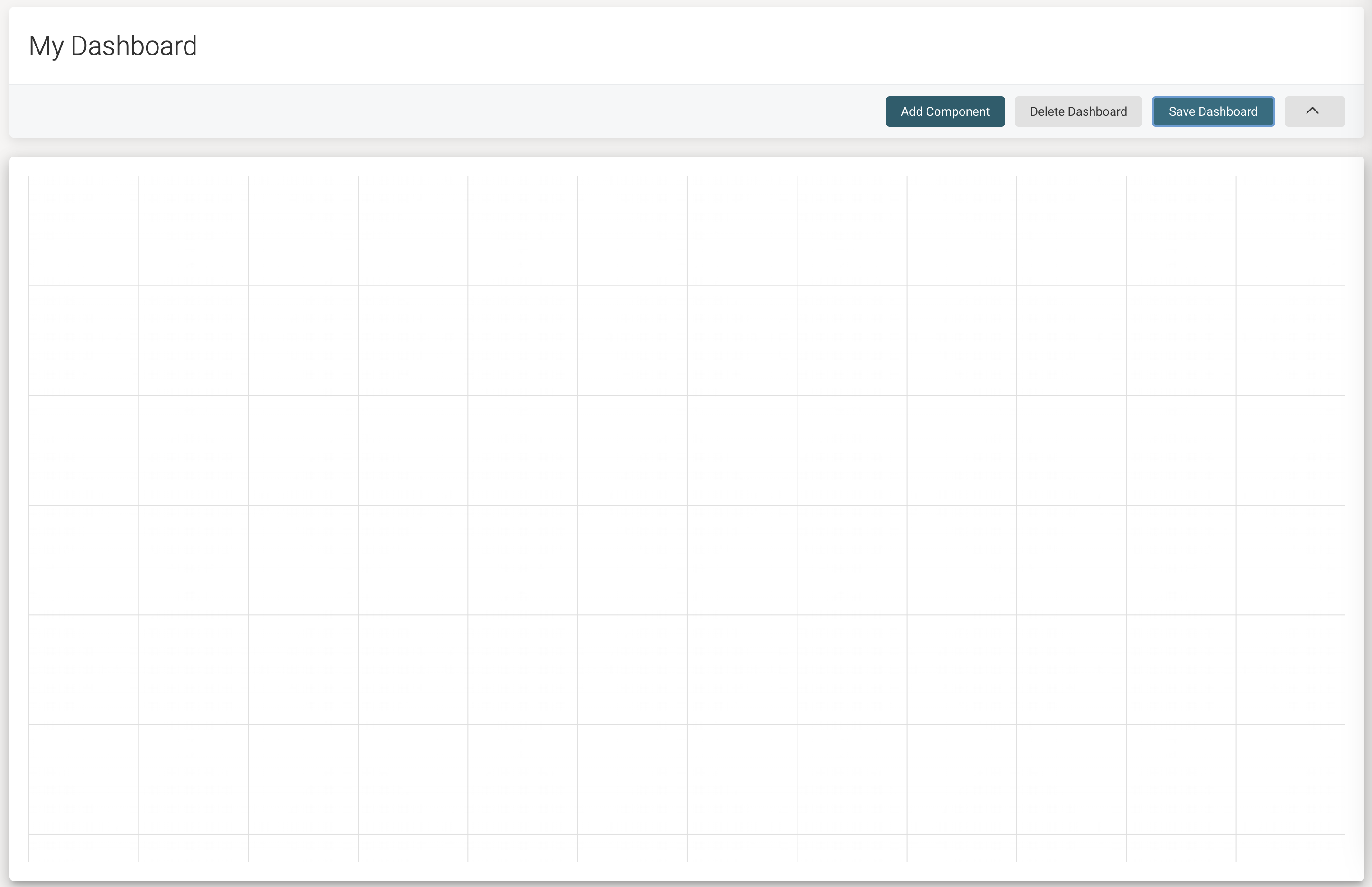
The Delete dashboard button allows to delete this particular dashboard and the Save dashboard button will save all current changes and switch back to the view-mode.
The Add component button will show the Component catalog which displays all out-of-the-box components and all custom ones published to this system:
After chosing a component, a custom title and component-specific settings can be configured.
When multiple dashboard components reuse the same filter (for example the process definition picker), only one entry is rendered in the header. When the filter is changed, all components that use it will re-fetch the data and re-render.
Documents
The Documents option gives you access to the documents in your content library.
When you click on Documents, the content library appears showing the first level of folders: Work and Personal.
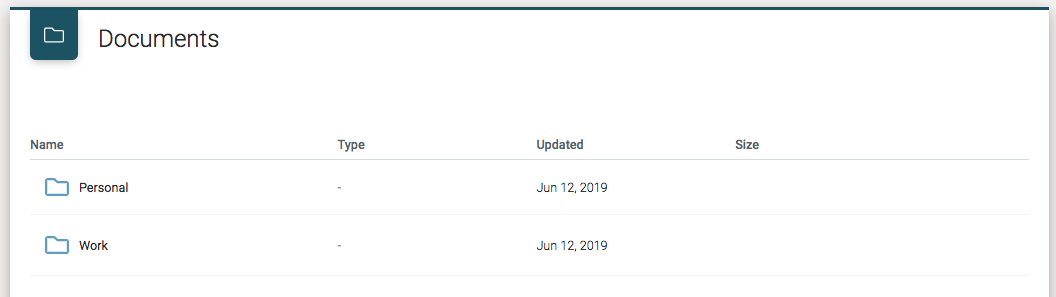
Those two folders are special system folders that cannot be modified.
Work includes all the documents related to the Work application, which includes cases, processes, and tasks documents.
Personal is a special folder only for the current user. It provides a personal space to organize your documents.
Clicking on the folder name or double-clicking on a folder row opens the folder and displays the current content.
Work Folder Hierarchy
Folders hierarchy is inherited from the Work item definition. So adding a file called
sample.doc in a task of a case creates the following folder structure:
Case 1
Task 1
- File
Document Upload
If a user has permission to upload files or create folders in the current folder,
then the Create folder and Upload file buttons appear on the right of the
screen.
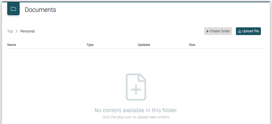
Clicking on the Upload file button opens the system file selector.
Alternatively, if the folder is empty, we can also upload files clicking on
the big file icon in the middle of the screen.
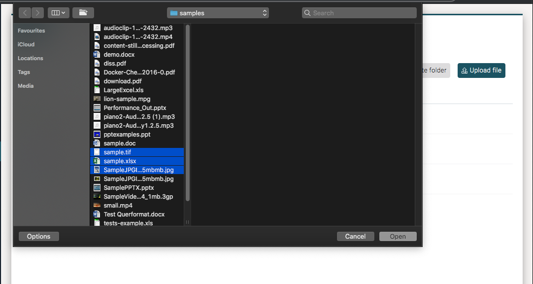
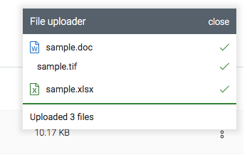
The uploading process allows for uploading multiple files at the same time. An upload status panel shows the upload process and the final result of the operation.
Folders
As with uploading files if we are in a folder that allows us to create folders,
we can use the Create folder button. A modal window appears in which a
new folder name is entered.
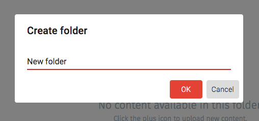
After clicking the OK button the new folder appears as a child of the current
folder.
To rename a folder,
select Rename in the context menu at the top right of the item row.
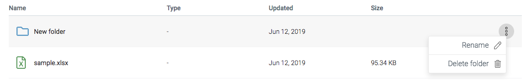
Selecting Rename opens a model window in which we set the new folder name.
After clicking the OK button, the screen is refreshed displaying the
new folder name.
To delete folders (again assuming we have permissions), use the same context menu
and select the Delete folder item.
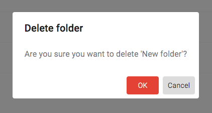
Selecting Delete folder opens a confirmation window
in which if we click the OK button, the folder is deleted.
Document Versioning
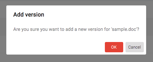
We can add different versions of the same document by selecting New version in the
context menu associated with a file.
Selecting New version opens a model dialog confirming that in fact, we do
want to upload a new version of the document. Clicking the OK button
then opens the system file upload dialog in which we select the file to upload.
At any time in the process we can cancel the versioning action.
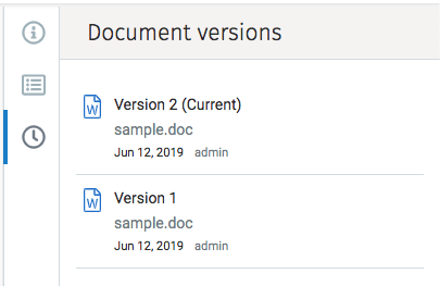
To see the full list of document versions, we first must open the document in preview mode. Next click the versions icon to see the various versions. See versions in the Preview mode.
Content Type
We can add content type information to a document using the context action menu
and clicking on Add content type.
Selecting Add content type produces a dropdown menu from which to pick one
of the possible content types defined in the system.
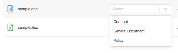
Once the content type is selected a form with the corresponding metadata fields appears in the list into which we fill in the required information.
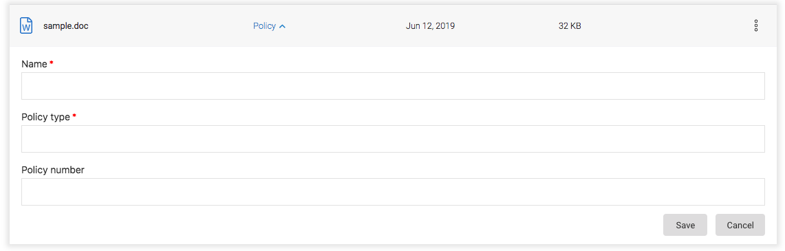
Once the information is entered, click on the Save button
and if the save is successful, a success message appears:

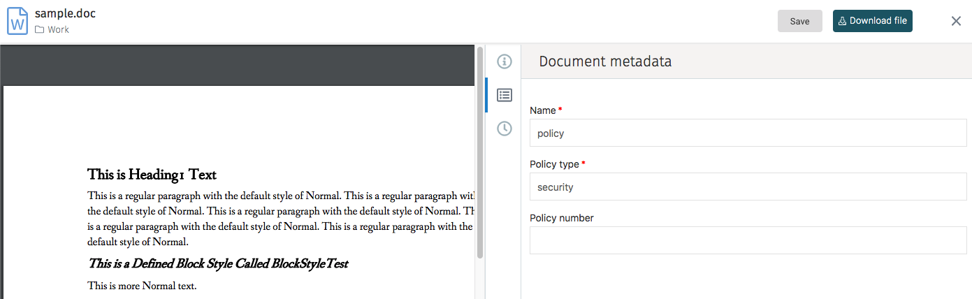
To view the metadata associated with a document metadata open the document in preview mode.
Document Preview
Clicking on the name of a document in the document list shows a preview of the document contents:
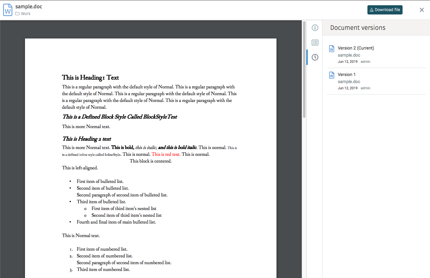
If the document has a convertible file format then a preview in PDF format or the image itself is shown:
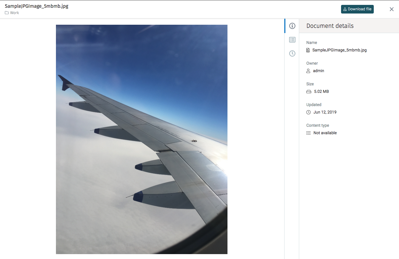
The right panel contains additional details about the document, including the filename, size, and owner.
Actions
The current document is downloaded using the Download file button
on the top right.
Navigation is accomplished by either clicking on the folder name on the top left (breadcrumbs) above the list of files or when previewing a document by clicking on the "X" at the top right corner.
Document Metadata
In preview mode, one of the details tabs is the document metadata. That tab shows the content type and related information defined for that particular document.
Document Versions
The versions tab lists all the previous versions of the current document. By selecting a previous version from the list that specific version is available for download.
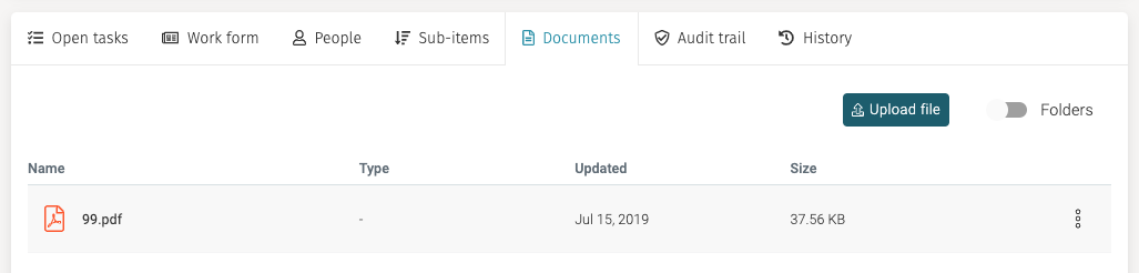
Documents Tab
For each of the Work details pages, there is a tab that shows the documents associated with that particular case, process, or task.
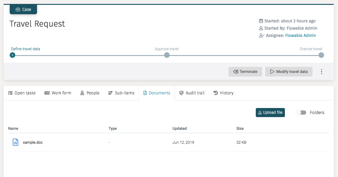
The documents tab includes a switch control labeled Folders that is used
to control whether or not to show the hierarchy
of folders. By default the folder hierarchy is disabled; thus all the files
associated with that
work item are shown in a flat list as shown above.
If the Folders switch control is enabled, the view shows
folders under that case folder. As seen in the next example, we see the task
folder where contains the sample.doc file.
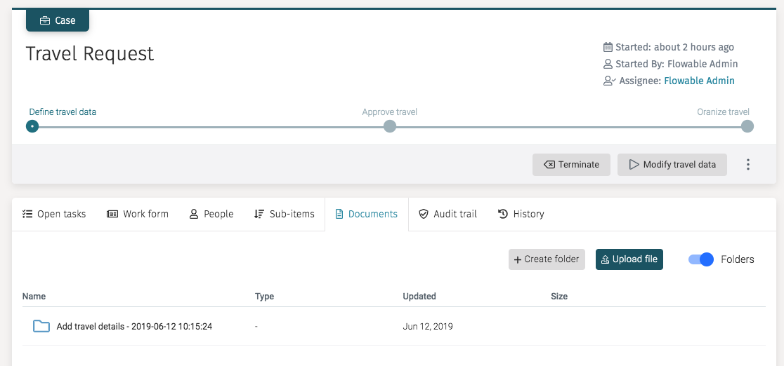
In either view, we can upload files directly to the work item folder, and if the Folders switch is active we can create folders too.